Featured article.

Let’s look at some common font issues you might have already come across, and how Monotype Fonts can help you resolve them.


Let’s look at some common font issues you might have already come across, and how Monotype Fonts can help you resolve them.

Long gone are the days of zipping up folders of font files and sharing them across your organization, or even messier, embedding fonts in documents in the cloud in hopes that the design remains intact. We recently announced an expanded set of licensing rights which allows all employees within an organization to access Commercial Production Fonts in their desktop environments.

This week we’re welcoming Andrew Krivine, author and punk rock collector, alongside Michael Worthington, faculty at CalArts and co-founder of Counterspace. The creative duo is here to tell the tale of how they co-created the largest exhibition of punk and new wave graphics ever shown on the West Coast.

Over the past four years, we’ve been lucky to forge a reciprocal partnership with the Limerick School of Art & Design / TUS in Ireland. Both Creative Type Directors Tom Foley and Emilios Theofanous have now participated in workshops and modules at the leading fine art, design and creative media school. This year’s students were asked to write a message platform for one typeface and build a marketing plan and design assets to promote it in digital or print media.

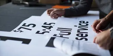
Rebranding a business is not for the faint of heart. It’s an enormous operation that requires significant time and investment while offering the possibility of totally revitalizing a brand.

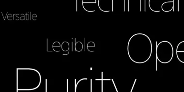
Legibility is a crucial consideration when trying to choose a font for your project. Here’s how to find a legible font that will be easy on the eyes for your readers and customers.

Launching a website or app? Your font choice is key to your success. Here’s how to assess the legibility, consistency, performance, and longevity of your font choice.

Find design inspiration in an age of information overload.

In this article, get a peek at recent and upcoming book releases in a variety of genres to get a sense of what typography styles are trending in publishing right now. This post is a guest piece from our friends at Reedsy, a website that connects authors with publishing professionals.

Today’s brands must keep up with a fast-paced digital world and navigate a “new normal” that’s still emerging from the worst of the pandemic. The last few years shifted everyone’s digital expectations, how brands operate, and in some cases, impacted their business models. Moreover, issues like biodiversity, sustainability, diversity and equity, and brand activism are all booming. So how does this all impact brand building? These macro shifts are greatly influencing how companies position themselves, the services they offer, and how they communicate with their customers.
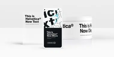
Designers and studios might be deeply familiar with Neue Helvetica, but it’s the product of a pre-digital era. Here are four reasons why it’s time to switch.
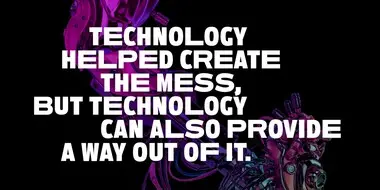
As technology raises the stakes for brands, fonts can either level you up or hold you back. A simple, well-organized font system is essential to making sure you can keep pace.
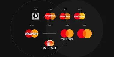
Mastercard made waves when it announced that it will drop the word “Mastercard” from its logo. But is it the right decision for every brand?

The World Cup is back, and all eyes are zeroed in on the best football … jersey fonts? We examine the tall task of designing for the world of sport.
Monotype’s Akira Kobayashi worked closely with Sony’s Chief Art Director Hiroshige Fukuhara to create an original typeface ready for nearly 100 languages.
Monotype and Lippincott worked closely with Southwest Airlines to craft an authentic typographic voice that formed the center of a fresh new identity.
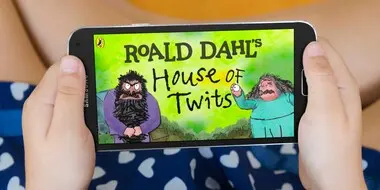
Monotype worked with noted illustrator Sir Quentin Blake and his team to recreate his handwriting as a bespoke typeface.
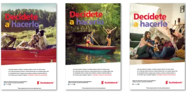
Scotiabank has long used Frutiger as its brand font. But as they expanded to new digital channels and regions, font licensing became too complex. Until now.

Monotype designer Terrance Weinzierl delivered a taste of modern Americana to Domino’s, with his modular, multi-weight Pizza Press typeface.