


Creative Characters S2 E8: Andrew Krivine and Michael Worthington.
Michael Worthington.
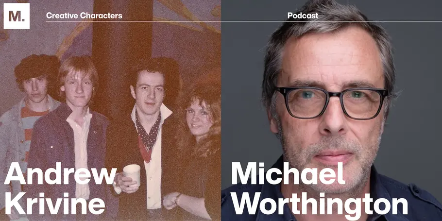
This week’s guests are multi-talented. We’re welcoming Andrew Krivine, author and punk rock collector, alongside curator Michael Worthington, founding partner of Counterspace and faculty of graphic design at CalArts. The creative duo is here to tell the tale of how they created the newest Pacific Design Center exhibit, “Torn Apart,” featuring the largest exhibition of punk and new wave graphics ever shown on the West Coast.
Knowing a good thing when you hear it.
Like many music origin stories, we have to talk about The Clash.
Growing up, Andrew visited London every year to see his aunts and uncles. His first cousin, John, founded punk stores Acme Attractions and BOY in the 1970s. It was while hanging out at BOY that Andrew heard his first Clash album.
“The first few times I heard it, I couldn’t understand what the singer was saying. It was really getting on my nerves, but then the fourth time it suddenly hit me: this is the greatest record of all time,” says Andrew.
He was so attracted to graphic ephemera of British punk music that he started collecting it. Today, he owns one of the largest private collections of punk and post-punk graphic design and memorabilia in the world. His collection contains over 7,000 pieces including posters, flyers, fanzines, and stickers.
Andrew teamed up with Michael to curate this collection of graphics from 1976-1986 into a 1,000-piece showcase: the “Torn Apart” exhibit at the Pacific Design Center. To hear the full co-creation story, listen to the podcast.
On a similar wavelength, Michael has also been drawn to the typography of bands and musicians since childhood.
“For me, being in Andrew’s collection was like opening up this a gigantic Christmas present of all the things you ever wanted. I remember re-drawing all of those band logos as a kid on my pencil case, on the back of my back of my schoolbooks, and carving them into desks,” he adds.
The music scene in England.
In the 70s, music became a place for youth culture and a means of self-expression. Avid listeners would wear pins from their favorite bands as a “sheath of armor” to show who they listened to and what music circles they belonged in. The typography used also represented the shift of philosophy at the time.
“It was like you suddenly got permission to do whatever you wanted to do. I think in England that was also tied into an oppressive class system where the working class always felt like: we can’t do anything or we’re not allowed to do anything. We have to have permission from the upper class,” says Michael.
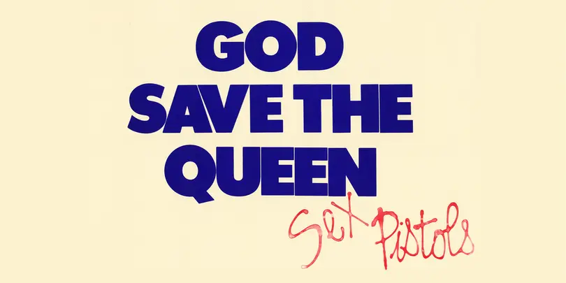
He cites Jamie Reid as one of the graphic designers who really put the attitude of punk into design. His typography featured newspaper cut letters that looked like a ransom note for the Sex Pistols’ album Never Mind the Bollocks and the singles “Anarchy in the UK” and “God Save The Queen”.
The do-it-yourself mentality of punk rock translated across album covers and posters, which were often designed by friends of band members who were all in art school together.
“It was this weird constellation, where these amazingly talented people happened to cross paths to a degree,” says Andrew.
Graphic design was an outlet for working-class students who wanted to be in the art world while also making a living. The design form grew from the printing industry, which is historically a class industry.
“You had to send out for type. It wasn’t like now where anybody could do anything really quickly. A lot of those aesthetics in early punk work come from people not having a lot of money. And again, figuring out, ‘how do I do it myself?’ I think that kind of rawness and physicality is still very appealing in a lot of the design work from that period,” adds Michael.
Fan favorites.
Now that we’ve taken a stroll down punk history lane, it’s time to see how these designs from the 70s and 80s have stood the test of time.
One of Andrew’s favorite posters is the design Peter Saville created for electronic band Orchestral Manoeuvres in the Dark. The artwork was for their 1983 album Dazzle Ships.
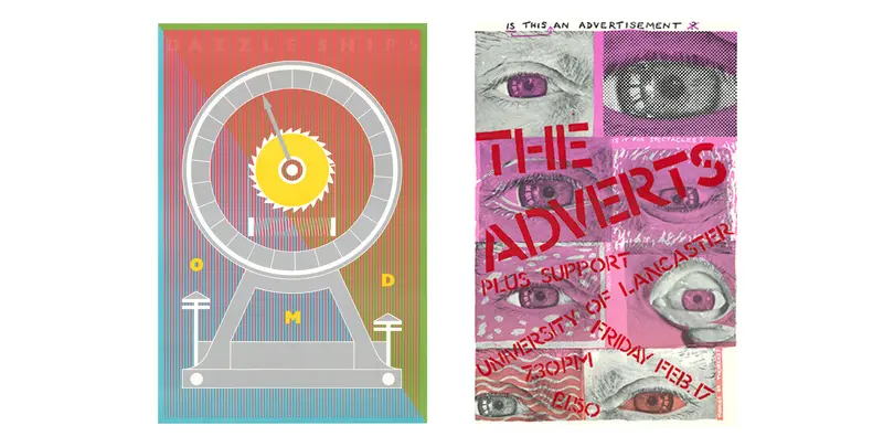
Andrew also has an appreciation for designer John Angus, who served as the in-house poster designer for University of Lancaster, in North West England. Andrew’s favorite design is the poster for The Adverts, a 1976 English punk band. “The colors are extraordinary and the imagination is pretty wonderful.”
Among Michael’s standout favorites is Malcolm Garrett’s poster design for the English punk rock band the Buzzcocks.
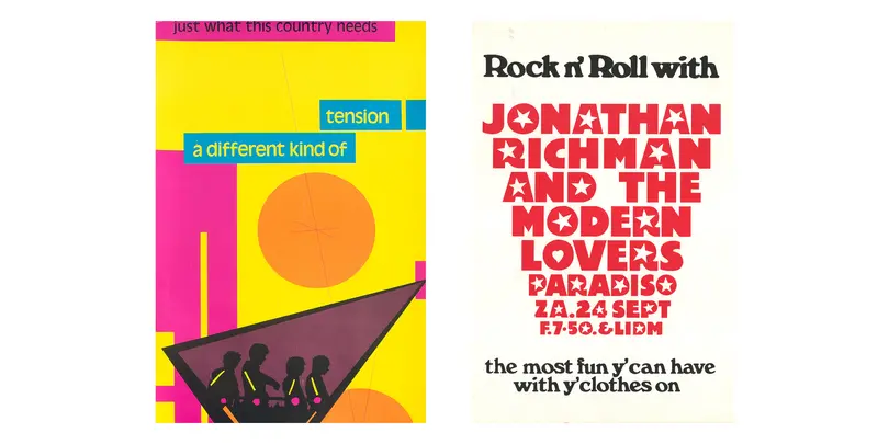
Michael also enjoys the expressive, novelty typefaces that designer Martin Kaye created for the gigs at the Paradiso in Amsterdam. Kaye used split fountain screen-printing methods, and was the Paradiso’s longest serving in-house designer.
As these designs get released back into the public eye through the “Torn Apart” art exhibit in West Hollywood, Andrew and Michael are excited to share their passion for design and hopefully inspire the next generation.
“If these designs can trigger an emotional and aesthetic connection with young people, that would be hugely gratifying for me,” says Andrew.
Visit the “Torn Apart” exhibit at the PDC Design Gallery until September 8. For more information, check out the PDC Design Gallery on IG and the exhibit website. To see more of Andrew’s work, view his collection of published books.

 sustainable brand.")


