5 rebrands that used type to transform their sector.
James Fooks-Bale
Rebranding a business is not for the faint of heart. It’s an enormous operation that requires significant time and investment while offering the possibility of totally revitalizing a brand.
There’s a long list of reasons a company might overhaul its visual identity, ranging from the purely aesthetic to the more practical. In some cases, a business might have changed its positioning, leaving its current branding feeling irrelevant or outdated. Mergers and acquisitions often prompt the need for a renewed design language, as does an expansion into a new market or product focus. There could also be a need to streamline and simplify a brand voice which has, over the years, become increasingly complicated.
Type is the soul.
Type answers many of these challenges. While color and form are important, type is the absolute soul and visual voice of a business. And it carries that power across environments. “You can use it to persuade people on trust, or sincerity,” says Fooks-Bale. “You can transform something quite quickly, and it can inspire as well.”
A rebrand with a font change can use type to take people into the future, evoke the past, or speak to a particular place or culture. “It’s form, but it’s also content and style as well,” adds Fooks-Bale. “Look at the lowest common denominator - for example, a cup, on an airline, where all you’ve got is plastic and embossing with no color, sound, or content other than a letterform. Or a favicon on a website. Or an icon on a Twitter handle. It’s shorthand. It can act like a glue throughout any touchpoint to bring that brand together from the big scale down to the tiny scale.”
Type also fulfills a critical emotional role. While many of us aren’t consciously aware of its impact, there’s no denying it affects us. It’s something that’s gradually attracting more research, and this emotional influence can be key to launching a successful rebrand that helps a company reconnect with consumers.
Taking an iterative approach to branding.
Rebranding doesn’t just have to be about a big announcement and a business-wide update. Brands have to flex and adapt to new challenges, and their design language and font families have to enable them to do that. “Change is the only constant in life,” says Fooks-Bale. “Whether it’s your audience group changing their views, or the world around them, or technological changes. It might be that the business is growing, and going into new territories. Then you’re doing that two- or three-year-long rebrand, and by the time you’ve painted the bridge you have to start again.”
A more iterative approach to branding can meet some of these challenges, helping a business to morph and shift without embarking on a top-to-toe brand refresh. A rebrand font can help businesses do so, by offering a solid bedrock that can be built upon, but also expanded and adapted as needed.
Industry-changing rebrands.
Excellent use of type is a common thread in some of the biggest, most successful rebrands of the last decade - some of which revolutionized not just the immediate business, but the wider sector they operate in:
Minimal type does the most.
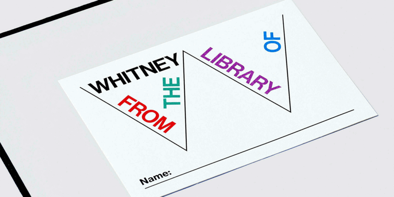
The Whitney Museum of American Art, designed by Experimental Jetset, 2013.
Although extremely minimal in appearance, and economical in its use of type, the Whitney’s rebrand showed how much expressive power there is in a single, sans serif letterform. Experimental Jetset created what it called “the responsive W” - a flexible typographic grid centered around a monoline letterform that could be adapted as needed, becoming a frame for other design and imagery.
“I remember when Experimental Jetset launched it, it was incredibly fresh,” says Fooks-Bale. “It was really like nothing else. It was delivering stability and fluidity through one letterform - through the W and how that could adapt and expand to different grids, layouts, heights, widths, places, and situations.”
Not only did the rebrand offer a contemporary approach that was counter to the ‘heritage’ branding of other arts institutions - many of which have also now explored more modern design systems – it prefigured our changing understanding of businesses. “It was adopted before people were thinking of brands as living, breathing things,” adds Fooks-Bale. “It was well ahead of its time in my opinion; it didn’t have many ingredients, but this one ingredient was used incredibly well.”
The food brand that changed the face of food.
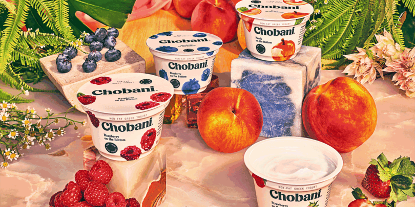
Chobani, designed in-house, 2017.
The yogurt brand’s nostalgic, retro-tinted rebrand disrupted not just its immediate market, but the entire food industry. And its after-effects can still be seen years later, as other major food brands, such as Burger King, have adopted similarly vintage rebrands.
In many ways, Chobani kickstarted the nostalgic design movement, using a bespoke serif typeface that carried undertones of previous eras. It broke the ‘templatized’ design approach, embracing quirky, characterful type in a way that other brands of the time simply weren’t doing. “It was visually jarring, almost,” says Fooks-Bale.
The rebrand received extensive press coverage and, as all the best design projects do, provoked significant debate. But it was Chobani’s willingness to go against the prevailing typographic trends of the time - which called for functional, efficient type that could work anywhere - that made the work resonate
Data makes a place.
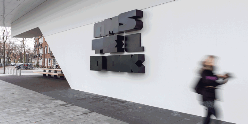
Amsteldok, designed by VBAT, Superunion, and Fontsmith, 2019.
As technology has improved, the potential for more fluid, expressive, responsive type has also increased enormously. VBAT, Superunion, and Fontsmith tapped into this for the rebrand of Amsteldok – the Amsterdam campus of creative network WPP.
This project totally upended the way places and environments are branded, creating a living, breathing identity that responded to movement, time of day, and temperature. In the past, this kind of work would have relied on static wayfinding and logos, but Amsteldok showed the possibilities of both variable type and data.
“The campus didn’t want to have a fixed, sterile identity,” says Fooks-Bale. “This had movement and change and could respond to the situation. The outlines of the letterforms expand, contract, and the colors change. It gets calmer and quieter toward the evening, and more active at lunchtime. You could feed it anything, and it would be different each time you see it.”
The project hints at the enormous future potential for variable type and data as well, potentially responding to people’s various emotional states of levels of concentration throughout the day. “Variable allows you to play in that way,” says Fooks-Bale.
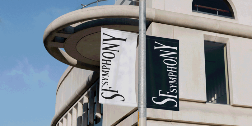
The expressive potential of type.
San Francisco Symphony, designed by COLLINS, 2021.
Arts organizations such as the San Francisco Symphony are all about celebrating movement and evoking emotion – and that’s exactly what its 2021 rebrand did.
COLLINS took traditional typography and gave it the ability to ‘dance’ in reaction to sound. The variable type had its roots in the more ‘classic’ branding that arts organizations are familiar with, but with an expressive twist that pointed the way forward for new interpretations of this.
“If you look at some of these institutions, there’s almost a standard way of how you should see a museum, or gallery, or concert hall,” says Fooks-Bale. “These places tend to be based on past references built on past references. What COLLINS did was see through that, and present a brand in a more alive, relatable, and fresh way.”
Typographic maximalism.
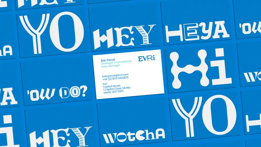
Evri, designed by Superunion and Monotype, 2022.
While its competitors opt for consistency, delivery service Evri re-established itself in a busy and competitive market by choosing the exact opposite: typographic maximalism. Its rebrand introduced a ‘living’ logo design that could be arranged in almost 200k typographic combinations to ensure Evri’s branding is, almost, never the same twice.
This was entirely driven by type, with Monotype creating a bespoke typeface programmed to randomize letters and symbols. It’s a revolutionary decision in a market where reliability is conveyed by static, dependable branding.
“It gave a bit more human soul to all their different drivers and customers around the world, but is still evergreen so they can change, and flex, but still be that default brand,” says Fooks-Bale. “We don’t want fixed and rigid. We all respond to our surroundings, and this rebrand showed a more flexible, fluid, living and breathing design system.”
Where to start.
Rebranding has never been so rich with potential, and type is a huge part of that. Once you’ve made the big decision to overhaul your company’s branding, the next step is exploring how a new typeface (or faces) can support it. A trusted font portal gives access to thousands of potential options, housed in one easily accessible place. This can be hugely beneficial in defining the rebrand’s direction and understanding what typeface will best convey a company’s tone of voice. “If you’ve got a broad library to look into, you can quickly map out what will deliver, technically, but also visually what can deliver on the task at hand,” says Fooks-Bale. “Experiment with fonts. Don’t settle - change the whole game.”


