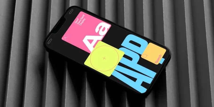
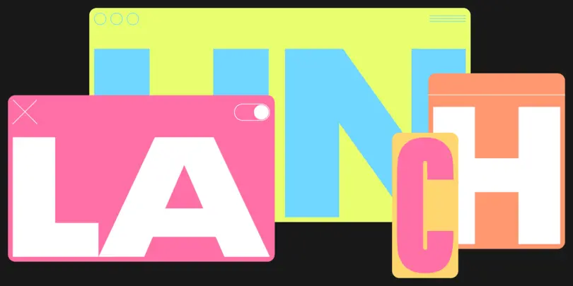
The 4 most important considerations when choosing a font for website or app launches.
Launching a new website or app is a big project with many considerations, from the architecture to the copy and imagery to the color scheme. One consideration that merits special attention is your choice of font, for two reasons: branding consistency and future-proofing your brand’s operations.
Launching a new website or app is a big project with many considerations, from the architecture to the copy and imagery to the color scheme. One consideration that merits special attention is your choice of font, for two reasons: branding consistency and future-proofing your brand’s operations.
Type is the visual voice of your brand. Choosing type is like choosing a spokesperson, one who will be working around the clock, every day of the year. None of us would opt for a sloppy or lackluster spokesperson whose values don’t align with our own. You shouldn’t choose a sloppy, lackluster font, either. The right font will communicate your brand’s ethos, values, and spirit in crowded digital spaces. The right font will also be flexible enough to contribute to brand consistency across platforms or regions, with licensing terms that ensure you can use it for a long time to come.
So, how do you choose the right font for your website or app? The key is knowing who you are and how you want to be perceived. It’s like choosing clothing. Like fashion, typography communicates meaning, feeling, moods, and intentions. The way the language looks affects the way it’s interpreted by the reader. If you know who you are as a brand, finding the right type is considerably easier. Who are you speaking to? And how do you want that audience to perceive you? Tell your brand story to an expert in typography and he or she can guide you to the right typefaces. Read books on typography – Thinking with Type by Ellen Lupton is a good start – and you’ll invariably find topics and ideas that lead you to seek out more books and information. Approach your search as a process of discovering a range of possibilities and you’ll enjoy it more than if you focus on discovering the single perfect font.
As you explore, consider these four type attributes that are most critical to a successful website or app launch: legibility, consistency across mediums, performance, and longevity.
Legibility: more than readability.
A readable font is the bare minimum. Aim higher and find a font that will convey thought seamlessly. There are 14 key ingredients to a legible font:
- Serif status. With the advent of digital typography in the 1980s, some fonts – like Lucida – were designed specifically for screens based on vision and reading research. Today, readers expect sans serif fonts online and serif fonts in books and other printed materials. Those expectations condition us to be more receptive to one form or another, which influences understanding. The Journal of Vision Impairment and Blindness’s 2007 review of research on typeface legibility revealed that low-vision readers tend to prefer sans serif fonts, even though reading speed did not appear to be affected. Consider choosing a sans serif font for your website or app to best meet your users’ expectations.
- X-height. The x-height is the distance between the baseline and the mean line (or waistline) of a lowercase letter, which creates a visual impression of the size of a typeface. Generally, a larger x-height is perceived as more legible.
- Size. The point size is the most important and straightforward aspect of legibility. A larger point size is more readable to everyone!
- Aperture. The small openings in letters like a lowercase “e” or “a” allow the light both outside and inside the letter to mingle together. The repetition of these apertures across a sentence or paragraph has a deep impact on legibility. Modern typefaces often feature smaller apertures, which can make letter forms more difficult to differentiate and cause misreading. Try reading a few sentences in your chosen font options on your computer and phone to make sure you don’t stumble over the words or reread phrases. If you do, it’s time to consider a font with more open apertures for your website or app.
- Spacing. Spacing that’s too tight or too loose will be less legible. Find the Goldilocks spacing by reading a few sentences and noting how seamlessly your eyes moved across the text.
- Weight. A font’s weight refers to the thickness of the letters. Most people expect to encounter text in a normal weight (as opposed to bold or thin); letter forms in heavier weights can be more ambiguous, so use caution.
- Width. When type is more condensed or wide than expected, it becomes both harder to read and fatiguing over long passages. Stick to normal widths for dense text especially.
- Slant. As italics have waned in popularity, readers have grown to be more familiar with upright fonts. As a result, they’re perceived as more legible than italics.
- Case. Even though text in all caps looks larger, it tends to be less legible as capital letters can be more easily confused with each other.
The ingredients above all contribute to the legibility of a typeface’s inherent form. But legibility is also impacted by how you use the type, including:
- Color. Color can convey a mood or personality, but it can also negatively impact legibility. When choosing the color of the text and background of your website or app, don’t forget that color blindness affects up to 8% of men and 0.5% of women worldwide. Make sure your choices will be accessible to those with color blindness.
- Contrast. Related to color, contrast refers to the difference in brightness between foreground text and background colors. The most legible contrast is black text on a white background.
- Polarity. In the context of type, positive polarity refers to black text on a white background while negative polarity refers to white text on a black background. Reversing the traditional black text on white background (also known as “dark mode”) can give the human eye relief from too much light, but it doesn’t make text more legible. A 2017 study in the journal Applied Ergonomics found that, contrary to popular belief, positive polarity is more legible on screens.
- Leading. The space between lines, or leading, affects how a reader experiences your message. Tight leading is less legible, but loose leading can break up a single thought over two lines, which can be less desirable. It’s key to find the right balance of leading that smoothly delivers a complete thought.
- Measure. The length of a line is called its measure. Seek a balance between a line that’s too long (and thus tiring to read) and a line that’s too short, which can fracture the message and limit understanding.
There’s a lot that goes into legibility. If the details overwhelm you, just go back to the basics. Type out a few sentences in the fonts you like – in the sizes, weights, colors, etc. that you’re considering for your website or app – and read through the text on your devices to see how smooth and seamless of an experience it is. If you stumble, refer to this guide to identify why. Then try a different font or layout to fix those issues.
Consistency across mediums.
If your typeface is your spokesperson, consider this: how jarring would it be for that spokesperson to look completely new – different hair and eye color, totally separate style, with a changed voice and demeanor – in disparate settings? Of course, it would be perfectly acceptable for your spokesperson to dress differently depending on the occasion. Similarly, your typeface scheme should maintain a strong, consistent sense of self but with enough built-in flexibility to meet the occasion. That may mean that you use one font for your printed materials and another for your website. As long as they feel cohesive and intentional, a little variety is fine – just don’t pair a sterile sans serif with a flowery script, or else your brand will evoke Dr. Jekyll and Mr. Hyde.
Performance.
Treat fonts like any other licensed design component. If your brand needed a new creative authoring tool, a multi-functional team would likely embark on a rigorous discovery and evaluation process to ensure the final selection has all the functionality and quality you expect. Do the same for your fonts. Fonts are software!
Longevity.
Typeface longevity is such an important component of performance, it’s worth mentioning separately. Avoid future rebranding headaches by ensuring your chosen font includes all the languages and characters you need today as well as those you may expand to in the future. Established foundries with a reputation for responsiveness to technical issues, custom character requests, and other support requests are more likely to ensure their fonts function perfectly in the latest and greatest web and app environments.
Now, go hire your spokesperson.
Like a perfect spokesperson, the font you choose for your new website or app should have the right voice and presence to accurately represent your brand (with some adjustments, like a change in attire). Your spokesperson should meet specific qualifications around performance and be fully committed to representing your brand in digital spaces for years to come. Finding the right font spokesperson for your website or app may not be a fast or easy process, but the discovery process can be fun if you approach it with a curious spirit – so enjoy the ride!


