Featured article.

Let’s look at some common font issues you might have already come across, and how Monotype Fonts can help you resolve them.
Let’s look at some common font issues you might have already come across, and how Monotype Fonts can help you resolve them.

Long gone are the days of zipping up folders of font files and sharing them across your organization, or even messier, embedding fonts in documents in the cloud in hopes that the design remains intact. We recently announced an expanded set of licensing rights which allows all employees within an organization to access Commercial Production Fonts in their desktop environments.

This week we’re welcoming Andrew Krivine, author and punk rock collector, alongside Michael Worthington, faculty at CalArts and co-founder of Counterspace. The creative duo is here to tell the tale of how they co-created the largest exhibition of punk and new wave graphics ever shown on the West Coast.

Over the past four years, we’ve been lucky to forge a reciprocal partnership with the Limerick School of Art & Design / TUS in Ireland. Both Creative Type Directors Tom Foley and Emilios Theofanous have now participated in workshops and modules at the leading fine art, design and creative media school. This year’s students were asked to write a message platform for one typeface and build a marketing plan and design assets to promote it in digital or print media.

Rebranding a business is not for the faint of heart. It’s an enormous operation that requires significant time and investment while offering the possibility of totally revitalizing a brand.

Legibility is a crucial consideration when trying to choose a font for your project. Here’s how to find a legible font that will be easy on the eyes for your readers and customers.

Launching a website or app? Your font choice is key to your success. Here’s how to assess the legibility, consistency, performance, and longevity of your font choice.

Find design inspiration in an age of information overload.

In this article, get a peek at recent and upcoming book releases in a variety of genres to get a sense of what typography styles are trending in publishing right now. This post is a guest piece from our friends at Reedsy, a website that connects authors with publishing professionals.

Today’s brands must keep up with a fast-paced digital world and navigate a “new normal” that’s still emerging from the worst of the pandemic. The last few years shifted everyone’s digital expectations, how brands operate, and in some cases, impacted their business models.

As an IP attorney at a font company, I get a very specific set of reactions when I explain my job. The first is usually some version of: “You need a license for fonts?” The other is usually asking what my favorite font is (shoutout ITC Benguiat®).
By Tim Costello, Chief IP Counsel at Monotype
Web font performance depends on efficient implementation. Combined with ongoing monitoring and optimization tools, these 10 best practices improve load times, user experience, and brand consistency.

This guide walks through each step of setting up, configuring, and maintaining fonts on a CDN while ensuring licensing compliance and a consistent user experience.

Supporting iconic global brands, Kenvue worked with Monotype to bring structure, compliance, and clarity to a complex, decentralized font ecosystem.
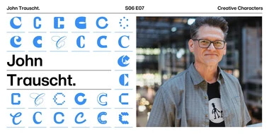
In this episode, Pixar Senior Graphic Designer John Trauscht shares how typography, creativity, and “creative surfing” help bring Pixar stories to life across languages, and why the human touch still matters in storytelling. Tune in now.
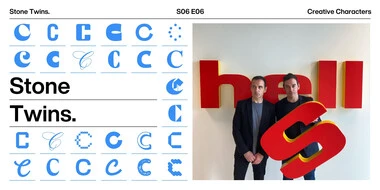
This week’s episode is with the Stone Twins, for an insightful conversation on the art of branding and design. Tune in to hear how these creative siblings blend visual and verbal storytelling to craft meaningful, authentic brands.
Creating a new brand, or evolving an established one, is never simple. Every decision shapes perception in the market, influences operational efficiency, and determines how consistently a brand shows up across hundreds or even thousands of touchpoints.