Featured article.

Let’s look at some common font issues you might have already come across, and how Monotype Fonts can help you resolve them.
Let’s look at some common font issues you might have already come across, and how Monotype Fonts can help you resolve them.

Long gone are the days of zipping up folders of font files and sharing them across your organization, or even messier, embedding fonts in documents in the cloud in hopes that the design remains intact. We recently announced an expanded set of licensing rights which allows all employees within an organization to access Commercial Production Fonts in their desktop environments.

This week we’re welcoming Andrew Krivine, author and punk rock collector, alongside Michael Worthington, faculty at CalArts and co-founder of Counterspace. The creative duo is here to tell the tale of how they co-created the largest exhibition of punk and new wave graphics ever shown on the West Coast.

Over the past four years, we’ve been lucky to forge a reciprocal partnership with the Limerick School of Art & Design / TUS in Ireland. Both Creative Type Directors Tom Foley and Emilios Theofanous have now participated in workshops and modules at the leading fine art, design and creative media school. This year’s students were asked to write a message platform for one typeface and build a marketing plan and design assets to promote it in digital or print media.

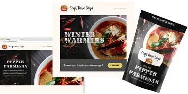
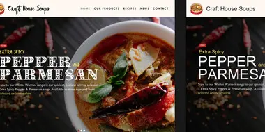
Rebranding a business is not for the faint of heart. It’s an enormous operation that requires significant time and investment while offering the possibility of totally revitalizing a brand.

Legibility is a crucial consideration when trying to choose a font for your project. Here’s how to find a legible font that will be easy on the eyes for your readers and customers.

Launching a website or app? Your font choice is key to your success. Here’s how to assess the legibility, consistency, performance, and longevity of your font choice.

Find design inspiration in an age of information overload.

In this article, get a peek at recent and upcoming book releases in a variety of genres to get a sense of what typography styles are trending in publishing right now. This post is a guest piece from our friends at Reedsy, a website that connects authors with publishing professionals.

Today’s brands must keep up with a fast-paced digital world and navigate a “new normal” that’s still emerging from the worst of the pandemic. The last few years shifted everyone’s digital expectations, how brands operate, and in some cases, impacted their business models.

Theo Inglis chats with graphic designer, writer, lecturer, editor and publisher, Adrian Shaughnessy, about his love of design, vinyl and album art.
Whether you are looking for a new brand font or want to establish a consistent visual identity across the web, here’s how to choose a font that works everywhere.
When you choose a font for your brand, you assume it will just work. But that’s not always the case, this fact can damage your brand’s visual identity.
Corporate typeface helps a timeless railway company now and into the future.

Kenneth Woodruff explores the difficulties of AR/VR product development and highlights projects that are breaking new ground in the space.

Lovers and Greenpeace talk through their campaign, End Ocean Plastics which aims to drive awareness of ocean pollution and drive urgent change.

A custom version of Proxima Nova will streamline Royal Caribbean’s digital presence for clear and confident communication with Chinese customers.

Companies in the financial services sector must keep pace with shifts in consumer behavior and expectations. Our latest eBook outlines five ways fonts can help.

Creativity is often seen as a uniquely human quality that can’t be replicated by a machine, but AI may actually have a role to play in the creative process.