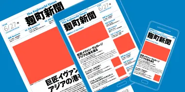
Tazugane® Gothic
Japanese humanist sans serif face.

Japanese humanist sans serif face.
The Tazugane Gothic typeface family is the first original Japanese typeface created by Monotype. Designed by Akira Kobayashi, Kazuhiro Yamada and Ryota Doi of the Monotype Studio, the Tazugane Gothic typeface offers ten weights and was developed to complement the classic Latin typeface, Neue Frutiger. The design of the Tazugane Gothic typeface balances an original, humanistic style with elements of traditional Japanese handwriting. The two typefaces work together in a natural, seamless and adaptable manner so that Japanese and Latin texts can be used side-by-side for a wide range of applications, including in magazines, books and other print media; on digital devices; in branding and corporate identity systems; and in signage for buildings, highways and mass transit.


The Tazugane Gothic typeface family is the first original Japanese typeface created by Monotype. Designed by Akira Kobayashi, Kazuhiro Yamada and Ryota Doi of the Monotype Studio, the Tazugane Gothic typeface offers ten weights and was developed to complement the classic Latin typeface, Neue Frutiger. The design of the Tazugane Gothic typeface balances an original, humanistic style with elements of traditional Japanese handwriting. The two typefaces work together in a natural, seamless and adaptable manner so that Japanese and Latin texts can be used side-by-side for a wide range of applications, including in magazines, books and other print media; on digital devices; in branding and corporate identity systems; and in signage for buildings, highways and mass transit.
Tazugane Gothic was updated to support the “Reiwa” new era symbol. Reiwa can be written as two kanji: 令和. This update to Tazugane Gothic includes Reiwa designed as a single ligature and is encoded as U+32FF.
The inspiration for the Tazugane Gothic typeface is as elegant as its design. Since antiquity, cranes have been regarded in East Asia as auspicious birds for their noble appearance and elegance in flight. The typeface is named Tazugane Gothic in honor of the longevity of the crane, with the goal that it will be used for many years to come.
The combination of the Tazugane Gothic typefaces’ traditional and humanistic elements, along with its intended ability to complement popular Latin typefaces, makes it one of the most uniquely flexible designs for applications where Japanese and Latin texts can be used together. The typeface family was created to have wide appeal, with a pleasing and consistent experience for readers, for use on screen, in print, in signage, packaging and advertising.

As type director at Monotype GmbH in Germany he controls the aesthetic quality of in-house typefaces, and has been creating digital interpretations of classic typeface families for renovation, and designing corporate custom typefaces, besides making his own types. He is a frequent speaker at international type conferences and workshops in Europe, Americas and Asia, and serves as a jury member in prestigious international typeface design competitions.

Senior type designer at Monotype Japan since 2014. He holds a BA (2008) from Tama Art University where he studied visual communication design. After graduation, he worked as a book designer in the office of Yukimasa Matsuda, a famous graphic designer in Japan. At Monotype Japan, he is responsible for designing Japanese typeface.

After receiving his BA in design from Tokyo University of the Arts in 2013, he enrolled in the MA program in Typeface Design at the University of Reading, U.K. Upon earning his Master of Arts degree in 2014, he returned to Japan and began working at Monotype Japan as type designer. He has been developing Japanese typeface that corresponds to Latin typeface and vice versa.
We offer a number of ways for you to start working with our typefaces.
Monotype unveiled a new glyph design for its popular Tazugane Gothic and Tazugane Info typefaces that commemorates the new emperor of Japan.

