Featured article.

Let’s look at some common font issues you might have already come across, and how Monotype Fonts can help you resolve them.
Let’s look at some common font issues you might have already come across, and how Monotype Fonts can help you resolve them.

Long gone are the days of zipping up folders of font files and sharing them across your organization, or even messier, embedding fonts in documents in the cloud in hopes that the design remains intact. We recently announced an expanded set of licensing rights which allows all employees within an organization to access Commercial Production Fonts in their desktop environments.

This week we’re welcoming Andrew Krivine, author and punk rock collector, alongside Michael Worthington, faculty at CalArts and co-founder of Counterspace. The creative duo is here to tell the tale of how they co-created the largest exhibition of punk and new wave graphics ever shown on the West Coast.

Over the past four years, we’ve been lucky to forge a reciprocal partnership with the Limerick School of Art & Design / TUS in Ireland. Both Creative Type Directors Tom Foley and Emilios Theofanous have now participated in workshops and modules at the leading fine art, design and creative media school. This year’s students were asked to write a message platform for one typeface and build a marketing plan and design assets to promote it in digital or print media.

Rebranding a business is not for the faint of heart. It’s an enormous operation that requires significant time and investment while offering the possibility of totally revitalizing a brand.

Legibility is a crucial consideration when trying to choose a font for your project. Here’s how to find a legible font that will be easy on the eyes for your readers and customers.

Launching a website or app? Your font choice is key to your success. Here’s how to assess the legibility, consistency, performance, and longevity of your font choice.

Find design inspiration in an age of information overload.

In this article, get a peek at recent and upcoming book releases in a variety of genres to get a sense of what typography styles are trending in publishing right now. This post is a guest piece from our friends at Reedsy, a website that connects authors with publishing professionals.

Today’s brands must keep up with a fast-paced digital world and navigate a “new normal” that’s still emerging from the worst of the pandemic. The last few years shifted everyone’s digital expectations, how brands operate, and in some cases, impacted their business models.

All those design assets you work with daily come with their own super confusing licensing agreements—but there’s nothing to fear—because while this infographic illustrates how design assets layer together to introduce complex licensing risk, it also offers solutions that ensure licensing compliance, even under tight deadlines. View the infographic to learn more.

Font and creative asset licensing myths can seduce even the most sensible of creative teams. That’s because when we humans don’t understand something…well, if it’s complicated, we tend to oversimplify it…and/or ignore it.
Or fill we fill in the blanks using our own “logic.”
Or take someone else’s word for it, without questioning their expertise.
All of which makes us as susceptible to myths as we are to Ryan Gosling’s ravishing good looks and charm.
That’s right, whether made up in your noggin, or handed down from your beloved team members, you ain’t got enough time nor money to pay for any End User License Agreement (EULA) drama! We’re gonna debunk five foolish font and creative asset licensing myths once and for all and transform you into the best font and creative asset licensing critical-thinker ever!

Efficient creative operations is the glue that holds top marketing, design, and production teams together. In the fast-paced world of creative work, every minute counts, and inefficiencies lead to costly delays. In fact, 51% of marketers report that last-minute revisions and numerous rounds of changes are a major source of delays in delivering creative projects. Managing large volumes of fonts, licenses, assets, and workflows can overwhelm even the best teams. Without a streamlined system, time is wasted searching for resources, duplicating efforts, or fixing errors. Creative operations solves this by centralizing font management, asset organization, and license tracking into one strategic, disciplined workflow. This boosts productivity, reduces inefficiencies, and lets teams focus on high-quality work instead of administrative tasks.
Read on for tips to optimize efficiency in your creative operations.
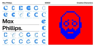
Max Phillips, founder of Signal Type, shares his journey from designing theater posters as a teen to running a type foundry in Dublin. Tune in now.
A Font Manager Delivers Designs Worth Talking About.

Do you know whether you might be using a font illegally? Most people understand the risk of license infringement for software but many don’t know that fonts are licensed in a similar way.
Carefully selected after much deliberation, the perfect font can make the difference between a lackluster marketing campaign and a strong brand identity that leaves an unforgettable impression.
As General Counsel of one of the world’s largest foundries, my legal team and I are always monitoring developments in copyright law and concepts related to font software and typeface designs. This article will summarize some of those developments and provide some general history and background context where appropriate.
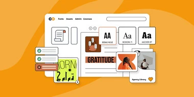
Organizing fonts isn’t just about keeping things tidy—it’s the key to boosting your creative potential and streamlining your workflow. Whether you’re a freelancer, part of an internal or agency-based design team, or managing IT systems for a creative team, proper font organization helps you stay efficient and productive.