Featured article.

Let’s look at some common font issues you might have already come across, and how Monotype Fonts can help you resolve them.
Let’s look at some common font issues you might have already come across, and how Monotype Fonts can help you resolve them.

Long gone are the days of zipping up folders of font files and sharing them across your organization, or even messier, embedding fonts in documents in the cloud in hopes that the design remains intact. We recently announced an expanded set of licensing rights which allows all employees within an organization to access Commercial Production Fonts in their desktop environments.

This week we’re welcoming Andrew Krivine, author and punk rock collector, alongside Michael Worthington, faculty at CalArts and co-founder of Counterspace. The creative duo is here to tell the tale of how they co-created the largest exhibition of punk and new wave graphics ever shown on the West Coast.

Over the past four years, we’ve been lucky to forge a reciprocal partnership with the Limerick School of Art & Design / TUS in Ireland. Both Creative Type Directors Tom Foley and Emilios Theofanous have now participated in workshops and modules at the leading fine art, design and creative media school. This year’s students were asked to write a message platform for one typeface and build a marketing plan and design assets to promote it in digital or print media.

Rebranding a business is not for the faint of heart. It’s an enormous operation that requires significant time and investment while offering the possibility of totally revitalizing a brand.

Legibility is a crucial consideration when trying to choose a font for your project. Here’s how to find a legible font that will be easy on the eyes for your readers and customers.

Launching a website or app? Your font choice is key to your success. Here’s how to assess the legibility, consistency, performance, and longevity of your font choice.

Find design inspiration in an age of information overload.

In this article, get a peek at recent and upcoming book releases in a variety of genres to get a sense of what typography styles are trending in publishing right now. This post is a guest piece from our friends at Reedsy, a website that connects authors with publishing professionals.

Today’s brands must keep up with a fast-paced digital world and navigate a “new normal” that’s still emerging from the worst of the pandemic. The last few years shifted everyone’s digital expectations, how brands operate, and in some cases, impacted their business models.
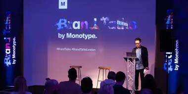
Brand Talks featured speakers from leading global brands and agencies who discussed the primary factors influencing brand identity in a modern world.
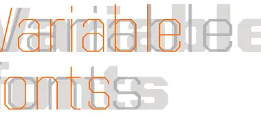
Tom Rickner introduces Monotype’s first Variable font, available free on GitHub, and shares his research into potential use cases for variable fonts.

Speaking at Typographics 2017, Director of Design Hilary Greenbaum explained how typography helps the museum keep the focus on its art.
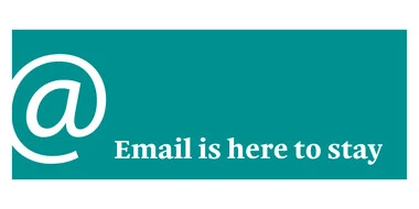
As new marketing strategies come and go, email remains one of the most effective ways brands can reach their customers. Here’s how web fonts can help.

Each element of your typography strategy has a role in streamlining your workflow and helping your designers produce higher quality work on deadline.

This episode features Marina Willer of Pentagram and Nadine Chahine of Monotype. A 30-minute dose of fascinating dialogue about the business of creativity

What are the major challenges facing CMOs? Together with The Future Laboratory, we identified a number of ways that CMOs must adapt for future success.

On November 7, Monotype hosted our second Brand Talks in Paris to explore the ways brands are impacted by both social and economic changes and how they can evolve. A few years ago, brands did not have the same considerations, but they now must keep pace with major issues such as environmental concerns, changing societal expectations, and new ways of engaging with the audience.

An amazing line up of 60 speakers will take the stage at TYPO Berlin to explore how they use digital tools creatively and how to overcome digital distractions.