Featured article.
Let’s look at some common font issues you might have already come across, and how Monotype Fonts can help you resolve them.
Discover, manage, and use fonts with a subscription.
Individual font purchases for any project.
Discover, manage, and use fonts with a subscription.
Individual font purchases for any project.
Let’s look at some common font issues you might have already come across, and how Monotype Fonts can help you resolve them.
Long gone are the days of zipping up folders of font files and sharing them across your organization, or even messier, embedding fonts in documents in the cloud in hopes that the design remains intact. We recently announced an expanded set of licensing rights which allows all employees within an organization to access Commercial Production Fonts in their desktop environments.
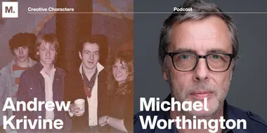
This week we’re welcoming Andrew Krivine, author and punk rock collector, alongside Michael Worthington, faculty at CalArts and co-founder of Counterspace. The creative duo is here to tell the tale of how they co-created the largest exhibition of punk and new wave graphics ever shown on the West Coast.
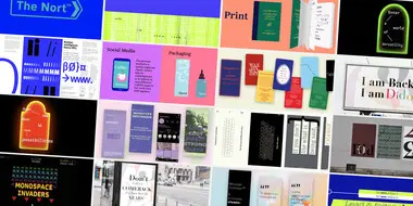
Over the past four years, we’ve been lucky to forge a reciprocal partnership with the Limerick School of Art & Design / TUS in Ireland. Both Creative Type Directors Tom Foley and Emilios Theofanous have now participated in workshops and modules at the leading fine art, design and creative media school. This year’s students were asked to write a message platform for one typeface and build a marketing plan and design assets to promote it in digital or print media.
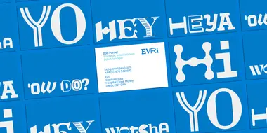
Rebranding a business is not for the faint of heart. It’s an enormous operation that requires significant time and investment while offering the possibility of totally revitalizing a brand.
Legibility is a crucial consideration when trying to choose a font for your project. Here’s how to find a legible font that will be easy on the eyes for your readers and customers.
Launching a website or app? Your font choice is key to your success. Here’s how to assess the legibility, consistency, performance, and longevity of your font choice.
Find design inspiration in an age of information overload.
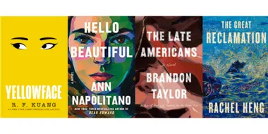
In this article, get a peek at recent and upcoming book releases in a variety of genres to get a sense of what typography styles are trending in publishing right now. This post is a guest piece from our friends at Reedsy, a website that connects authors with publishing professionals.
Today’s brands must keep up with a fast-paced digital world and navigate a “new normal” that’s still emerging from the worst of the pandemic. The last few years shifted everyone’s digital expectations, how brands operate, and in some cases, impacted their business models.
In episode seven we talked with Sarah Hyndman, founder of Type Tasting and the author of several books, including Why Fonts Matter and How to Draw Fonts and Influence People.
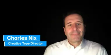
Get to know our Studio team with this introduction of our Creative Type Director, Charles Nix.
Charles Nix is a Creative Type Director, designer, typographer and educator. He designed a number of popular typefaces in the Monotype Library, including Walbaum and Hope Sans, which received a Certificate of Typographic Excellence in the 22nd Annual Type Directors Club Typeface Design Competition. He’s also designed custom typefaces for Google Noto, Progressive Insurance and the Philadelphia Museum of Art.
Learn more about Charles Nix and his work here.
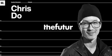
In episode six we talked with Chris Do, award-winning designer, CEO and Chief Strategist of Blind and the founder of The Futur—an online education platform that teaches creatives how to make a living doing what they love.
Phil Garnham, Creative Type Director at Monotype, speaks to Transform magazine about the importance of typeface in branding and the growing significance within the mobile platform. Phil discusses Monotype’s recent collaboration with creative agency Superunion for Arabic Bank ABC, which revealed an emerging typography design trend in mobile banking.
Creative Type Director, Phil Garnham, sits down with Creative Bloom to reflect on this year’s type trends and the role that type plays in influencing contemporary design - with a deep dive into the power of nostalgia.
Monotype’s Creative Type Director Phil Garnham, is joined by O₂ and their brand agency to discuss O₂’s new custom typeface, with an in-depth look at how this has propelled O2 to become a more digital and contemporary brand throughout different markets.
Tom Foley, Creative Type Director at Monotype talked with Recliner Designer’s very own, Lance Shields, about the world of type and Tom’s design heritage.
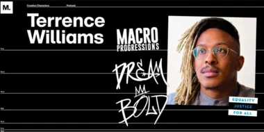
In episode five we talked with Terrence Williams, Senior Design Lead at Salesforce, who discusses the emergence of relationship design, and shares why it is important for people to bring their full identities into their work.
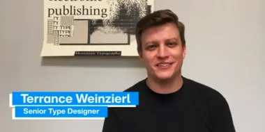
Get to know our Studio team with this introduction of our Creative Type Director, Terrance Weinzierl.
Terrance has been creating and modifying typefaces for the Monotype Library and a wide range of brands since 2008. In addition to working on custom projects for PBS, Microsoft, Google, Barnes & Noble, Domino’s and SAP, he’s designed type for video games, professional sports teams and auto manufacturers.

