Phil Garnham on the creative trends and surge of nostalgia.
Phil Garnham, Creative Type Director at Monotype.

Creative Type Director, Phil Garnham, sits down with Creative Bloom to reflect on this year’s type trends and the role that type plays in influencing contemporary design - with a deep dive into the power of nostalgia.
Broadly speaking, the foundry says that “what emerges is a sort of struggle playing out between our rapidly digitising lifestyle and an equally strong yearning for something tangible”. This is played out through boundary-pushing type on the one hand, which makes use of cutting-edge technology to align with and drive forward modern devices and platforms on the one hand. On the other, “a return to the familiar, comfortable letterforms of decades past,” as Monotype puts it, “driven by a desire for genuine connection in a world we increasingly experience through screens”.
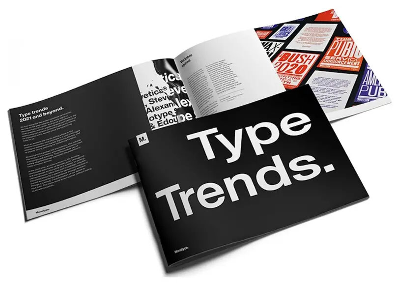
The trends report is divided into several key themes that Monotype has either seen to be on the rise when it comes to typography approaches and aesthetics or predicts will be on the rise this year and in the coming years. These themes include Variable Speed, Touchable Type, Virtual is Reality, Cultivating Contrast, and Hand Was Here. The latter relates to the trend for hand-drawn lettering and wood-blocked textures – “type that evokes the nostalgia of your lunchtime walk to the food market, the hand-painted street-food signs, and mom-and-pop storefronts, reminders of the human experience we so covet from our homes,” says Monotype. The foundry adds: “In a world gone fully digital, it’s no surprise that people would be searching for something warm, familiar, and human again.”
Clearly, a key component of that trend is nostalgia – the idea of humanity and comfort as told through letterforms. We spoke to Phil Garnham, senior creative type director at Monotype, about nostalgia in type: why it’s so popular right now, the brands capitalising on it, and what exactly a “retro” type family is.
There’s so much nostalgia hanging in the air. Why do you think that is?
It’s certainly an interesting time for creatives. Zoom has pushed the creative day into ever-more focussed windows of time for “doing” the “hands-on” creative, and there’s less social interaction within creative teams. Our home/work life also straddles this boundary of on/off, rest/work; comfort meets deadlines. Could this be driving a fall-back mentality? I don’t really know, but trends in brand typography feel a little circular right now.
We have such a rich typographic heritage, and that has always been a source for new interpretations of type, re-modeling and revamping. Still, there’s definitely a sense that brands are thinking of type in a more directly nostalgic form. This could also be a push back from the geometric “digital” type aesthetic that has dominated for nearly two decades.
Phil Garnham, Type Trends Report.
Can you give us some recent examples of campaigns or brand identities?
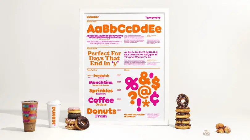
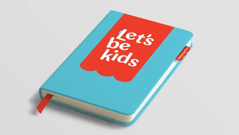
The standout example is obviously JKR’s Burger King rebrand, which has this “soft-serve” aesthetic, but many others are moving this way… Fisher-Price, Mailchimp, Dunkin, and Tentree also continue this trend towards 1920s soft serifs. In creative tech sectors with brands such as Twitch, Tweag, and Dreamhack, we see more 1980s 8-bit minimalism with “Blockheads” – this is type that harkens back to the days of ZX Sinclair and Atari. Brands are now beginning to exploit the creative and practical benefits of variable font technology. That is giving rise to type reminiscent of avant-garde wood typography, where a case of mixed-width type was slammed together and inked. Paula Scher’s work for the Public Theatre in New York in the ’90s revived this trend too.
What type are you seeing, again and again, that follows this theme?
Our recent type trends report really dug into what agencies are doing with type right now across all kinds of verticals and geographies. Before the report, we had a sense things were shifting, but really we didn’t know to what extent. Our report highlights that today, brands seek more distinction and authenticity in the tone of voice than ever before. In a locked-down world, brands have limited exposure to rectangular devices, and so many brands follow familiar patterns and themes.
Type in digital is reading, and fonts are a big part of conveying brand tone and creating this subliminal memorability. Brands know they have to brave to set themselves apart, and our trends report highlights just how much brands are looking to create a more distinctive typographic character and, in doing so, are imbuing this sense of nostalgia. And maybe this only feels nostalgic because of context. We’ve been cultivating our minds to accept geometric sans as “digital”: we’re not conditioned to read soft-serve 1920s serifs as “digital”. It feels out of place, but within there likely lies its impact.
Are you seeing a surge of nostalgic families on Monotype?
Type drives culture, and culture drives type. Last year we released FS Rosa as a new take on what we had foreseen as an emerging trend, and it’s certainly getting more popular. As a creative studio, we have certainly been working with brands pushing more in this way, reviving heritage as new. It’s an exciting time to be playing with type and challenging notions of what’s acceptable with some big-name brands. We also want to create the typefaces that designers are asking for, the fonts that brands need to deliver on all fronts, so I would expect more creative work in this area over the next year or two.
How do you think consumers and users will feel about this design trend?
The idea of pure nostalgia isn’t really a trend that drives for change, but it is a vehicle for empathy in a world that seeks familiarity and comfort during difficult times. As we optimistically prepare to pivot, to re-open out of lockdown, this sense of familiarity will help stabilise, reassure and provide a grounding for trust as we move forward. I think most of us enjoy retro themes too, so there’s a lightness and levity to this new approach in design, and that’s what the world needs right now.
What defines a retro type family?
I guess it’s a classic face, one of a bygone era, wrapped up with all the connotations of a cultural aesthetic. The familiar letters that pull you in on an emotional level, and say “remember that time?” As the trend grows, I’m really curious about how we can redefine those faces now, either through modernising the letters themselves or how we are using them.