Type resources for designers and brand owners
There comes a time in every organization’s life when a makeover becomes essential.
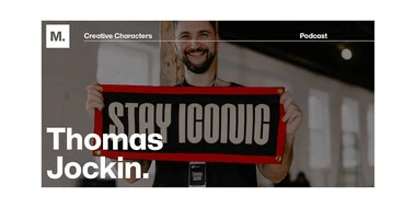
This week on Creative Characters, host Charles Nix sits down with Thomas Jockin, the founder of Type Thursday, a global type meetup. Tune in for an interesting look at the intersection of type design, education, and community-building.
Host Doug Wilson sits down with his long-time friend, Kyle Read, a distinguished type designer and graphic designer based in Denver, Colorado. Kyle shares his journey from studying at the Savannah College of Art and Design, working for various design studios and advertising agencies, to founding Badson Type Foundry. Tune in to hear Kyle’s story.
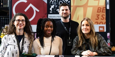
From June 4th to 7th, 2024, the creative industry gathered in the port of Hamburg for the ADC Festival 2024. A who’s who of German and global design, and an event we certainly weren’t going to miss! We had the pleasure not only of attending, but also speaking and hosting partnered activations with Merchery. Here’s the low-down on what we got up to at the festival:
It’s well-known that font related issues can have a dramatic impact on your creative workflows, creative output as well as your admin teams. Lesser known, but just as important, is the impact fonts can have on your internal IT, as well as the digital experience you’re offering as a brand.
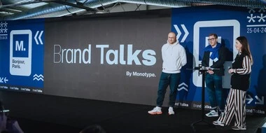
We recently had the pleasure of hosting Brand Talks in Paris. It was our second time ever hosting in the French capital and was a great success! Surrounded by stunning views of the Parisian skyline, the Eiffel tower looking over from afar, we sat down for a captivating afternoon, listening to some of the industry’s finest. Renaud Cambuzat from lingerie brand Chantelle kicked things off with a presentation about restructuring in an evolving market. Then, Reza Bassiri, from design agency Carré Noir, accompanied by Isabelle Duvernay (from CCF bank), presented two case studies: the rebirth of French banking landmark CCF, and the recent rebrand of the Kronenbourg brewery. Alexandre Delassus and Pascal d’Amico followed up with a candid presentation of sporting mega-brand Decathlon’s rebrand. Our very own Damien Collot and Laurène Girbal closed off the event with a poetic nod to what makes typography so fascinating and intriguing.
With great digital presence comes the great responsibility of protecting your digital assets. Fonts stand bravely at the frontlines of your organization’s brand, valiantly broadcasting its values at every touchpoint. Therein lies the question - how does a brand protect its fonts so the fonts can speak for the brand?
Design choices might seem superficial — but clear, engaging brand systems deliver significant impact for small businesses. A strong visual identity can give you an advantage by telling a clear story about your products or services and convincing customers to convert. Ultimately, effective design delivered consistently across key touchpoints can help you:
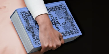
What is the difference between a typeface, a font, a font file, a font license, and a EULA? Does a font license cover one or multiple fonts? What informs a font license strategy? What’s the easiest way to resolve a font license gap—before or after it arises? From fundamental principles to pre-purchase considerations, this guide aims to help you confidently speak the language of fonts.
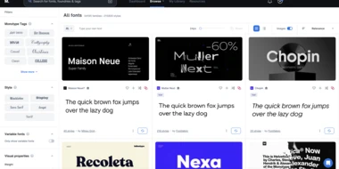
Let’s look at some common font issues you might have already come across, and how Monotype Fonts can help you resolve them.
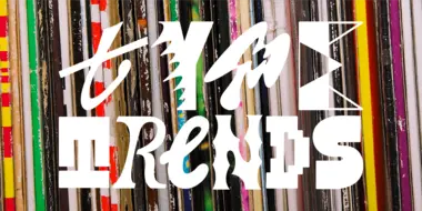
What is type saying to us in 2024? This year’s Type Trends report is a celebratory look at the universality of type – a collection of groundbreaking designs that reflects our changing world.
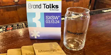
This year, Monotype brought our Creative Characters podcast to SXSW for our first-ever live recording on stage. Read on for highlights from the unique event.
The time has come, our popular Type Trends report is back, and it’s bigger and better than ever. Over the last year, we here at Monotype have been scouring the world for inspiring design work and compiling examples of typography that reflect these changing times. Will 2024 be a year of chaotic maximalism, stylish serifs, or quirky hand-lettering? You’ll have to dig in to find out.
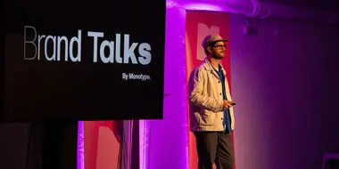
Brand Talks recently touched down in London at the Vinyl Factory. Read on for some of our favorite highlights from the inspirational evening.
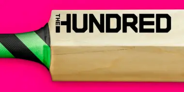
The England and Wales Cricket Board (ECB) have reimagined Cricket with the introduction of a new competition; ‘The Hundred’. Monotype collaborated with FutureBrand London to create a bold and confident typographic identity aimed at shifting perceptions to attract a wider audience to the game.
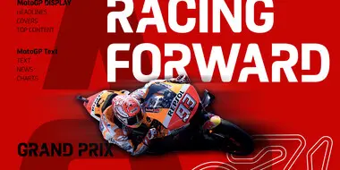
MotoGP™ is the top division of the FIM Road Racing World Championship Grand Prix. It’s the oldest motorsports championship (racing since 1949) and visits a total of 16 countries across four continents every season.
Typeface Collection: fonts & feelings.
