


Type resources for designers and brand owners
Tag: Brand fonts
137 articles
This year, Monotype brought our Creative Characters podcast to SXSW for our first-ever live recording on stage. Read on for highlights from the unique event.

The time has come, our popular Type Trends report is back, and it’s bigger and better than ever. Over the last year, we here at Monotype have been scouring the world for inspiring design work and compiling examples of typography that reflect these changing times. Will 2024 be a year of chaotic maximalism, stylish serifs, or quirky hand-lettering? You’ll have to dig in to find out.

Brand Talks recently touched down in London at the Vinyl Factory. Read on for some of our favorite highlights from the inspirational evening.
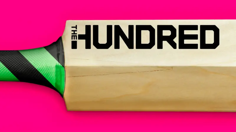
The England and Wales Cricket Board (ECB) have reimagined Cricket with the introduction of a new competition; ‘The Hundred’. Monotype collaborated with FutureBrand London to create a bold and confident typographic identity aimed at shifting perceptions to attract a wider audience to the game.
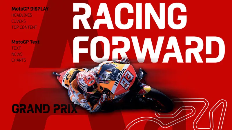
MotoGP™ is the top division of the FIM Road Racing World Championship Grand Prix. It’s the oldest motorsports championship (racing since 1949) and visits a total of 16 countries across four continents every season.

Typeface Collection: fonts & feelings.

There is nothing as exhilarating as spending three jam-packed days surrounded by friends old and new, learning with each other and from one another at Adobe MAX. Read on for our thoughts after the event.

We recently had the fortune of hosting our first-ever Brand Talks in Chicago. Read on as we recap some of the highlights from this wonderful event.

In early autumn of 2022, EDIT invited Monotype to partner on one of London’s most anticipated rebrands, the refurbished National Portrait Gallery which is home to some of the world’s most iconic and progressive portraits. Read on for the full customer story.
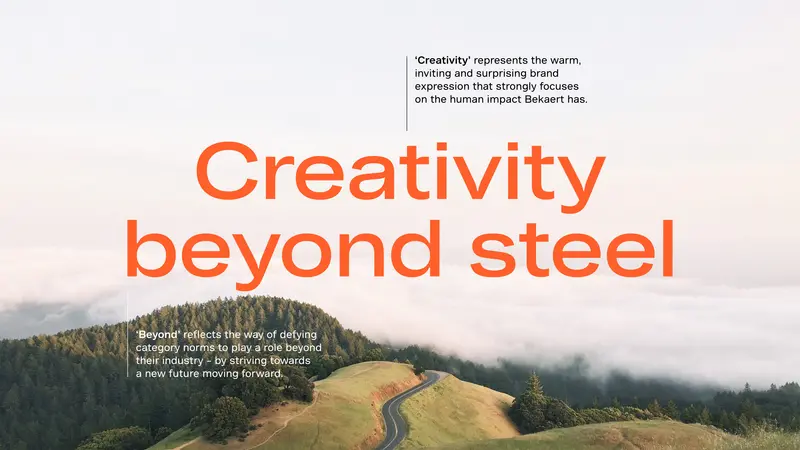
Utility, authority, and a hint of steel for Bekaert.

Last week, Monotype descended on San Francisco for our first in-person Brand Talks event in the golden city since 2019, read on for our thoughts following the event.

As a disclaimer: There are no big secrets here, no giant revelations from my 20 years of design and type experience, but it may be helpful to see how someone else goes about the process of narrowing down their font options. Once you start giving focused thought and deliberate time to choosing fonts, your choices will get better.

Text rendering is an important component in the design of modern graphical user interfaces (GUIs) and digital media. With the increasing demand for high-quality graphics, animation and real-time rendering, the use of Graphics Processing Units (GPUs) for text rendering has become a popular solution.

Monotype and Picsart have built a partnership that’s fueling creativity for Picsart’s 250 million monthly global users. Picsart, the world’s largest digital creation platform, allows creators of all levels to design, edit, draw, and share photo and video content.
When it comes to trends, timing is everything.

Paid fonts are superior to free fonts in a variety of ways (and no, we're not just saying that because we sell fonts). Learn what separates a premium font from a free font from experts at Monotype.
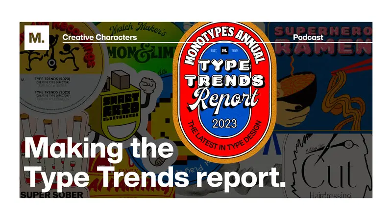
This week, we take you behind the scenes of one of Monotype’s biggest, and most anticipated campaigns of the year: the annual Type Trends report. Tune in to hear from the report’s curators, Creative Type Directors Terrance Weinzierl and Emilios Theofanous on their experiences producing the report.

Monotype designed a pair of custom typefaces for global market leader in steel wire transformation and coating technologies, Bekaert, creating a bold, modernist design that speaks to the company’s extensive history and industrial heritage. The typefaces are an integral part of a company-wide rebrand, led by Interbrand and designed to support Bekaert’s ambition to be the leading partner in shaping the way we live and move: safe, smart, sustainable.