Studio
Tag: Studio
18 articles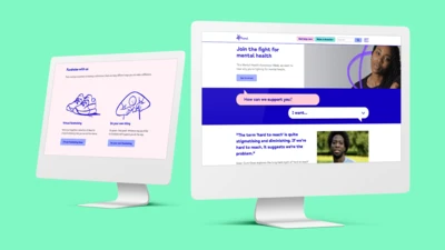
After years of raising awareness and understanding around mental health, the time had come for charity Mind to update its iconic visual identity. Monotype Studio developed Mind Meridian – a modified typeface that puts warmth and accessibility at the heart of the brand.

Creative Type Director, Tom Foley, sat down Antalis Creative Power to discuss the 2021 Type Trends report, the state of Sans Serif, and consider what makes a font timeless in his latest interview.
First published on Antalis Creative Power
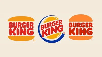
Phil Garnham, Senior Creative Type Director at Monotype Studio explores the evolution of type in digital and celebrates the heritage at the heart of the Burger King rebrand.
First published on BITE
Monotype’s Futura Now family is a revival and expansion of the famous typeface we all know so well. But do we know it, really?
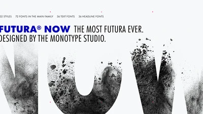
In light of breathing new life into typographic icons, the Monotype Studio would like to invite you to learn first-hand about a definitive version of a beloved font family that will offer designers a chance to see a classic with fresh eyes.
The contemporary version of this versatile family organizes and makes cohesive 90 years of one of the most popular typefaces of all times. It’s more true to the original than any digital version you’ve ever worked with, and brings to life 37 new styles, including a variable version.

It’s difficult to imagine the 20th century without Futura. Released by the Bauer Type Foundry in 1927, Paul Renner’s Futura was a near-instant hit that quickly established itself as an iconic, immovable piece of our shared culture.
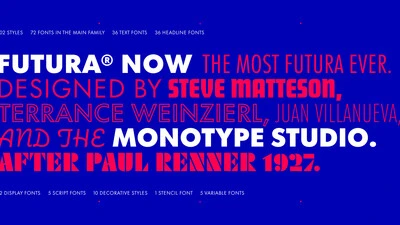
Futura Now is the definitive version of the definitive geometric sans, re-digitized based on Paul Renner’s original designs and updated to provide a more contemporary typographic palette.
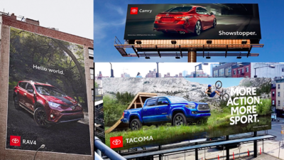
Learn how Toyota Type was developed as part of the iconic automaker’s new brand identity.

In part two of their Brand Talks presentation, Juan Erquicia, Group Brand Manager at Santander, and Lucas Machado, Associate Design Director at Interbrand, discuss Santander’s custom typeface and other brand elements as part of the recent rebrand.
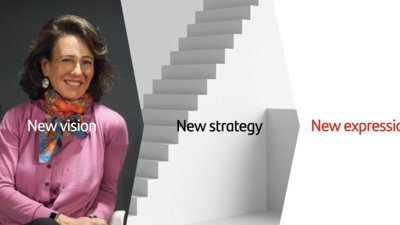
Juan Erquicia, Group Brand Manager at Santander, and Lucas Machado, Associate Design Director at Interbrand, discuss the creation of Santander’s new logo as part of the recent rebrand.
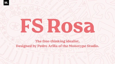
Serif typefaces are sometimes seen as serious and overtly intellectual, a more somber sister to their laid-back counterpart, the sans serif. But FS Rosa breaks away from these conventions by combining the classic elegance of a serif with warmth and frivolity, created by its round letterforms and curves.

When it comes to your brand, your customers aren’t just evaluating your logo or your colors or the typography, they’re evaluating how your brand makes them feel. More than anything, brands are built on feelings—all the thought you put into design and the experience is simply in service of creating a feeling.
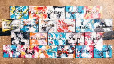
FS Renaissance is a handcrafted display font where each letter stands alone as a piece of art. Craig and Pedro recently shared their perspective on the concepts and creative process behind FS Renaissance.
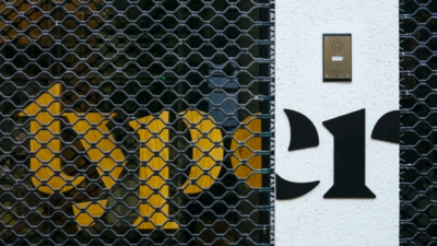
Tom Rickner delivers a presentation on the now and tomorrow of variable fonts.
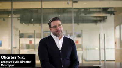
Get to a glimpse inside the Monotype Studio—the people, the process, and the problems they can solve for brands.
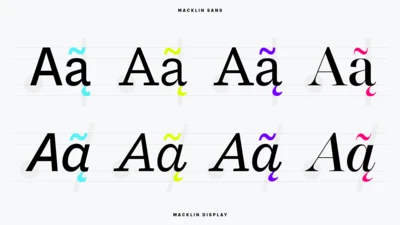
Font superfamilies are vast collections of type that can meet a multitude of needs without compromising on consistency. But what defines a superfamily, exactly?
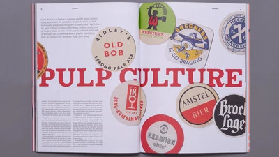
TypeNotes is a love letter to letterforms, a journal dedicated to typography and graphic design.
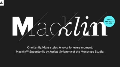
Malou Verlomme’s Macklin superfamily is a gently irreverent take on the display type of the late 19th century, with an elegant twist that updates these letterforms for modern use. Choose one style, or use the entire variable family as a type toolbox.


