A new typeface brings digital clarity to Mind’s mental health mission.
Phil Garnham, Creative Type Director.
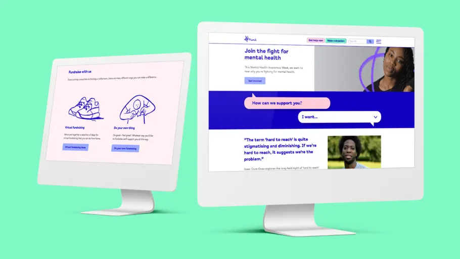
After years of campaigning to improve awareness and understanding around mental health, the time had come for charity Mind to update its iconic visual identity. The ‘squiggle’ logo is widely recognised in England and Wales, but social media and other digital spaces were creating new demands on the organisation. In partnership with agency DesignStudio, Monotype Studio developed Mind Meridian – a modified typeface which puts warmth and accessibility at the heart of the brand.
The brief.
“Mind wanted a partner to improve its brand, its story and its visual output, and communicate that to the rest of the world,” says DesignStudio Creative Director Vinay Mistry, who worked on the brand update. “With lots of research around the charity’s work, and insight into people’s lived experience – both employees and volunteers – we started to understand some of the stress points where elements weren’t working as hard as the rest.”
The organisation, which is the largest mental health charity in the UK, was previously using several different fonts – acquired over a number of years and in varying styles – which were now facing new accessibility demands. Making the brand more accessible to the diverse audience Mind serves was a huge part of the brief for the new typeface and design system, which also needed to be easy for volunteers and local Mind organisations to work with, regardless of whether they had design experience or not.
As with many other brands, much of Mind’s interaction now takes place online, making the digital realm absolutely essential for reaching the organisation’s audience. A key focus was updating Mind’s typographic palette to communicate clearly across these platforms, so the organisation could speak effortlessly through type. It also needed to build on the brand equity of Mind’s squiggle logo, which has always been a much-loved part of the brand.
Vinay Mistry, Creative Director, DesignStudio.
It was essential for the new typeface to embody the warmth and gravitas that Mind is known for. The organisation was built to reach out to and connect with people, with its mission taking on a new significance in the face of mental health challenges heightened by the pandemic. The brand refresh had to express the same level of humanity, and as Mistry says: “People need to know they can trust this organisation instantly, and that was a key part of the typeface brief.”
The solution.
DesignStudio had already developed a new palette of colours that would represent the “fighting spirit” of Mind; adaptable enough to be softer in tone where needed, and more vibrant when a punchier tone of voice was required. This reflected the broad spectrum of Mind’s mission – which includes providing support as well as holding the government and policy makers to account.
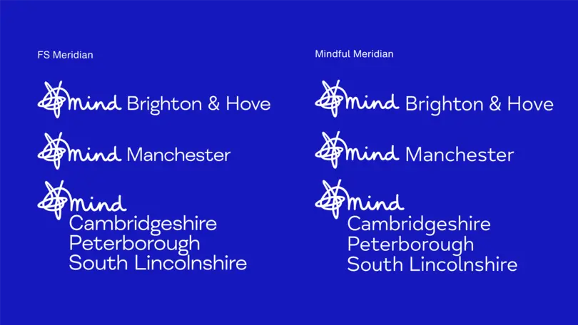
The organisation’s new typeface was designed to harmonise with this refreshed branding, retaining the vitality of the Mind squiggle while answering the functional needs of the organisation – in particular the accessibility requirements. Mind Meridian is legible for those with visual impairments, and has been tailored to sit comfortably alongside the local, handwritten executions of the organisation’s logo.
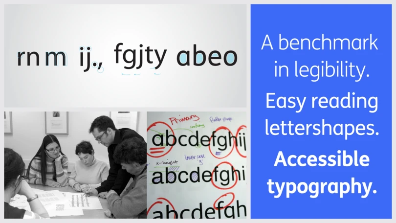
“Accessibility in type isn’t entirely down to the typeface design or the letterform shape,” explains Monotype type director Phil Garnham. “It’s also very much about the application, the colour, the contrast, and the actual typography. So working together, we established a clear set of rules around that.”
“One thing we learned from Monotype was that left-aligning type, or certain kerning or leading, can really improve things to be more legible and readable,” adds Mistry. “That knowledge, on top of the actual forms and characters of the font, were a huge help.”
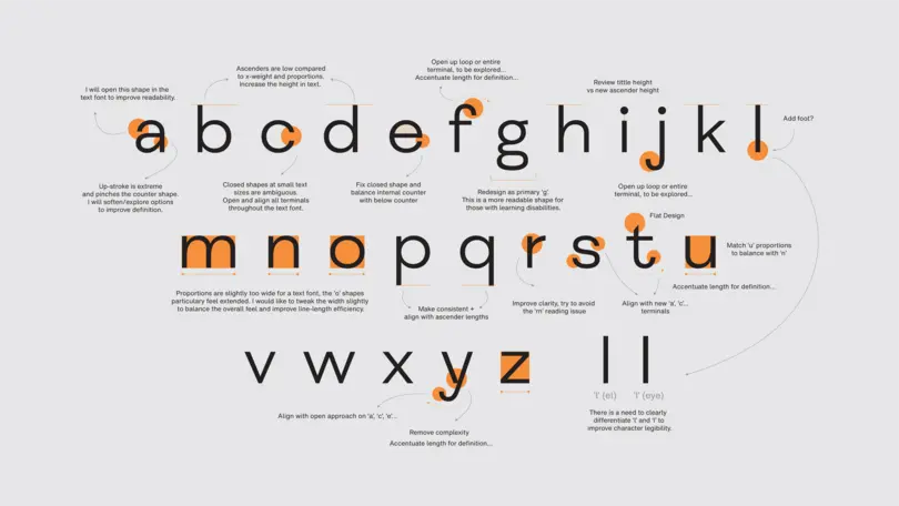
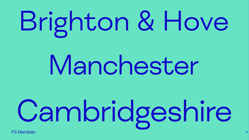
FS Meridian was the starting point for the design. Together with DesignStudio, the Studio team analysed its letter shapes and spacing, creating subtle changes such as narrowing proportions, opening character spacing, increasing ascenders and accentuating terminals — all to improve the “breathability” and readability of the typeface. These updates drew on extensive accessibility research already carried out by Monotype for brands including ING, RNIB and Mencap.
Phil Garnham, Creative Type Director.
A set of hand-drawn punctuation, created by the DesignStudio team, echoes the Mind logo, embedding the warmth and personality of the organisation in the heart of the design. “We didn’t think that symbol was being leveraged enough,” explains Mistry. “So we incorporated these illustrations as squiggly punctuation that provides that emphasis, and that human touch and personal nature that Mind prides itself on. It’s a good juxtaposition with the rest of the font, which is very clean.”
The result.
Mind Meridian comes in a Regular and Bold weight, as part of a broader brand toolkit that’s designed to be used by anyone – meaning less room for error when used by non-designers from Mind’s community. “Our system is extremely rigid, very structured, and has a clear hierarchy - from headlines to images and body copy,” says Mistry.
As well as the core Bold weight – which includes the alternative symbols and squiggle punctuation – there’s a second, more accessible version for users that aren’t so familiar with type. It allows them to easily use these symbols without having to rely on OpenType menus or design applications they may not be familiar with.
“We’re aware that creatives could also potentially be using it,” adds Garnham. “Mind has lots of partnerships, so we’ve ensured there’s ultimate flexibility for design teams to do something really exciting with the typeface for a campaign, or for broadcast.”
Aside from increased accessibility, Mind Meridian reflects a growing need for brands and organisations to adopt a more human approach to design. “Lots of companies have started to understand that they need to communicate in the most honest, authentic way possible,” explains Garnham. “It’s not about selling a product or service, it’s about being real. And in the past year we’ve definitely seen that trend.
Mind Meridian embraces where Mind is today, and allows the brand to flex its tone for the future, so the organisation can continue to fight for mental health without losing any of its much loved and trusted brand equity from the past.


