Introducing Futura Now: The definitive version of an iconic family.
Futura Now is the definitive version of the definitive geometric sans, re-digitized based on Paul Renner’s original designs and updated to provide a more contemporary typographic palette.
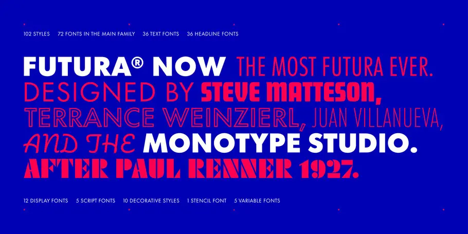
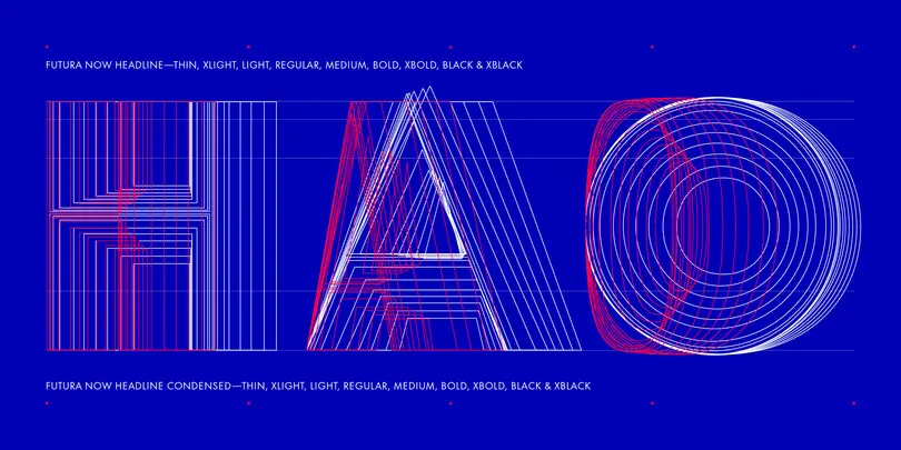
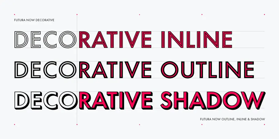
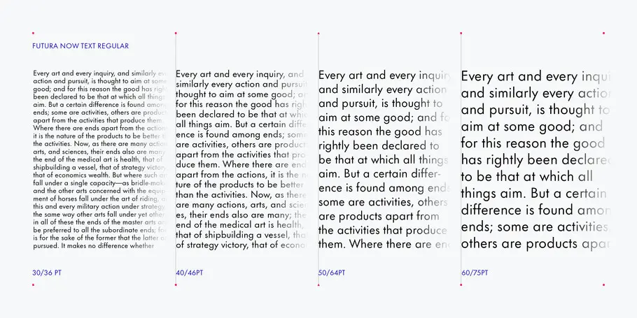
This release comprises 102 styles—including Condensed, Headline and Text weights—as well as wider language support than has ever been available. Futura Now also offers revivals of the lesser-known Display and Script fonts that bear the Futura name.
Futura has enjoyed steady popularity in the 90 years since it was first released. It has been used extensively in fashion magazines, iconic record albums and films, instrument panels, and even on a plaque placed by astronauts on the moon in 1969. Generations of fledgling graphic designers have learned how to use type by working with Futura. Its timeless warmth, austerity, and clever combination of geometric and classical proportions remain as relevant as ever to today’s brands. It’s no exaggeration to say Futura is the definitive geometric sans—an absolute icon in the world of type.
However, time and rapid changes in typesetting technology haven’t always been kind to Futura. Numerous updates to digital versions of the typeface weren’t necessarily faithful to the original—the way photocopies of photocopies gradually lose quality. As a result, many designers who assumed they were working with Futura may actually have been using a much looser approximation of the design than they realized.
This was one of the issues Steve Matteson, Creative Type Director at Monotype, says he wanted to fix. Futura Now collects, organizes, and recasts the entire history of the Futura family, from Paul Renner’s initial drawings to the metal foundry type released by Bauer and the beautiful specimen pages produced when Futura was released. It’s the result of careful study, planning, and crafting, but it moves well beyond historical revival.
“The challenge comes from seeing how timeless designs can benefit from contemporary refinement,” Matteson says. “We’re enhancing the attributes of the original while extending its capabilities for today.”
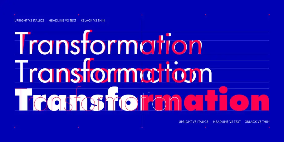
Futura Now is what Futura needs to be in today’s demanding typographic world. It addresses the inconsistent spacing that plagued previous digital versions, and overhauls the typeface’s range of weights and nomenclature—meaning the Ultra Bold is as inky, and the Thin as delicate, as you’d expect from their names. Futura Now also re-introduces true italics, rather than the slanted romans, or obliques, found in other versions. (Obliques are created by literally slanting the original upright design, which causes shapes to become distorted. Futura Now italics are true to the original and preserve the geometric rhythm of the design.)
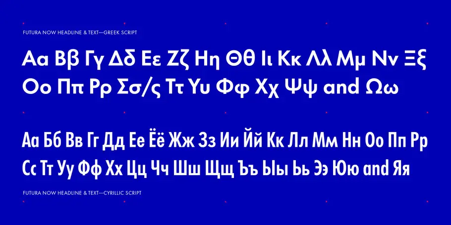
The release features a contemporary palette of weights (including variable font files for infinite interpolations in weight and width) and language support for a broader readership, including Greek and Cyrillic scripts.
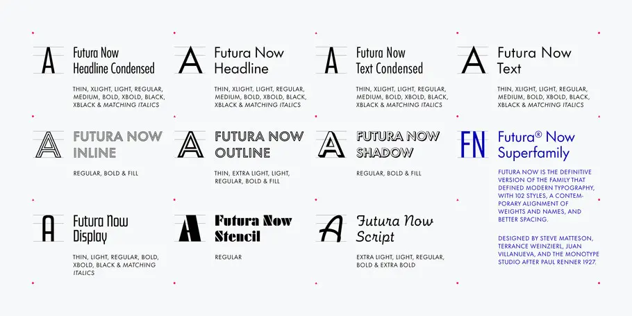
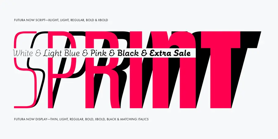
Futura Now also reintroduces lesser-known cousins of Renner’s original design. Futura Now Display is a rectangular-geometric meant for impactful contrast to the main Futura family, while Futura Now Script, originally drawn by Edwin Shaar, is a monolinear interpretation of handwriting intended to provide a soft contrast to Futura’s austere geometry.
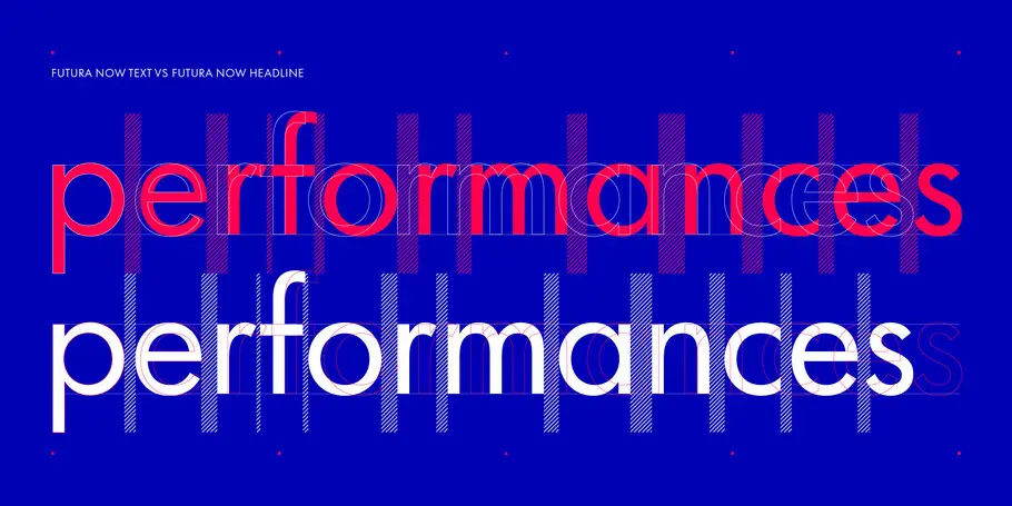
Referencing the Bauer Type Foundry specimens, Monotype’s designers examined character shapes, proportion, and spacing closely, picking up the details lost through years of digital decline. Modern geometric designs such as Avant Garde increased the size of the lowercase in relation to the capitals, thereby losing the elegance of Futura’s proportions. Phototypesetting versions of Futura tended to squeeze letterforms together for display sizes, rendering the body text sizes practically unreadable.
For Matteson, who led the Futura Now design team, it’s a chance for many designers to reassess the real typeface rather than the thirty year old digitization they might have previously worked with. More than that, he believes it brings some much-needed humanity into the world of geometric sans serifs.
“It has an element of warmth to it that looks good in organic settings,” he explains. “You can set Futura next to a leafy tree or a stainless steel table. It looks at home in both places because it skillfully navigates the border between super-clean geometry and humanist warmth. Many contemporary geometrics look like they’ve been drawn with a compass and ruler without regard for optical and ergonomic refinement.”
Matteson adds “It’s important to think about the human elements in type and communication – especially in the times we’re in now.”
Purchase options for Futura Now
Buy the full family or individual weights at MyFonts.
Want to try Futura Now for yourself? You can download Futura Now Script Regular and Futura Now Headline Bold for free.
Subscribe to Monotype Fonts to experiment with Futura Now and thousands of other fonts.


