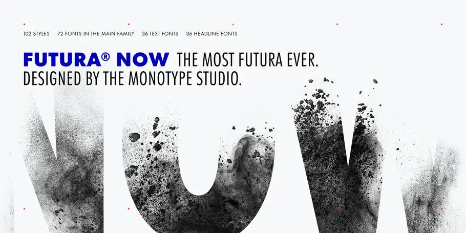
The next century of Futura.
Juan Villanueva, Type Designer.
It’s difficult to imagine the 20th century without Futura. Released by the Bauer Type Foundry in 1927, Paul Renner’s Futura was a near-instant hit that quickly established itself as an iconic, immovable piece of our shared culture.
Futura is timeless in the purest sense, a true typographic chameleon that is “equally at home next to a redwood tree as it is next to a steel table,” as Monotype Creative Type Director Steve Matteson puts it.
But the 20th century has come and gone. The print-dominated era in which Futura flourished has given way to decades of digital advancement for which it is ill-equipped. Ironically, Futura itself—adaptable, austere, and saturated with nostalgia—is as popular and indispensable as ever, in many ways the perfect aesthetic counterbalance to our tech-obsessed culture.
So, what would a 21st century Futura look like? It would be optimized for screen reading on brilliant, high-res OLED screens and tiny smartwatch displays alike. It would offer carefully-drawn weights for every purpose along with renewed attention to spacing. It would include a variable font for maximum flexibility and the ability to fine-tune designs. And it would encompass the full breadth of Futura’s history in a single release, including quirky offshoots like the Script and Display styles.
It would look like Futura Now.
No assembly required.
“The bottom line with Futura Now is that it’s easy to use, right out of the box,” says Terrance Weinzierl, who was part of the Futura Now team. That may not sound like a big deal, but previous versions of Futura could be a “bumpy ride,” as Weinzierl puts it. Inconsistent spacing, a limited range of weights, distorted obliques, and scattered language support all limit Futura’s ability to meet the needs of modern, digital brands. “Look closely at our Linotype cut of Futura, for example, and you’ll see it’s kind of quirky,” says Wienzierl. “You have to use it carefully.”
Terrance Weinzierl, Senior Type Designer.
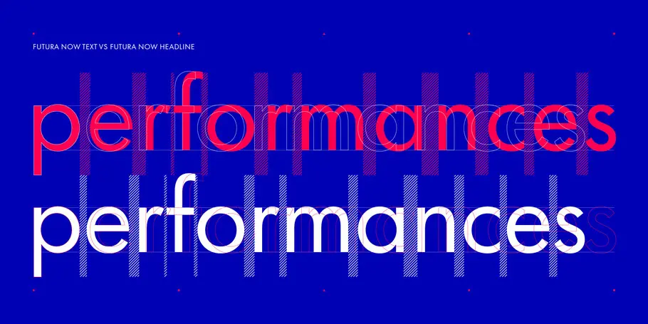
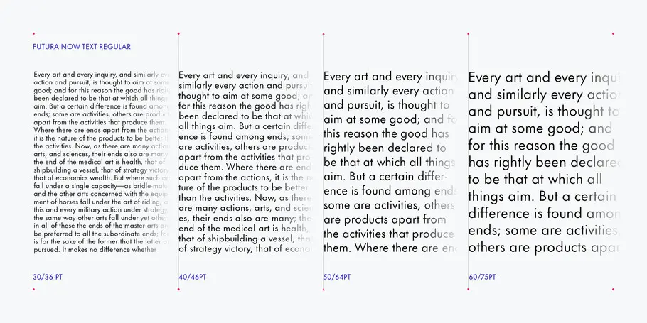
The key to Futura Now’s ease of use is the typeface’s optical sizes: Futura Now Text and Futura Now Headline. While in some cases optical sizes are created by redrawing letterforms to optimize legibility at certain point sizes and viewing distances, the optical sizing in Futura Now is focused solely on the aforementioned spacing issues.
As the name implies, Futura Now Text is generously spaced for extended reading. Futura’s classic letterforms have a little extra room to breathe on the page and, especially, on the screen. This is particularly noticeable in the thinner weights, where more white space allows those hairline strokes to stand out. Futura Now Headline tightens the spacing just a little, both to save room in limited text settings and deliver the visual punch that has made Futura a favorite of advertisers and artists alike.
“The spacing is such an important part of the design,” says Monotype Type Designer Juan Villanueva, who also worked on Futura Now. “Just adding a little extra spacing can result in a far more legible typeface at different sizes.”
While these adjustments are impactful in print, they really make their mark in digital design. “Screen quality is catching up to paper,” Weinzierl says. “In 1995, the screens were so rough that you couldn’t see optical sizes if you had them. Now we have 400-dpi screens on our wrists. We have so many more pixels to work with.” Optical sizing takes full advantage of those pixels, delivering pristine legibility in virtually any digital setting.
Juan Villanueva, Monotype Type Designer.
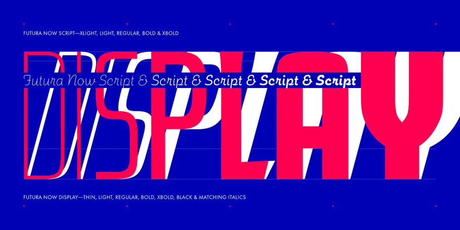
Futura Now also includes the first-ever variable font versions of Futura, available in the Text and Headline (which are combined), Display, and Script sub-families. Variable fonts are sometimes developed separately or as accompaniments to existing fonts, but Futura Now was “born as a variable,” according to Weinzierl, who says the variable fonts were built from the beginning to match the static versions exactly.
Each variable font offers a seemingly endless number of possibilities, but the Studio also built in what Wienzierl and Villanueva call “bookmarks” that snap to the static weights like a preset on the radio. This means designers can fine-tune Futura Now to infinitesimal degrees, but quickly and easily find the way back to whatever weight their brand guidelines require by selecting style names in the font menu as you usually would.
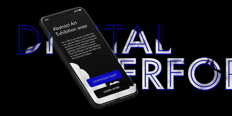
As brands embrace an increasingly digital future, tools like optical sizing and variable fonts will help deliver a uniform experience to customers, whether they’re on a phone, tablet, laptop, or watch. “Scalability is not just about size of the type, but also the viewing distance,” Weinzierl points out. “The viewing distance for a phone is maybe six inches, but then it could be two feet for a desktop. You need fonts that can adapt to each without sacrificing brand consistency.”
Family wrangling.
Futura has been through a lot of changes over the years, including additions like the Script, Display, and Stencil (historically named Black). Rarely has a single release gathered up all these distant cousins, but Futura Now does just that. If the optical sizing and variable fonts make Futura Now easier to use, the expanded range of weights and styles makes it more versatile and fun.
“At a high level, this project was about wrangling a family together,” says Villanueva. “We really had to decide what Futura is today, and how it can be used.”
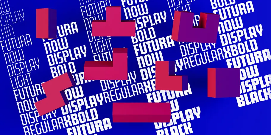
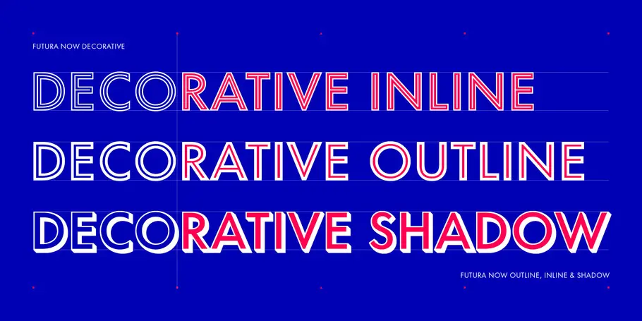
In addition to collecting all those existing variants, Futura Now adds a whole lot of newness, too: There are six new Headline weights and six new Text weights. Futura Now Script has four new weights and has been completely redrawn. Futura Display, a stylized condensed display variant, has five new weights, and six new Futura Display italic fonts. The italics have been completely redrawn, leaving behind the warped, slanted obliques of previous Futuras and replacing them with carefully crafted true italics. There are also ten new decorative variants, including outlines, inlines, shadows, and fill for multi-color layering. That’s a massive toolbox for designers and brands to play with, and expands the range of what Futura can do.
Both the Text and Headline subfamilies have the same range of weights, character sets (including full Greek and Cyrillic alphabets covering at least 89 languages in total), and the same naming conventions. This has not always been the case, especially for designers patching together multiple iterations of Futura. “The different versions of Futura were made piecemeal over time, so there are a lot of differences between them,” says Weinzierl. With Futura Now, “You don’t have to worry about choosing the Thin Regular width only to find there isn’t a matching Condensed font, or discover that the character set is different.”
This makes Futura Now easier for designers to use and more practical for brands as well. Futura is hugely popular with companies of all sizes, but its patchwork history has made it difficult to deploy across a global brand ecosystem, which can have dozens or even hundreds of digital and print touchpoints. Futura Now is built for brand consistency, and versatile enough to stretch and shift as brands evolve, expand to new markets, and add digital channels.
“What we’ve done is look at the full Futura universe, cleaned it up, and put it in order in a way that people using type today will understand,” says Villanueva. “We asked ourselves, what does this family need to be, today? What would be the best version of Futura for the next fifty or hundred years? And that’s what we set out to create.”


