


Tag: Typography
154 articles
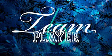
Good Type part 6: Good type is a team player.
Pairing typefaces is one of the more challenging tasks a typographer faces. This installment of Good Type examines the different ways designers can pair fonts.
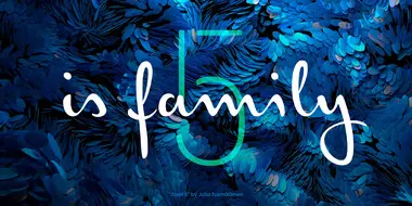
Good Type part 5: Good type is family.
A good typographic system is like a family—and just like people, it comes in all shapes and sizes, allowing it to address a range of design requirements.
Typography Dilemma: Choosing Custom, Modified, or Library Type.
Choosing the right typeface can be a daunting task for any brand. We explored this topic in greater detail during a panel discussion at this year’s Adobe MAX.
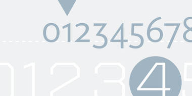
OpenType walkthrough: How to use figure styles in Illustrator.
When designing with type, the use of numbers can take a layout from good to great. Here’s how to use them to the best of their ability.
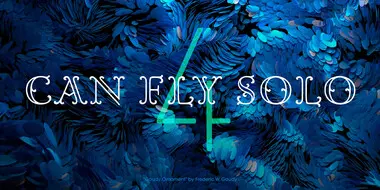
Good Type part 4: Good type can fly solo.
When it comes to the display fonts, there’s more freedom to experiment and play. Not just with the type itself, but with people’s expectations.
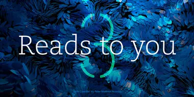
Good Type, part 3: Good type reads to you.
Conveying a clear message means using a typeface that’s effortless to read. This installment of the Good Type series examines which factors affect readability.
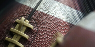
The Monotype Studio talks football
The National Football League has a long history of memorable logo design. We asked the Monotype Studio team to share their favorites, both contemporary and from childhood.
Monotype adds Reiwa combined kanji glyph to Tazugane typefaces.
Monotype unveiled a new glyph design for its popular Tazugane Gothic and Tazugane Info typefaces that commemorates the new emperor of Japan.

Behind the font: The challenges of going it alone.
Typeface design is a mysterious business. While most people are acquainted with the dropdown menu in Word or a website like MyFonts, not everyone realizes there’s a host of independent designers and foundries all quietly making their contribution to visual culture.

Announcing the 2019 Type Champions!
Monotype is thrilled to introduce the inaugural recipients of the Type Champions Award, a new program that recognizes brands for their creative, innovative, and memorable use of typography in developing and maintaining their brand identities.

D&AD New Blood 2017 shortlist: Our pick of the pencils.
We are proud to showcase the 2017 D&AD New Blood pencil winners, along with commentary from judges, Nadine Chahine and Malou Verlomme.

Meet Placard Next.
Placard Next is a reimagined version of a 1930s poster design, that takes all the original quirky details and refines them for digital use. Its condensed versions pack an instant typographic punch when used at large sizes, introducing some unusual flavor to posters, headlines and anywhere else designers need to make a statement.

Neue Helvetica comes into its own for TED.
With their first site redesign in seven years, TED turned to Neue Helvetica as the perfect typeface for conveying ideas worth spreading.
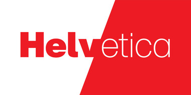
Right place, right time: The complicated legacy of Helvetica, one of the world’s most iconic typefaces.
You can love it or hate it, use it for nearly anything or refuse to use it at all. But however you feel about Helvetica, no one can deny its place in society.

The past, present and future of machine translation.
Julia Errens traces the course of machine-augmented translation, from Turing to Google Translate.

Creating the typeface for SAP Fiori.
Monotype’s Terrance Weinzierl helped software company SAP to develop a typeface for SAP Fiori, for which SAP won a Red Dot Award in 2015. It was important that the design of the typeface works well in text-based UI environments without compromising on personality. The new typeface, called 72, has won a 2017 Red Dot Award.

A digital-ready Chinese sans-serif is born.
Many Chinese typefaces have a reputation for looking dated and not reading easily on small screens— not M Ying Hei. It checks all the boxes that it’s forefathers can’t.

Tazugane Gothic.
The first Japanese typeface from Monotype is a humanist sans serif, designed to work in partnership with Neue Frutiger. Tazugane Gothic sets out to introduce a new typographic standard, allowing designers to comfortably set Latin and Japanese characters alongside one another while maintaining visual harmony.