OpenType walkthrough: How to use figure styles in Illustrator.
When designing with type, the use of numbers can take a layout from good to great. I’ll detail the four main styles below, what they look like, and how to use them to the best of their ability. I’ll also add a few tidbits of related information as we go.
When typographers talk about the characters that make up numbers, we call them figures. Numbers, after all, can be anything—10, 200, 0.0125, whatever. So: 10 is a number, but 1 and 0, individually, are figures.
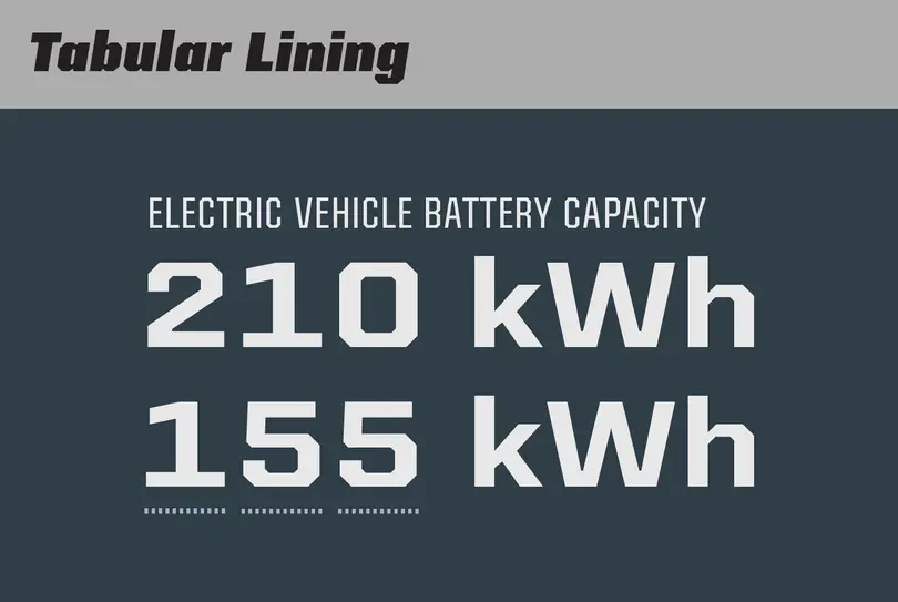
1. Tabular lining, best for tables & columns
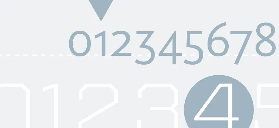
The most common figures found in fonts are tabular lining figures. “Tabular” means the figures are designed for tables, so the figures all have the same advance width. “Lining” means the figures align horizontally with each other, usually around the height of the capitals. Real life examples include an Excel spreadsheet or a receipt.
When the figures are aligned, the table is easier to read and scan for information. Making something easy to read is one of the typographer’s main goals.
Some typefaces have figures that are a little bit shorter than the caps to balance the color and weight with the rest of the typeface. In some cases, if the figures were as heavy (stroke width) as the caps, they would stand out as being too dark. This is an optical adjustment thing, and a stylistic option for the type designer. See Helvetica for an example of figures that are a little shorter than the caps.
The stand-out characteristic of tabular lining figures is usually a numeral one with a lot of white space on both sides, sometimes compensated for with a wide flag and foot serifs to try to fill some of that white space.This is a similar concept to monospaced fonts, where all of the glyphs are the same width, as seen in typewriter-style typefaces.
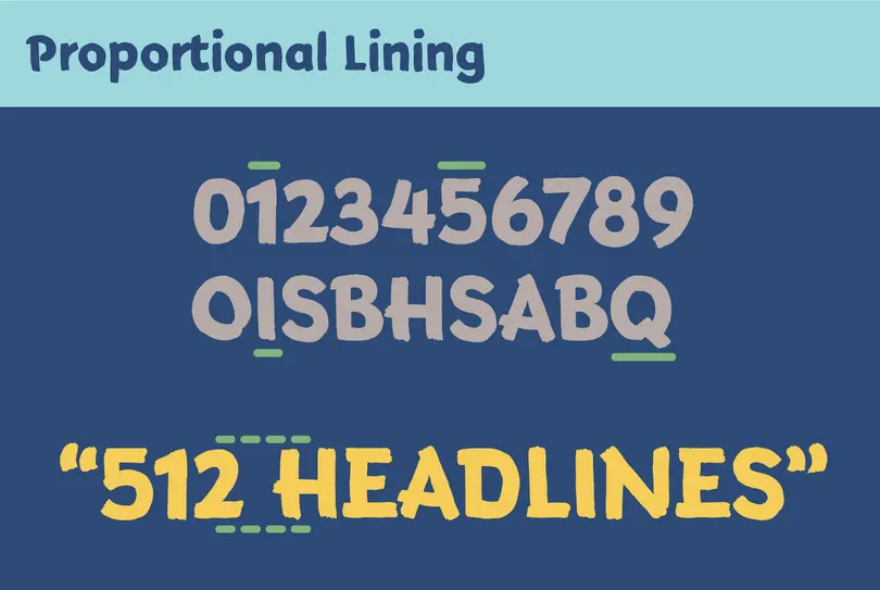
2. Proportional lining, best for headlines and some text
Proportional lining is probably the second most common style. These are lining again, as above, so they are similar to the cap height. But instead of being tabular, the horizontal advance width is proportional to the shape of the figure. This means the one will be narrower than the five, for example. Proportional spacing allows for a more even texture, a balance of black and white.
These can be preferable in text over tabular lining figures, and can improve headlines dramatically.
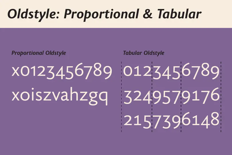
3. Proportional oldstyle, best for text
Proportional oldstyle figures are designed for text. They bounce up and down on the baseline, blending in with the lowercase, and are proportionally spaced for even typographic color.
For a period of time, this was the primary way figures were written. Lining figures were introduced later on, around the 19th century, so the ‘oldstyle’ moniker refers to the dominant style before lining figures became popular. Everything is relative.
Oldstyle figures might not align with the lowercase x-height. It’s commonly a bit higher, like small caps. Some designs are famous for using proportional oldstyle figures by default, like Georgia. This style can be used for stylistic purposes as well, perhaps in a menu to add some finesse or contrast.
4. Tabular oldstyle, best for tables & columns in that oldstyle flavor
This is the odd one out. As the name describes, these figures are tabular yet with oldstyle forms. This makes sense from a logical point of view because it fills out the set: Lining in tabular and proportional varieties, and oldstyle in tabular and proportional. I have yet to see these used in the wild (outside of the type design world), but if you are setting a table that requires that oldstyle mood, look no further.
Some typefaces do have small cap sized figures as well. Again, I haven’t seen these in the wild, but I suppose they could be helpful if you are using the small caps heavily—a broader palette of styles to work with. But, pairing small caps with proportional oldstyle figures can work too.
Online previews
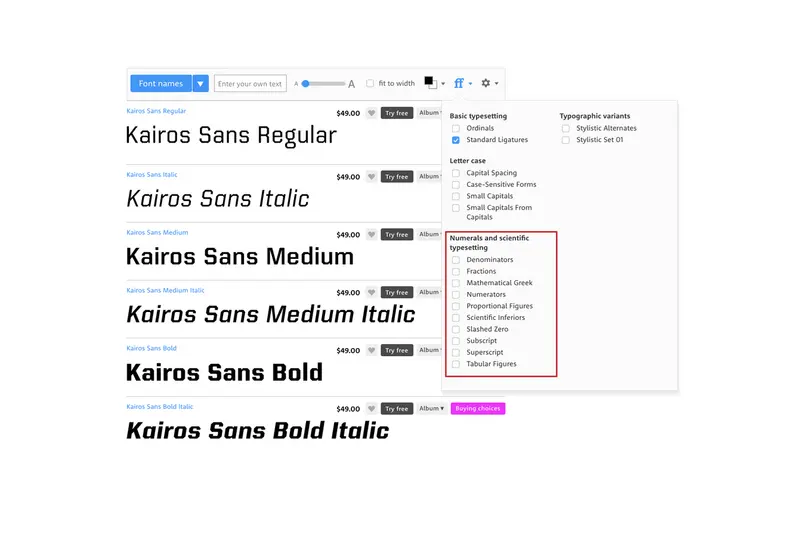
It can be hard to tell if your favorite font has these options. First, you could check the menus shown below, using trial and error. Some font packaging might give you a clue as well, something with ‘Pro’ in the name might have these extras. You could also contact the type foundry or designer directly. Many font vendors, like MyFonts.com, will show details about the font that include OpenType features, so have a look before you purchase a license.
How to use figures with Adobe applications
The OpenType options in Adobe apps vary, but in recent years they have become more uniformly implemented. Of course, you can always check with Adobe’s documentation, when in doubt. Let’s look at them together.
Illustrator
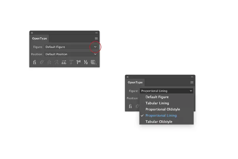
Start at the OpenType palette, and select the pop-up menu labeled ‘Figure.’ Easy!
Window>Type>OpenType
InDesign
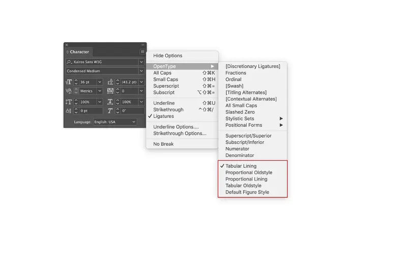
Start at the ‘Character’ palette, click on the little hamburger icon menu (three horizontal stripes), then ‘OpenType,’ then you’ll find the figure options at the bottom of the list. You can also access OpenType options under the powerful ‘Character Style’ and ‘Paragraph Style’ submenus under the Type menu.
BONUS TIPS!
There are a few similar symbols in a basic Latin character set, some are meant to be used in context with figures, so let me clarify it with examples.
Degree vs. masculine ordinal vs. ring diacritic.
I frequently see the wrong symbol used for degree. A degree symbol is usually a perfect circle that often aligns with the top of the figures. If the symbol sits higher—like a superscript zero or the ring diacritic—it’s probably not the degree symbol.
- 72° 34° (macOS: Shift+Opt+8, Windows Alt+0176)
The masculine ordinal, frequently used for Spanish, is a small letter o that is usually at the cap height. This is used to describe the assigned gender, segundo and segunda for example.
- 2.ª 2.º (macOS: Opt+9, Opt+0. Windows Alt+0170, Alt+0186).
This might also be difficult to tell apart from the superscript zero. The context in the glyph palette can help with that, so pay attention to what’s around it. But hovering over the glyph in the Glyph Palette will reveal the 4-digit Unicode value, which is really the only way to know for sure.
The ring diacritic is also frequently very round and small, but often sits lower than the cap height. (Unless there is a cap specific variant). This is used for the A-ring and a-ring glyphs needed for Swedish, Norwegian, Danish and Finnish, among others. (macOS: Opt+K, Windows Alt+0197)
- Åå
- Smörgåsbord
Conclusion
As we look closer at the advanced options a professional font may offer in terms of OpenType figure styles, we can find ways to make these special tools enhance a larger design piece. Hey, it may be that one thing that prevents your client from complaining about the ‘kerning’ around the 1.
Terrance expanded on this topic as part of our Inside the Studio webinar series. You can watch a recording of his webinar today.
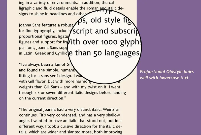
The fonts used in this article’s imagery are Kairos Sans, Terry Junior, and Joanna Sans Nova.


