Good Type, part 3: Good type reads to you.
Conveying a message with clarity means finding a typeface that’s effortless to read. That goes a step further than making sure people can interpret it with ease.
When aiming for clear communication, there are plenty of factors to consider. Font choice might seem like the obvious place to start, but the size or perceived size of the text, the space around it, the space between it, and the age of the reader – who may find their eyesight deteriorating with time—matter just as much, if not more.
While for some brands clear type is important for others it’s essential – think medical labels, for example, that need to give readers unmistakeable instructions. New environments, such as virtual reality and augmented reality, can also put type through its paces, creating distortion or disorientation that affects how people view, understand and respond to type. People choosing fonts should consider the demands of where they are appearing, and how that will affect their ability to ‘read’ to people.
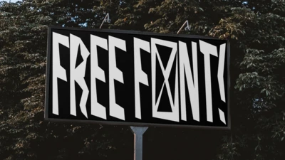
When it comes to selecting a typeface, there are some things to be aware of that can increase clarity. Character differentiation affects how people perceive fonts, particularly in sans serif typefaces where it can be more challenging to tell letters apart. The shape of different designs also influences their legibility. Viewed from a distance, letters set in the geometric Eurostile may appear as a series of small boxes, but a typeface such as Metro Nova is easier to differentiate thanks to its greater range of shapes.
Depending on how type will be used, rhythm is another consideration. For example, compare the ‘staccato’ downstrokes of Bodoni – which occur at different widths and intervals – with the calmer downstrokes of Applied Sans, which would offer a more harmonizing reading experience. That said, too much regularity of rhythm can create homogeneity, and make it challenging for readers to differentiate.
Other factors that can boost clarity include generous x-heights, and the counters in letters – think of these as the windows of a typeface, letting in the light to help readers determine what different shapes are. Type designer Zuzana Licko once said, “We read best what we read most”, and there’s wisdom for designers and brands to draw on here as well.
“Familiarity with specific typefaces can be helpful, but not as helpful as familiarity with words,” says Monotype Director of Product Design Jamie Neely. When assessing a typeface, examining how it affects high frequency words can offer some guidance to how it’ll affect the readability of content generally.
A good mantra to follow is: be clear first, and clever second. Without the necessary clarity, it doesn’t matter how beautiful, expressive, or quirky a typeface is, it isn’t doing its job.
Stay tuned for more from the Good Type series. Video recorded live at Adobe Max 2017.


