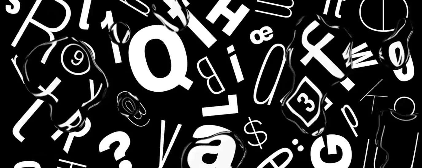
D&AD New Blood 2017 shortlist: our pick of the pencils.

This year we are, once again, proud to support the D&AD New Blood Awards, celebrating the brightest new talent in the design industry. Monotype’s 2017 brief challenged entrants to embody and express the importance of cultural diversity through a typography-led campaign or solution. After more than 3,000 entries, we are proud to showcase the 2017 Pencil winners, along with commentary from judges, Nadine Chahine and Malou Verlomme.
Grandstories, Yellow Pencil
Grandstories aims to celebrate the relationship between grandchildren and grandparents and encourage young adults to contact them, because they often forget to stay in touch.
We gather real stories and give them a strong visual voice for the attention they deserve. We developed a typeface with two complementary character sets to illustrate a typographic hug of those generations. The visual language makes Grandstories a versatile yet unified campaign.
It’s implemented all over the city and invites people to take part and remind each other on social media. Playful, universal and inspiring reminders to get in touch.
Nadine: The typeface is brilliantly put together and the posters are very charming and striking in design. This was one of my favorite entries!
Creative Team: Viola Konrad, Tilman Koppert, Nicolas Bernklau, Tobias Müller
Tutor: Markus Rathgeb
College: DHBW - Duale Hochschule Baden-Württemberg Ravensburg
Regather Hangul, Yellow Pencil

The campaign, ‘Regather Hangul’ is made to encourage separated families between North and South Korea to communicate with each other. The Korean War that occurred in 1950 resulted in many families being broken up. Many Koreans still hope of being reunited with their families currently living on the other side of the North or South region. ‘Regather Hangul’ aims to heal this sorrow by letting families communicate with an open and vibrant visual language.
Nadine: Very strong visuals with type that helps in story telling. Those stamps are great!
Malou: This campaign manages to weave new typography and Korean tradition into a striking visual vocabulary. It speaks in a calm but assured, beautiful voice to address the painful division of families between North and South Korea.
Creative Team: Jeong Eun Yoo
Tutor: David Barnett, Ray O’meara
College: Chelsea College of Arts
Radical Good, Yellow Pencil
Radical Good is a typography solution that helps to promote gender equality in Chinese. In simplified Chinese, each character is made up of graphical components called radicals, which alone have their own meanings. However, a long history of patriarchy in Chinese society is reflected in how some radicals are combined to make characters, so I have chosen eight Chinese characters with single gender radicals that are commonly used in daily life, and redesigned their typeforms to allow the use of the female and male gender radicals interchangeably, in order to promote gender equality.
Nadine: A very smart solution to how to teach Chinese to children and to address gender bias that is inherent in some Chinese words.
Creative Team: Jingwei Liang
Tutor: Andy Gregg
College: School of the Art Institute of Chicago
Fabric of the Nation, Graphite Pencil


‘Fabric of the Nation’ is a campaign which uses the type systems of fashion and fibre composition labelling to challenge the beliefs surrounding British identity. The rise of mass migration and globalisation has been accompanied by a questioning of what, if anything, it means to be British. Too often these discussions lead to the division of our citizens into those who are ‘more’ British and those who are ‘less’ British. ‘Fabric of the Nation’ focuses on the DNA profiles of well-known British citizens and celebrities; and aims to reinforce the fact that we are all different AND all British.
Nadine: Very smart play on words. Yes we are all different parts of the fabric of this nation. Different but still interconnected.
Creative Team: Sian Macfarlane
Tutor: Jackie Malcolm
College: Duncan of Jordanstone College of Art & Design
Remember.ttf, Graphite Pencil
We asked the public to engage with the topic of dementia by writing down their most treasured memories on a post-it and attaching it to our installation, challenging them to consider what it might be like to have those memories distorted or taken away.
We rearranged the collected memories, inspired by the structures people made on the wall to generate a typeface:
Remember.ttf is a typography-led campaign that highlights the degradation of our memories - the things that truly define us.
Ensuring we ‘don’t forget those who can’t remember’ inspires acknowledgment of the dementia community as part of our society.
Malou: Remember.tff has the depth of an artistic installation. By making the public engage in the campaign, it puts in perspective the group and the individual, a remembered memory and a forgotten one, sanity and dementia.
Creative Team: Jordan Smith, Daragh Anderson, Ollie Pearson
Tutor: Kira Salter
College: Central Saint Martins
DYSLEXIA, Wood Pencil
A common experience for people with dyslexia is that they have been criticised for being slow, dumb and lazy because of their disability. There is a lack of knowledge surrounding dyslexia and people confuse symptoms with personal characteristics. The Dyslexia campaign will give people an insight, when faced with similar challenges to what 15% of people go through everyday, when reading.
Malou: By reversing roles between the public and the targeted group, this campaign manages to bring awareness to the condition of people affected by dyslexia.
Creative Team: Arvid Nilsson, Susanna Mönttinen
Tutor: Pål Pettersson
College: Berghs School Of Communication
No to Trident, Wood Pencil

A campaign that engages a new generation with the CND (Campaign for Nuclear Disarmament) with the intention of increasing membership numbers.
Nadine: Gorgeous posters that are just ready to be printed and posted up!
Creative Team: Mabel Dilliway
Tutor: David Barnett
College: Chelsea College of Arts
Save Frisian, Wood Pencil
We asked the public to engage with the topic of dementia by writing down their most treasured memories on a post-it and attaching it to our installation, challenging them to consider what it might be like to have those memories distorted or taken away.
We rearranged the collected memories, inspired by the structures people made on the wall to generate a typeface:
Remember.ttf is a typography-led campaign that highlights the degradation of our memories - the things that truly define us.
Ensuring we ‘don’t forget those who can’t remember’ inspires acknowledgment of the dementia community as part of our society.
Malou: Remember.tff has the depth of an artistic installation. By making the public engage in the campaign, it puts in perspective the group and the individual, a remembered memory and a forgotten one, sanity and dementia.
Creative Team: Jordan Smith, Daragh Anderson, Ollie Pearson
Tutor: Kira Salter
College: Central Saint Martins
6 Word Survivors, Wood Pencil


To avoid the upsetting emotions that accompany the reality of the Syrian Civil War, many people have chosen to mentally distance themselves from the situation. We decided to share the experiences of refugee children in the form of the six word story in order to force viewers to identify with, and humanize refugees. Each six word story will be placed in a location that is relevant to that particular story, and includes sub copy directing viewers to sixwordsurvivors.com where they can read the full story, and donate through Unicef.
Nadine: This brought tears to my eyes. So powerful in its simplicity, and so evocative in the stories it does not tell. Outstanding work!
Malou: When treating such difficult subject as the Syrian civil war the most difficult task is to speak in the right voice, and this is precisely what this campaign manages to do. It takes elements from our daily lives to put them in perspective with the condition of Syrian children, creating a very emotional response.
Creative Team: Tessa Kasinkas, Madelyn Falk
Tutor: John Delacruz
College: Miami Ad School San Francisco
We The Tenants, Wood Pencil

The negative stigma surrounding social housing has contributed to the abandonment of council estates by the outer community. Subsequently, this has led to the demise in the past’s call for an egalitarian society as neighbours, class and wealth become increasingly segregated. Fuelled by resident pride, ‘We The Tenants’ aims to tackle the demonisation of social housing often projected by non-residents.
Malou: Typography and lettering is here used to create social interaction and raise awareness on the issue surrounding social housing in the UK. The typography and lettering borrowed from graffiti and street stencil messages creates a raw and very strong visual system which is used to engage with the general population, brilliantly bringing back pride to the tenants.
Creative Team: Anna Smith
Tutor: Ray O’meara
College: Chelsea College of Arts
Immigration Town, Wood Pencil
Slough was recently dubbed ‘Immigration Town’ by the BBC and is commonly misrepresented. There are over 150 languages spoken in Slough, with many seeing the rising rates of immigration as it losing its identity, we feel this is what gives it it’s identity. With Slough being a town built along the M4 we used the typeface Transport and combined it with Google’s and Monotype’s Noto typeface to incorporate the different languages. We created a colourful identity showcasing the spectrum of languages by integrating them into an adaptive and responsive logo and identity, highlighting the diversity of ‘Immigration Town’.
Malou: In today’s context, it feels like a relief to see a project treating immigration not as a problem to be solved but as a chance to be embraced. The simple typographic system, rolling out perfectly in all mediums creates a very effective campaign.
Creative Team: Kieran James, Tammy Johal
Tutor: Phil Jones, Marion Morrison
College: Arts University Bournemouth