Type resources for designers and brand owners
Behind the Font highlights the people and process behind the fonts you love and use. This installment features Jessica McCarty, founder of Magpie Paper Works and Rare Bird Fonts.
Ever year, Monotype and the Type Director’s Club (TDC) award the Beatrice Warde Scholarship to a young woman entering the design industry. This year’s winner is Blossom Liu from ArtCenter College of Design in Pasadena, California.
Behind the font highlights the people and process behind the fonts you love and use. This installment features Carl Crossgrove of the Monotype Studio.
Retail customers are scattered across a wide range of touchpoints and react with them all interchangeably. However, they’re all linked through the mobile experience.
More than 150 languages and scripts are supported in this global super family, which uses the warmth and clarity of the original Frutiger design to help brands communicate around the world with consistency.
German designer Paul Renner is best known for his Futura design, but Plak, his ‘other’ typeface, is long overdue a rediscovery. Monotype designers Linda Hintz and Toshi Omagari have restored this under-appreciated design, creating a versatile set of 60 weights that draw on the forms of the original wood type.
In this feature from the Recorder, issue 2, we speak to the Swiss designer about how his natural aversion to authority has played a role in his approach, and how his work aims to break the boredom of everyday design.
Setting text in augmented and virtual reality presents new design challenges. Learn about six fonts that can enhance your AR/VR creations.
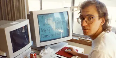
Tom Rickner, veteran type designer, shares his personal role in the beginnings of type’s most exciting development in decades.
You know what they say, “classics never go out of style.” Maybe this is true, maybe it isn’t. But one thing is certain: When sans serifs took over typography in the early 1900s, they weren’t just a fad. They came to stay.
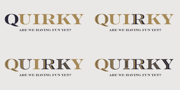
Sans serifs have long dominated the world of corporate branding, but some companies are going for a different look: Fun, funky serifs. What’s behind the change?
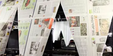
When your business is the printed word, your use of type is serious business. From the introduction of the Times New Roman® typeface in 1932 through to its Times Modern fonts today, The Times newspaper’s use of type has been a critical and iconic aspect of its brand.
Sometimes clients just don’t care where their fonts come from. Here’s why their project (and your reputation) benefit from convincing them it matters.
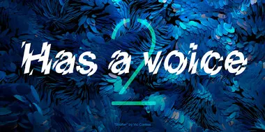
If fonts could speak, what would they say? The second installment of our Good Type series looks at how the fonts you choose impact the voice of your brand.
With HTML5 and web fonts becoming the industry standard for digital ads, it’s time to take a look at some web font FAQs.
In this new video, learn more about how we bring brands to life, utilizing our full product suite to empower modern brand expression.
This first installment of the Good Type series shows how traces of the same forms and styles emerge again and again as fonts are created or revived.
D&AD announce the winners of their annual New Blood Awards. Typography category judges, Jamie Neely and Nadine Chahine, share their pick of the pencils.


