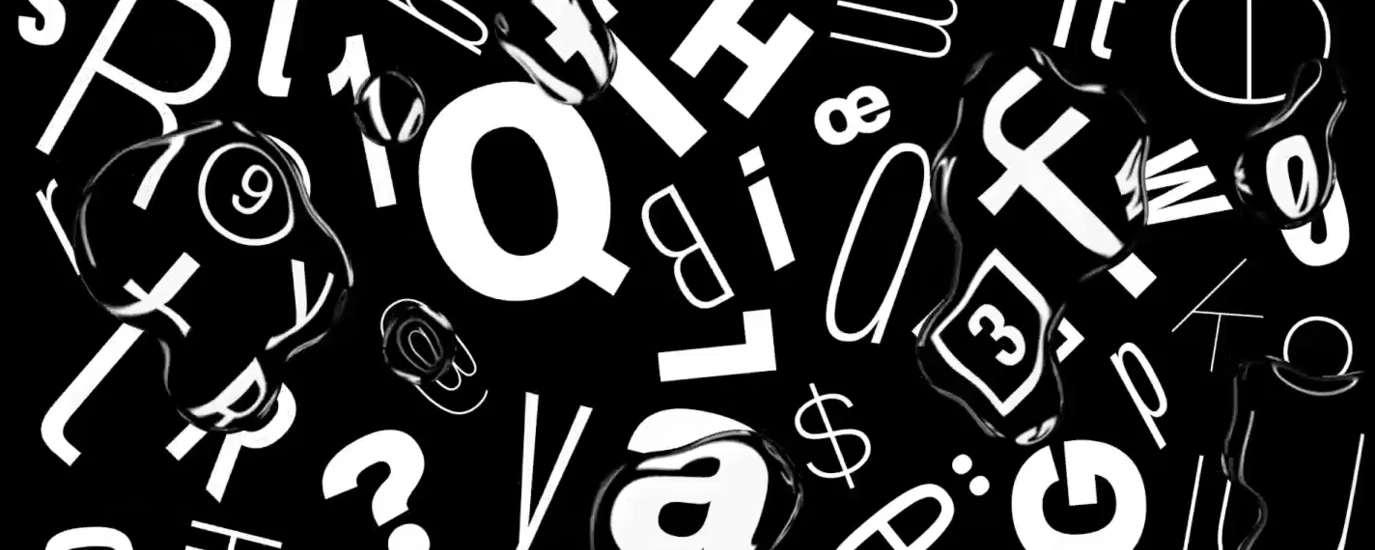
D&AD New Blood Awards: using the power of typography to activate your cause.

This month our friends at D&AD announce the winners of their annual New Blood Awards. Monotype is proud to have set the brief for the Typography category, inviting hundreds of young designers to use the power of typography to activate their cause. Category judges, Jamie Neely and Nadine Chahine give us a behind the scenes look at the submissions and share their pick of the Pencils.

#DoYouMINDTHEGAP
“This is a smart campaign that is able to very quickly illustrate what the disenfranchising of a big part of society can be like by taking some key letters out of the alphabet. The connection to the iconic Mind The Gap phrase helps to connect to the gender gap issue and skillfully asks all of us: do we mind this gender gap? We automatically want to say yes.” - Nadine Chahine

20/20
“Bye, Bye, Culture. A Tax on the Poor. Overcrowded, Underfunded. These are posters printed on newspaper spreads and meant to resonate with a younger audience in order to engage in political discourse and to get them to vote. The posters are simple, strongly worded, and bold. The message is very direct and straight to the point.” - Nadine Chahine

Better Together
“Of course it is great to create books for children that address those with both regular and low vision! A wonderful idea that is very well executed and the results are visually stunning. Though children are not reading in uppercase format (the only downside to this typeface system), the material prepared has visual appeal that is very inclusive.” - Nadine Chahine

Bring Back Our Girls
“The judges were unanimous in agreeing with regards to the visual strength of this campaign. The masterful execution of this simple idea (brush lettering on faces) gives it a lot of power coming from both the skill of the calligraphy, to the facial expressions of the subjects depicted. The end result is haunting.” - Nadine Chahine

Child Obesity
“This campaign is smart, well executed and visually striking. It plays on the colorful (and highly appetizing) packaging style of candy bars to sell you diabetes and pancreatic cancer. The designs are so well done you almost say yes.” - Nadine Chahine

Discovering The Aesthetic of Tradition
“We fell in love with the posters. These were so well crafted, so charming in their details, that we wanted to take them home. The hand-stitched letters feel very techy and home made at the same time. Incredibly strong visuals!” - Nadine Chahine

Henry
“The irreplaceable skills of long-surviving artist “Henry” stirred meaningful debate between the judges. Should we view the digitalization of Henry’s craft as preservation… or a threat to other typographers following in his footsteps? One thing all judges agreed on, is how this project has been delivered with optimism and depth alongside some really beautiful lettering work.” - Jamie Neely

No Air
“No Air is clever on several levels. Type choice; The stencilled font is a perfect fit for a theme of environmental breakdown. Typesetting; The repetition of the subscript “2” motif creates a campaign identifiable through text alone. Environment; We loved the suggestion that street-level advertising might visually choke in polluted environments, magnifying the poignancy of the cause.” - Jamie Neely

Protecting Pubs Campaign
“Saving the British local pub is a novel motive, and not for the faint-hearted designer. The danger of bringing together recognisable, historic beer brands is that the result could be a cliched pastiche working against the message itself. But the Protecting Pubs campaign is extremely successful due to thoughtful consideration and craft of the smallest of details. Type and colour are expertly combined to create a fun and flexible beer mat alphabet that would undoubtably be a big hit right across the UK.” - Jamie Neely

Retro Serif
“The communist Russian revolution creates a wonderful backdrop to Retro Serif’s politically-charged narrative. This well-researched campaign resolves in a beautifully designed typeface that demonstrates a measured and mature design approach. We wonder if Leo Tolstoy would approve?” - Jamie Neely

Whoever You Are
“Whoever You Are brings due attention to UK restrictions for gay men who wish to donate blood. The tubular, playful typographic execution that underpins the campaign was an instant hit with the judges. Bold and beautiful.” Jamie Neely