Behind the font: Jessica McCarty of Magpie Paper Works.
Behind the fonts is series of designer interviews aimed at highlighting the people and process behind the fonts you love and use.
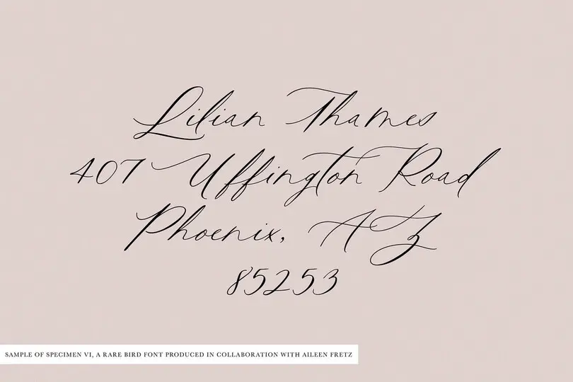
This installment features Jessica McCarty, an award-winning designer of handwritten and calligraphic fonts. McCarty founded Magpie Paper Works, a boutique typographic foundry specializing in hand-drawn fonts and custom lettering. She also co-founded Rare Bird Foundry in 2017, where she transforms select artists’ calligraphy into premium OpenType fonts.
Where does a new font start for you? Do you sketch concepts by hand? Do you know what you want to do before you start, or do you find the design concepts through sketching or some other exploratory practice?
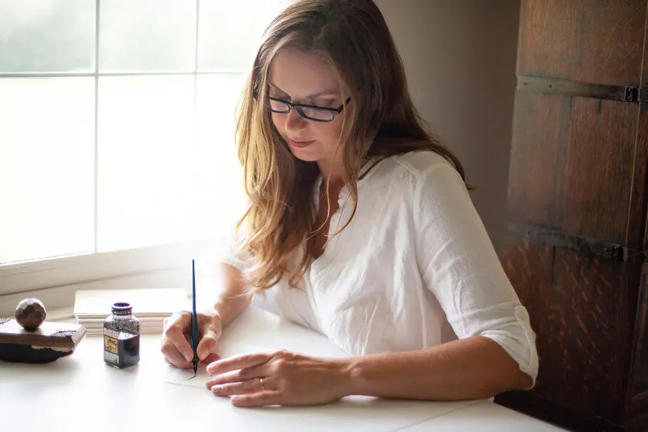
“For me, a new font always starts as an idea that’s ultimately sketched and drawn by hand.
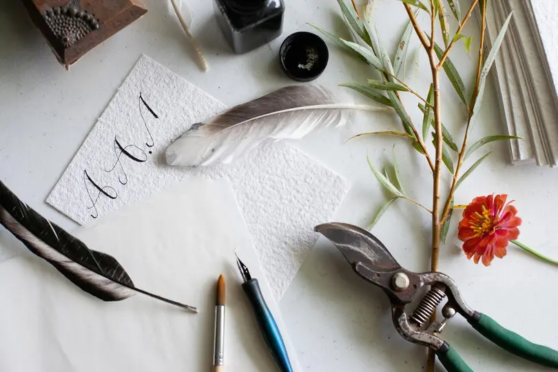
“The concepts are typically sparked by something visually interesting in my daily “non-type” life. Anything that’s old or handcrafted catches my eye, as do the shapes and movement found in nature. Sometimes I’ll experiment with unusual drawing tools, like feathers or nibs I cut from household objects, just to see what kind of strokes emerge.
“I love exploring in the analog and tried incorporating digital concepting into my workflow, but found that those tools fit more naturally into the production stage of a project.”
Building on that, are your designs purpose-driven, in that you set out to make fonts that fit a certain use case or audience, or do you follow inspiration and just end up where you end up?
“I love this question—the answer is both! As type designers, our ultimate job is to marry personal inspiration with our customers’ needs. Understanding how fonts can be tailored to a particular use case and intuiting what sort of fonts the market lacks is just as important as designing something beautiful. When the muse leads, I always try to incorporate a design brief into our conversation as soon as possible.”
Roughly how long does it take to bring a font from concept to release?
“Hand-lettered serif or sans-serif fonts generally require four months from concept to release. Calligraphy scripts average 6 months to a year, depending on their complexity. I’m usually working on a mix of two to three retail projects and custom typefaces at the same time.”
How do you know when a font is ready to transition from concept to formal design? If you do start on paper, how do you make the transition from paper to screen?
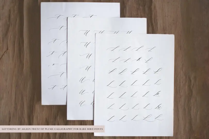
“When I’m starting with my own lettering at Magpie Paper Works, I sketch and then draw each character by hand on onion skin paper. Generally, I try to focus on the design of individual characters while I’m concepting and sketching—marking out those letters that don’t seem consistent, and starring the letters that I feel best represent what I’m trying to convey in the final font.
“When I’m collaborating with another artist at Rare Bird Font Foundry, we work together as a team to determine the “hand”—the look and feel—of the final font. Then the artist lets loose with a series of pangrams, testing that hand across a variety of words and sentence lengths, so that we can map out the construction of the font as well as the types of OpenType features it should contain. From there, the artist provides analog sketches of each character.
“Once all of the characters have been drawn, they are scanned and vectorized directly (if I want the edges of the letters to have a rough texture) or outlined by hand in FontLab or Glyphs (if I’d like for the edges of each letter to consist of smooth Bezier curves). Broad adjustments are made once I can see how the letters are working alongside one another on-screen. Sometimes I’ll discover that a particular letter isn’t working as well as it could be, and in those cases I prefer to re-draw the letter within the font editor.”
Walk us through your testing process a bit. What sort of unique issues (if any) arise when testing a hand lettered font compared to, say, a straightforward sans serif?
“Like most type designers, I want my customers to be able to use my fonts without having to buy the latest computer or design apps, so testing is a huge part of my workflow. After I’ve finished designing and programming, the font is installed on everything from a 2019 gaming PC loaded with the latest Adobe apps to a 2011 Mac Mini running an absolutely ancient version of Apple’s OS.
“I make sure to enable all of the OpenType features I can in as many apps as I can to confirm that everything is looking (and working) the way it should. My primary concerns are making sure the letters connect seamlessly with one another, all of the alternates and features are functioning as designed, and that all of the characters in the font are visible in Adobe’s glyphs panels.
“Older software, especially older word processors, have little OpenType support so it’s especially important to make sure that the font looks good even when none of those extra characters are available.
“Highly-textured and rough-edged fonts typically have many more points along their curve outlines than a straightforward sans serif, and these extra points can overwhelm some apps. I pay special attention to how the letters are rendered on-screen and, in some cases, will simplify outlines or streamline the code to improve the user experience.”
You’ve noted elsewhere that script fonts are “exponentially more labor-intensive” than non-connected fonts. Can you talk about how this factors into the various stages of a design? Are you problem-solving from the beginning, in terms of figuring out how certain letter combinations will work?
“Well-crafted script fonts are tricky things; they look deceptively simple from the outside. Inside, however, these fonts function like Rubik’s™ cubes!
“Every letter must be designed to seamlessly connect with every other letter. In a hand-drawn script, the baseline—the invisible horizontal line upon which all of the characters in a font rest—may “bounce” for visual effect, shifting the letters slightly up and down across a line of text. This can complicate how each letter connects with its neighbors.
“Additionally, if the font is meant to replicate analog calligraphy, multiple alternate versions of each letter are often required. These alternates are used in double-letter sequences so that the “o’s” in “noodle,” or the “t’s” in “little,” look natural. There are also tricky sequences of letters, like “os,” “ex,” and “az,” which can require more special alternates. If the font includes swashes, as most scripts do, all of the alternates will require their own duplicate swashed version.
“Complicating all of this are other common OpenType features like titling alternates and contextual alternates—alternate versions of letters based on their positions within a word—like a “t” with a longer or shorter cross-stroke. I’m a “more is more” kind of person so the hardest part of the design process for me is knowing when to stop adding extras. Does that font really need 20 stylistic sets, ligatures, contextual alternates, stylistic alternates, titling alternates, swashes, old-style numerals and chaining contextual substitution? You bet it does! It’s very easy for a type designer to suddenly find themselves sitting in front of 1,000+ characters.
“Then all of those alternates must be programmed into the font’s OpenType code. It sounds simple, but every substitution affects the next—just like each twist of a Rubik’s™ cube. Sure, a type designer can anticipate users turning a single feature on or off. But what happens when their customer wants to use swashes and contextual alternates and double-letter ligatures, all at the same time? Ideally, they should be able to layer these features and automatically see all of the characters they adore, at once, in their layout. This requires a lot of problem solving and testing from the type designer. It’s not unusual for a designer to invest hundreds, or even thousands of hours into a robust script font.
“Leaving all of this OpenType magic out of a script makes it much cheaper and faster to produce, but it can also make the end result clunky to use, with letters that don’t seamlessly connect and an overly digital aesthetic.
“When it comes to scripts, the old cliché is usually true: you get what you pay for!”
To see Jessica’s work, visit Magpie Paper Works or Rare Bird Font Foundry; you can also find her on MyFonts.


