How typography can make your brand feel more human.
It feels like real human beings are becoming rare these days. More and more, we find ourselves interacting with dodgy bots, synthetic voices, and artificial intelligence. Even the so-called real people we know as influencers are fundamentally fake. Visual filters are now the norm.
Now is the perfect time to humanize a brand.
It’s no wonder so many so-called thought leaders—in books, courses, and TED Talks—are pushing for “authenticity.” They know that real human beings respond to real human beings. We all crave a heartbeat. Emotion. Even imperfection. Humans value humanness.
Your brand should take notice.
Likeability requires personality.
Smart brands recognize our innate attraction to humanness and work to put forth a true personality. By articulating their beliefs, by trying to behave with sensitivity, and by crafting a human vibe and voice, many companies are doing what they can to present themselves as approachable, relatable, and likable. You know, like … people.
Humanness depends on design.
Together with messaging, your brand’s design is crucial to how the world perceives it. Thoughtful, effective design can make a visceral impression and raise your brand’s distinctiveness and memorability. It can reflect and reinforce your brand’s unique personality and capture its special spot in the brandscape.
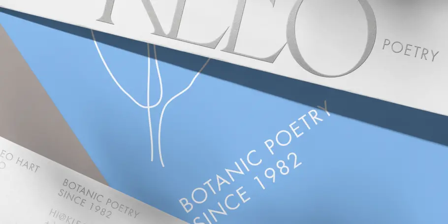
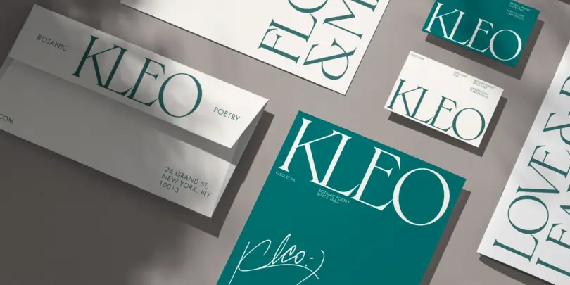
And at the very center of powerfully human design is typography.
Behold the face of typography.
The term “typeface” is remarkably accurate. Just as we make countless instant assessments when looking at a human face, we can quickly size up typography and make conclusions about the brand behind it. From rugged to ritzy, youthful to mature, serene to dynamic, courtly to kooky, the appearance of your brand’s letterforms will tell the world who it is.
Comic Sans® can teach us a lesson.
Comic Sans, the ubiquitous font modeled on comic book dialogue, definitely has its detractors. But Comic Sans’s backstory and ongoing prevalence is worth our attention, because they so clearly illustrate the power of fonts and our deep-seated need for the human touch in typography.
Why does Comic Sans exist?
As Simon Garfield explains in Just My Type: A Book about Fonts, a “typographic engineer” named Vincent Connare created Comic Sans at Microsoft in 1994 for a specific purpose. He had seen an unreleased version of the software called Microsoft Bob, which used a friendly illustrated dog named Rover to familiarize users with Microsoft’s functionality. The typeface chosen to fill the talk balloons, Times New Roman®, didn’t match the fun, friendly, accessible, and unintimidating vibe Microsoft Bob was meant to have.
So Connare got down to work and created an appropriate font for friendly little speech bubbles. It looked hand-drawn, roundish, and innocent.
Alas, it turned out that his font couldn’t be incorporated into the short-lived Microsoft Bob software for technical reasons. But it did end up getting distributed with Windows 95. And after that, there was no turning back.
When users saw Comic Sans among their more formal and traditional typeface choices, they tended to gravitate toward it because it felt more friendly and warm and unassuming. More—in a word—human.
Fast-forward to today, when Comic Sans can be seen on everything from restaurant menus to police cars to war memorials, and we can conclude that people deeply desire typography they can relate to.
(Here, the Monotype team will just point out that it’s easy to find many other examples of humanized type besides Comic Sans. You can start exploring by using the “show similar” feature to see a long list of alternatives.)
What makes a font human?
Have you ever found yourself chatting with a customer service representative online and tried to figure out whether or not they’re a real person? You look for clues, both consciously and unconsciously, that put them in either the “bot” or “not-bot” column.
It’s the same with typography. Sometimes it’s easy to point to what makes a font feel human, and sometimes you can’t quite put your finger on it. Handwriting fonts, of course, imply that they were written by an actual person. But even more traditional typefaces can convey the human spirit.
What is a humanist font?
Humanist typefaces are the OG human-ish typefaces.
Though they’re more refined-looking and standardized than handwriting fonts, humanist typefaces are characterized by their calligraphic roots—the movements of the human hand. Even the most contemporary humanist sans serifs reflect the proportions, shapes, and sensibilities that feel “right” to most readers, thanks to the long history of the written word.
And here’s a bonus to humanist sans serif fonts: They’re easier to read. Monotype conducted a study with MIT to compare the legibility of two different typefaces in automobile displays: Eurostile®, the square grotesque, and Frutiger®, the humanist sans serif. You can delve into the details of the study here, but the upshot is that the humanist sans serif could be read more quickly and accurately.
Plus, let’s face it—Frutiger feels more warm and welcoming than boxy, techy Eurostile.
Pick your penmanship carefully.
Handwriting typefaces are human by definition. (Our signatures literally identify us, after all.) Because handwriting imparts personality so strongly, though, these fonts should be chosen with great discretion. Monotype creative type director Terrance Weinzierl explains the challenge: “Handwriting typefaces can immediately make something look human, but people are really sensitive to them—like facial expressions. You need to consider a multitude of options and make sure you choose the perfect handwriting font.”
Many factors affect the feel of a handwriting font. Consider:
- The apparent medium. Does this seem to be written with a fountain pen or a paintbrush or something else?
- Any implied texture of a substrate. Was this written on 80-pound cotton stationery or a concrete wall?
- The overall mood and feel of the handwriting. Does it seem calm or amped up? Loopy or jagged? Restrained or happy-go-lucky?
You’ll also want to consider practical factors like the heights of the ascenders and descenders, the line weights and legibility, and how the font will work in all imaginable circumstances, paired with other typefaces.
If you’d like to discuss handwriting font options, someone from Monotype would be happy to speak with you. Just let us know.
Nostalgia: old-school humanness.
Nostalgia can be a powerful way to equip your brand’s design with humanness. Thanks to movies, television, books, and the internet, most members of Homo sapiens these days can recognize distinctive design eras and draw particular associations and feelings from them. When design harks back to certain time periods, it can convey something familiar, meaningful, and comforting, like a family story we all know and love.
In 2021, Burger King did a beautiful job of using nostalgia to update its design and typography. Look at the cushy, curvy, comforting letterforms on their website and read about what they signify in this piece by Monotype’s senior type director Phil Garnham. If you’d like to read more about the impulse toward and benefits of nostalgia, check out this interview with Garnham.
Perform a personality test.
When you’re assessing typefaces, go with your gut first and then you can conduct a more intentional analysis. Ask yourself:
- Does this feel like it was created by a machine or a person?
- If it feels handcrafted, what kind of person made it? What would that person dress like? How would they behave?
- How regular are the letters? How much variability can be incorporated using alternate characters?
- How smooth or pointy does the typeface feel? Would it be pleasant to touch? Or would it jab you?
Look at all the little details—the angles, the counters, the ligatures—and ask yourself why you think they were included and what they communicate.
For an excellent example of irresistibly friendly typography, take a look at this case study about the typeface Monotype created for M&M’s®. It’s called All Together, and every detail, down to the smile-shaped ink traps, connects you with the fun, playful, colorful personality of this classic candy brand.
How to find the perfect humanized type.
Monotype can help you find a font that accurately reflects your brand. Visit our extensive library and use the search functions to explore particular categories like handwriting, brush script, and casual script. Then, as you observe and assess different typefaces, notice the commonalities in the choices you’re drawn to (as well as those that make you say “no”). Just tap the “show similar” link to discover new fonts that fit your preferences.
All these humanizing branding tips start with self-awareness.
Typography is a powerful tool for connecting a business with the world. But before you can wield the typography tool, you need to be completely clear on the brand you’re portraying.
Make sure you and your team have done the important work of identifying what kind of “human” your brand is. Get personal, so to speak. Get detailed. Analytical. Obsessive. Identify the language your brand uses (and doesn’t use), the issues it cares about, and its fundamental character. Only then can you express it appropriately through typography.
And remember that human characteristics may be only part of your brand equation. You may need your design to exude innovation, technology, or automation alongside more organic “personal” qualities. No one said branding is easy.
Monotype is here to help. Even if you don’t opt for a custom font design, we offer an expansive library of more than 250,000 ready-to-use options. A subscription gives you unlimited prototyping access as well as commercial production fonts and millions of monthly page views.
And fortunately, the Monotype team is made up of real, live, type-loving human beings who would love to help you on your quest of brand expression. Contact us anytime.


