Resources
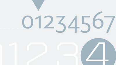
When designing with type, the use of numbers can take a layout from good to great. Here's how to use them to the best of their ability.

The conversation around individual data rights is accelerating. Learn about our approach to privacy guidelines and how brands can use them to their advantage.
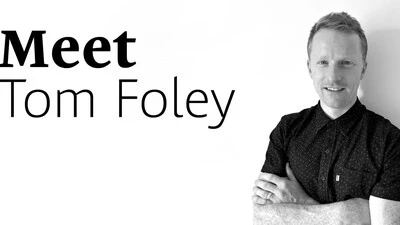
We’d like to introduce the newest member of the Monotype team, Tom Foley. As Creative Type Director, Tom will lead the Studio team in London.
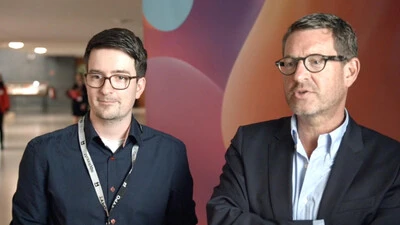
Two Brand Talks presenters discuss the importance of creating conversation with customers, and how fonts help build connections across platforms.

Actions speak louder than words. But for marketers trying to form genuine, lasting relationships with their customers, embodying that ideal is complicated.
Conveying a clear message means using a typeface that's effortless to read. This installment of the Good Type series examines which factors affect readability.

Monotype unveiled a new glyph design for its popular Tazugane Gothic and Tazugane Info typefaces that commemorates the new emperor of Japan.
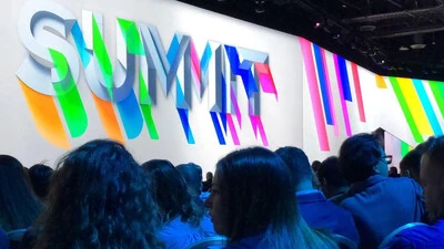
This year's conference centered on how brands can develop a more effective distribution approach. Here are a few primary trends we believe will matter in 2019.
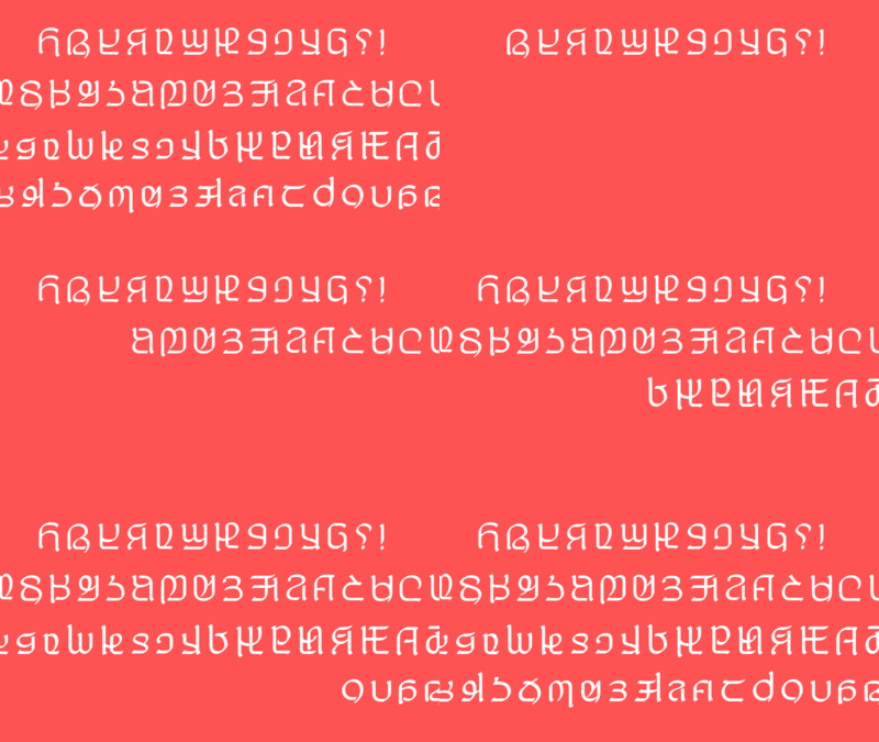
Imagine inventing a brand new written alphabet. How would you do it? What challenges would you face adopting it for digital use? That is the story of Adlam.
