Resources
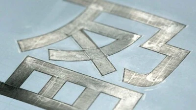
Many Chinese typefaces have a reputation for looking dated and not reading easily on small screens— not M Ying Hei. It checks all the boxes that it’s forefathers can’t.
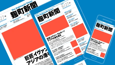
The first Japanese typeface from Monotype is a humanist sans serif, designed to work in partnership with Neue Frutiger. Tazugane Gothic sets out to introduce a new typographic standard, allowing designers to comfortably set Latin and Japanese characters alongside one another while maintaining visual harmony.
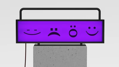
Typeface Collection: fonts & feelings.

Setting text in augmented and virtual reality presents new design challenges. Learn about six fonts that can enhance your AR/VR creations.
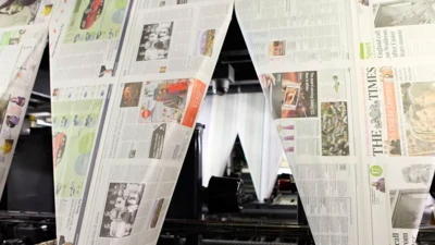
When your business is the printed word, your use of type is serious business. From the introduction of the Times New Roman® typeface in 1932 through to its Times Modern fonts today, The Times newspaper’s use of type has been a critical and iconic aspect of its brand.
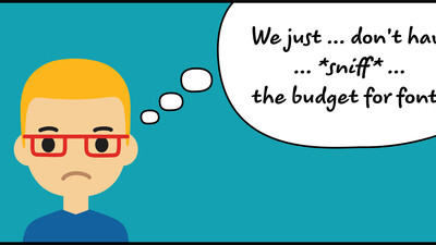
Sometimes clients just don't care where their fonts come from. Here's why their project (and your reputation) benefit from convincing them it matters.

With HTML5 and web fonts becoming the industry standard for digital ads, it's time to take a look at some web font FAQs.
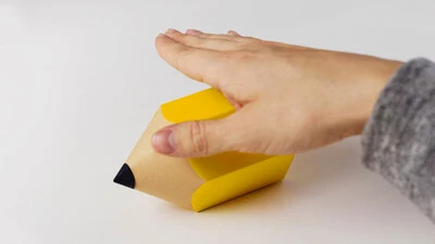
D&AD announce the winners of their annual New Blood Awards. Typography category judges, Jamie Neely and Nadine Chahine, share their pick of the pencils.

Finding the right brand font requires a deep understanding of who you are as a brand, and how you want to present that identity to the world.
