Resources
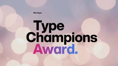
Monotype is thrilled to introduce the inaugural recipients of the Type Champions Award, a new program that recognizes brands for their creative, innovative, and memorable use of typography in developing and maintaining their brand identities.
We are proud to showcase the 2017 D&AD New Blood pencil winners, along with commentary from judges, Nadine Chahine and Malou Verlomme.
With so many ways to build HTML5 ad campaigns, there’s a lot to figure out. Here’s some handy tips to help you use Monotype web fonts in any environment.

Sans serifs have long dominated the world of corporate branding, but some companies are going for a different look: Fun, funky serifs. What's behind the change?
This first installment of the Good Type series shows how traces of the same forms and styles emerge again and again as fonts are created or revived.
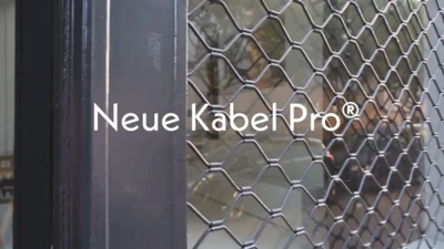
Neue Kabel brings back the liveliness of the original's strikingly quirky characters, while adding in the long-lost italics and missing glyphs needed for it to address a wide range of editorial and branding purposes.
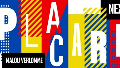
Placard Next is a reimagined version of a 1930s poster design, that takes all the original quirky details and refines them for digital use. Its condensed versions pack an instant typographic punch when used at large sizes, introducing some unusual flavor to posters, headlines and anywhere else designers need to make a statement.
You can love it or hate it, use it for nearly anything or refuse to use it at all. But however you feel about Helvetica, no one can deny its place in society.
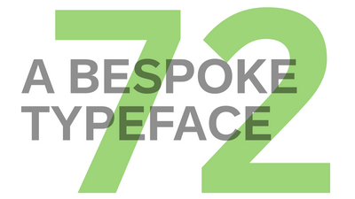
Monotype’s Terrance Weinzierl helped software company SAP to develop a typeface for SAP Fiori, for which SAP won a Red Dot Award in 2015. It was important that the design of the typeface works well in text-based UI environments without compromising on personality. The new typeface, called 72, has won a 2017 Red Dot Award.
