Resources.

Creative Type Director, Tom Foley, sat down Antalis Creative Power to discuss the 2021 Type Trends report, the state of Sans Serif, and consider what makes a font timeless in his latest interview.
First published on Antalis Creative Power
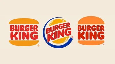
Phil Garnham, Senior Creative Type Director at Monotype Studio explores the evolution of type in digital and celebrates the heritage at the heart of the Burger King rebrand.
First published on BITE
Monotype's Creative Type Director Phil Garnham discusses the role of lettering in logo design with Superunion, one of our agency partners, with a real case example we worked on together.

Artists pour their heart and soul into their craft and creations and in an ideal world, every artist would be recognized and paid appropriately for their efforts. In reality, however, artists often have to fight for their rights to be upheld. This has been true for centuries and is only intensifying in the digital era.
Some recent research has shown that companies increasing their design budget grow substantially faster than the competition.
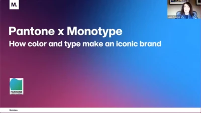
Join Monotype & Pantone to discover the main components of design, and learn why fonts are the element that holds it all together.
You’ll hear from Alice Palmer, Vice President of Marketing at Monotype, and Laurie Pressman, Vice President of the Pantone Color Institute.
Rebecca Price, Senior Brand Manager for Monotype, gives the opening remarks at Brand Talks Connected – EMEA on November 18, 2020.
Pablo Amade, Creative Director for SUMMA Branding, presents his Correos case study at Brand Talks Connected – EMEA on November 18, 2020.
Markus Dunke, Chief Client Officer, and Tanja Freudenthaler, Creative Director, for Strichpunkt Design, present their Audi case study at Brand Talks Connected – EMEA on November 18, 2020.
Rebecca Price, Senior Brand Manager for Monotype, gives the opening remarks at Brand Talks Connected – Americas on November 19, 2020.
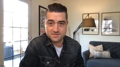
Melissa Centrella, Senior Director of Marketing for Monotype, moderates a lively discussion with esteemed panelists Ben Carmean, Group Creative Director at VMLY&R; Marti Romances, Creative Director and Cofounder at Territory Studio; Jim Bogenrief, Vice President, Head of Brand Strategy at First Republic Bank; and Jamie Levy, Head of Merchant Engagement, Shopify Plus.

Collin Whitehead, Director of Central Design for Dropbox, presents at Brand Talks Connected – Americas on November 19, 2020.
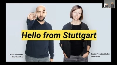
Markus Dunke, Chief Client Officer, and Tanja Freudenthaler, Creative Director, for Strichpunkt Design, present their Audi case study at Brand Talks Connected – Americas on November 19, 2020.
