Resources.
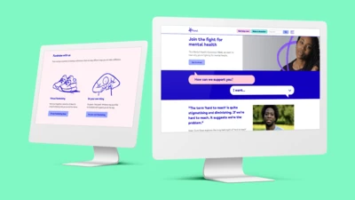
After years of raising awareness and understanding around mental health, the time had come for charity Mind to update its iconic visual identity. Monotype Studio developed Mind Meridian – a modified typeface that puts warmth and accessibility at the heart of the brand.
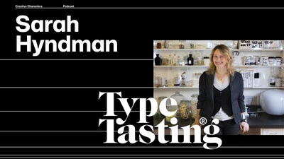
In episode seven we talked with Sarah Hyndman, founder of Type Tasting and the author of several books, including Why Fonts Matter and How to Draw Fonts and Influence People.
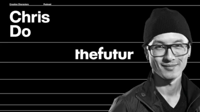
In episode six we talked with Chris Do, award-winning designer, CEO and Chief Strategist of Blind and the founder of The Futur—an online education platform that teaches creatives how to make a living doing what they love.
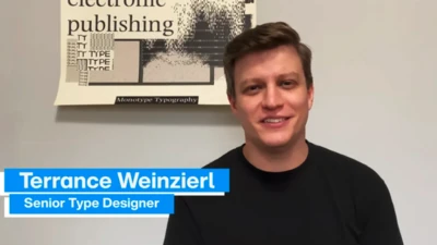
Get to know our Studio team with this introduction of our Creative Type Director, Terrance Weinzierl.
Terrance has been creating and modifying typefaces for the Monotype Library and a wide range of brands since 2008. In addition to working on custom projects for PBS, Microsoft, Google, Barnes & Noble, Domino’s and SAP, he’s designed type for video games, professional sports teams and auto manufacturers.
Brand Talks Connected delivers Monotype’s popular Brand Talks event series directly to wherever it is you’re working these days. Here’s a look back at some of the amazing content from 2020. We hope you’ll join us for the next event!
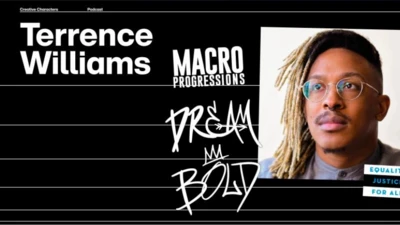
In episode five we talked with Terrence Williams, Senior Design Lead at Salesforce, who discusses the emergence of relationship design, and shares why it is important for people to bring their full identities into their work.
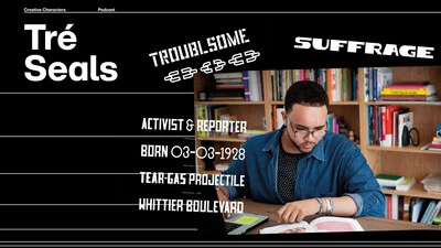
In episode four we talked with Tré Seals, founder of Vocal Type, about his efforts to break down stereotypes in design and how a middle-school side gig, born out of a brush with serious childhood medical issues, helped him become the artist he is today.
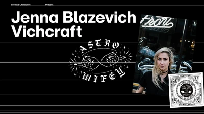
In episode three we talked with Chicago-based lettering artist Jenna Blazevich, about chain stitching, punk rock, intersectional feminism, and whatever the heck Malört is.
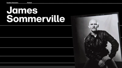
In our first episode, we talked with James Sommerville, co-founder of KNOWN_UNKOWN, about his ideas for the future of creative work, community, and work/life balance in a post-pandemic world.
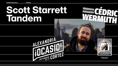
In our second episode, Monotype Creative Type Director Charles Nix talked with Scott Starret, co-founder of the design studio Tandem NYC, about serendipity and the experience of designing for a transformational political candidate.
After a year like no other, and with an ever-changing future ahead, it is truly an exciting time for the creative industry. Join Charles Nix and Phil Garnham from the Monotype Studio for an in-depth look at the typographic trends that have emerged from this experience.
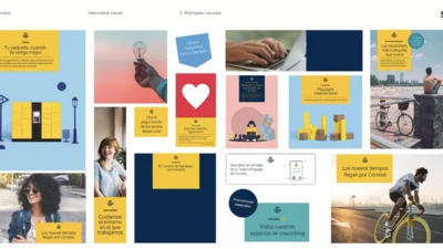
Pablo Amade, Creative Director for SUMMA Branding, presents his Correos case study at Brand Talks Connected – EMEA on November 18, 2020.
