Resources.
Monotype Fonts is the only on-demand font service designed by creatives, for creatives—making it easier than ever to find, manage, and share the world’s best typography.
Monotype is thrilled to introduce the recipients of the second annual Type Champions Award, a program that recognizes brands for their creative, innovative, and memorable use of typography in developing and maintaining their brand identities.
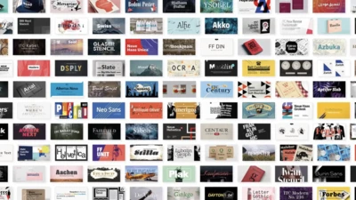
These days, designers have more fonts to choose from than ever before. When you’re starting a new project for your brand or receive a client brief, it’s easy to lose valuable time in a cycle of browsing, testing and second-guessing. In this tutorial, Monotype’s Content Manager, Carl Unger, will share helpful tips for choosing the right font.
Charles Nix, Monotype Creative Type Director, demonstrates how new variable font technology will enable designers to create with exciting, engaging, and effective typography.
Monotype’s Futura Now family is a revival and expansion of the famous typeface we all know so well. But do we know it, really?
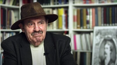
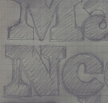
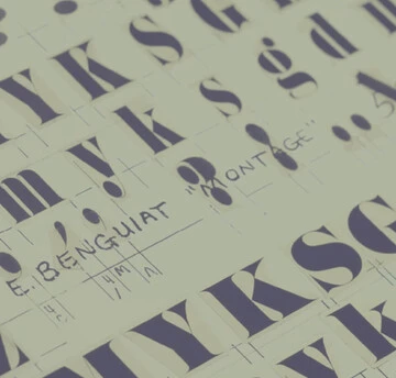
Ed Benguiat loved to draw letters. It’s what he did best. When he was not creating a new typeface, he could usually be found working on a piece of hand lettering or logo design for one of his many clients.
This webinar is for everyone who touches your organization’s font strategy—creatives, IT and procurement managers, even the finance team. We will be speaking to the ways Monotype can help your brand look great, streamline team workflows, save time, and take the headache out of managing fonts.
Brand Talks Connected delivers Monotype's popular Brand Talks event series directly to wherever it is you’re working these days. We hope you’ll join us for the next virtual event.
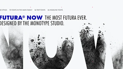
In light of breathing new life into typographic icons, the Monotype Studio would like to invite you to learn first-hand about a definitive version of a beloved font family that will offer designers a chance to see a classic with fresh eyes.
The contemporary version of this versatile family organizes and makes cohesive 90 years of one of the most popular typefaces of all times. It’s more true to the original than any digital version you’ve ever worked with, and brings to life 37 new styles, including a variable version.
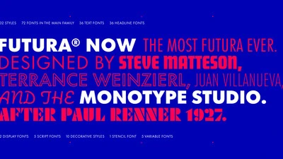
Futura Now is the definitive version of the definitive geometric sans, re-digitized based on Paul Renner’s original designs and updated to provide a more contemporary typographic palette.

It’s difficult to imagine the 20th century without Futura. Released by the Bauer Type Foundry in 1927, Paul Renner’s Futura was a near-instant hit that quickly established itself as an iconic, immovable piece of our shared culture.
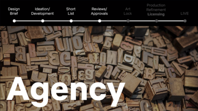
Kevin Laurino, Manager of Art & Print Production, Retouching and Finishing, at Netflix shares experiences from his career-long relationship with fonts and solutions his team has implemented to simplify licensing and improve collaboration.
