Resources.
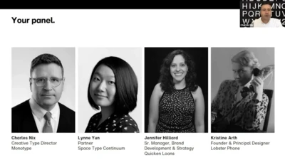
Charles Nix, Creative Type Director at Monotype, moderates a lively discussion with esteemed panelists Kristine Arth, Founder & Creative Director at Lobster Phone; Lynne Yun, Partner at Space Type Continuum; and Jennifer Hilliard, Senior Manager, Brand Development & Strategy at Quicken Loans. Watch the group discuss how they’ve adapted and uncovered opportunities during these unique and uncertain times. Learn more about Brand Talks here.
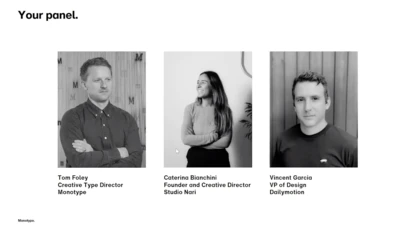
Tom Foley, Creative Type Director at Monotype, moderates a lively discussion with esteemed panelists Vincent Garcia, VP of Design at Dailymotion, and Caterina Bianchini, Founder & Creative Director at Studio Nari. Watch the group discuss how they’ve adapted and uncovered opportunities during these unique and uncertain times. Learn more about Brand Talks here.
Mark Borden, Editor-in-Chief and Head of Creative Strategy, House Industries, shares his perspective on the critical role of type in branding and culture. Learn more about Brand Talks here.

The National Football League has a long history of memorable logo design. We asked the Monotype Studio team to share their favorites, both contemporary and from childhood.
Bauer Media Group, an international multi-business company with hundreds of digital and print properties, implemented Monotype Fonts to serve fonts to hundreds of teams and thousands of employees across the world.
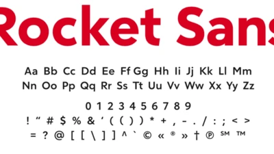
Monotype worked with Rocket Mortgage, the nation’s largest mortgage lender, to design a custom typeface for its brand to modernize and create consistency for the company across the full client journey.
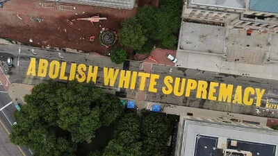
At its core, type is a storyteller. Letterforms deliver a message. And such messages are perhaps at their purest in the form of community-led designs for protest.
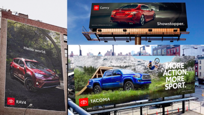
Learn how Toyota Type was developed as part of the iconic automaker’s new brand identity.

Mike Mandolese, Design Manager at HP Hood, explains how a quality-focused culture builds employee and customer trust and enables continuous improvement for design teams.
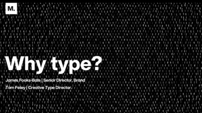
From brand strategy to sonic branding, learn why typography plays a significant role in your brand development. Monotype’s Senior Director of Brand James Fooks-Bale and Creative Type Director Tom Foley will guide you through what brands need to deal with today’s digital world, and into the future.
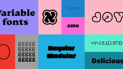
As businesses continue to ramp up their digital offerings amidst the Covid-19 pandemic, many designers, brands and agencies are turning their attention to variable fonts. But for many, the question remains: What are variable fonts, and what is the potential of variable fonts to transform how we are communicating on the web?
Everyone knows the saying, “what’s on the inside matters most.” Sure, a person’s character is more important than what they look like, but how does this relate to branding? A brand needs to look and act a certain way to engage with its audience, right?
