The Hundred - The new brand identity, for the new game.
Phil Garnham — Senior Creative Type Director, Monotype Studio.
The England and Wales Cricket Board (ECB) have reimagined Cricket with the introduction of a new competition; ‘The Hundred’. Monotype collaborated with FutureBrand London to create a bold and confident typographic identity aimed at shifting perceptions to attract a wider audience to the game.
The new ‘Hundred’ game format is simple: Eight teams, representing seven cities from around the UK, will compete against each other with 100 balls per team and the team with the most runs wins. The top three teams will compete in the ‘Finals Day’, the matches themselves will be fast paced and full of drama to help cricket reach younger, more diverse audiences with a focus on families.
In early 2018, a small focussed team of designers at FutureBrand London set out to name and create design concepts for the brand identity. As the competitions vibrant colour palette and graphic patterns emerged, it was clear that a strong typographic approach was needed. The fonts would play an important role and needed to stand up and communicate the brands values of fearless energy, optimism, the core idea of revolutionary cricket.
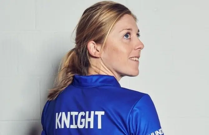
We were asked to help create a distinctive typeface for the brand, the scope of which extended to the players shirts, a junior participation programme called ‘Dynamos’ and the design of a bespoke typeface for the Manchester Originals team.
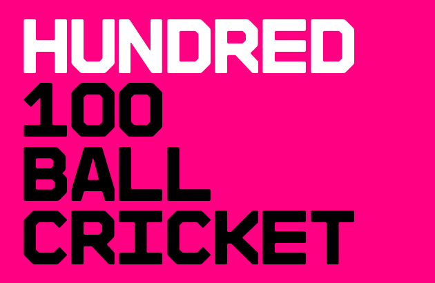
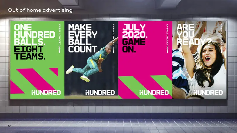
ECB Hundred — 100 balls. One voice.
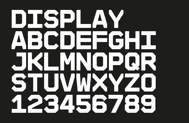
FutureBrand’s brief was clear: create a ‘mono-graphic’ headline typeface that can be set tight, to create blocks of stacked headings that ooze brand confidence. FutureBrand had spent a great deal of time researching type and we were in agreement that a distinctly solid, monospaced typeface that could imply the idea of a grid system would deliver a powerful branded voice. FutureBrand’s lively design system demanded a font with an impactful tone that also had to be readable and operate in short headlines. Establishing the correct letter proportions for the fonts wide ranging roles was vital.
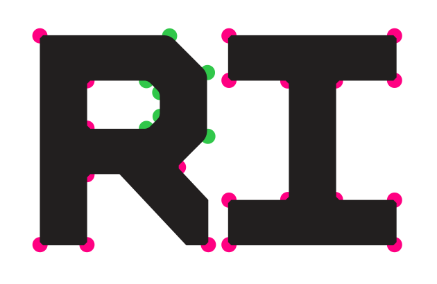
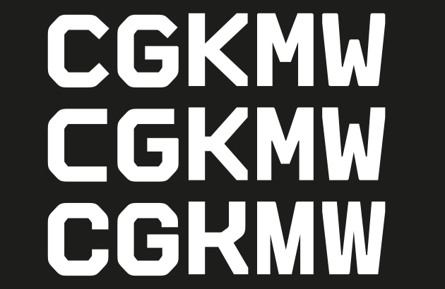
Taking inspiration from modular constructed type we created a monospaced, technical feeling font with a clearly defined character width. We created multiple creative options for specific characters such as C, G, K, M and explored ink trap and corner treatments to establish a clear creative direction. We chiselled into the letters and cut them off at the bounding box to create a sense of blocking, some gravitas and solidity. We were also mindful that the font needed to feel warm and family friendly in the spirit of the competitions audience. Warmth was added by short-cutting edges and softening rounded corner shapes.
We explored multiple structures for the figures, of which we had solid and stencil versions for each. We looked at different ways to cut in and stencil, to get the balance right as a whole set, not only as individual letterforms.
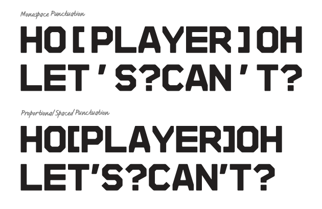
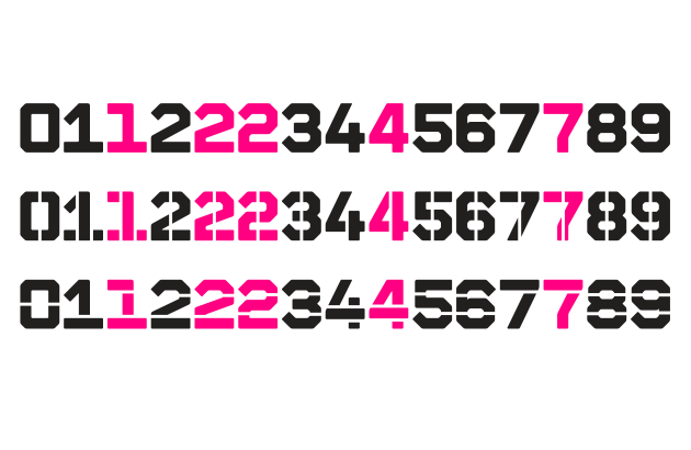
Monospaced fonts demand a monospaced ‘tabular’ spacing where every letter works within the same width. However, a bespoke font should very much be a bespoke font. As the Hundred font design went into brand testing we noticed some odd typesetting, some unanticipated white space gaps appearing where they didn’t exist in previous testing. A font’s ability to adapt to brand is important. We reviewed our approach to how we spaced the fonts punctuation, especially for when the fonts were used in mid-sized text e.g longer headlines or strap lines. It was determined a looser proportional approach to spacing the punctuation would work best. Sometimes it’s ok to break the rules.
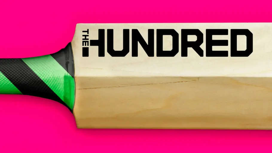
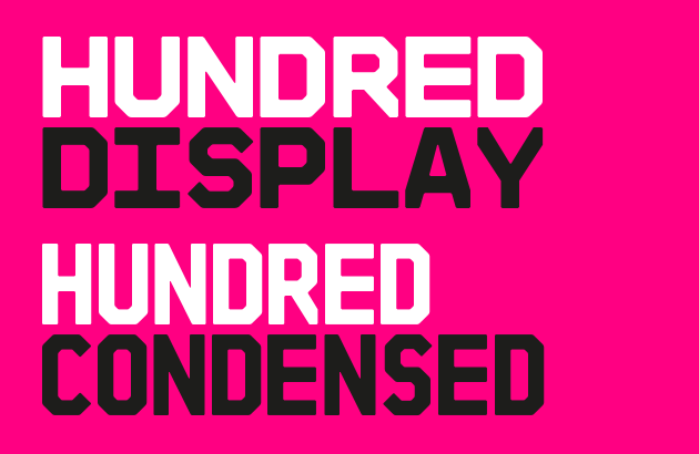
ECB Hundred Condensed
Once the final ‘Hundred Display’ font was established, our attention quickly turned to how we could adapt the design for the team shirts. The plan was to create a Condensed version of the font, which threw up challenges around readability. Did we maintain the same font weight? Would proportional letterforms read better at distance than monospace letters? Would specific character designs need a redesign to improve legibility?
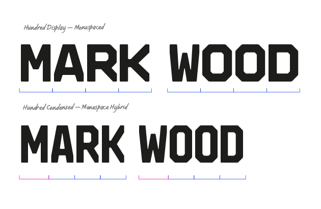
We reduced the fonts width by 25%, it’s weight by 14% and redrew all of the shapes to maintain a 45° angularity, in keeping with the original design. We then tested the font’s readability as a purely monospaced and proportional design. After much debate we created a ‘hybrid’ version, one which maintained a monospace approach but with redesigned characters such as ‘M’, ‘N’, ‘W’ and ‘4’ which are naturally wider. Once again, breaking ‘the rules’ helped us to improve readability yet maintain brand personality.
Katie Revell – Account Director, FutureBrand.
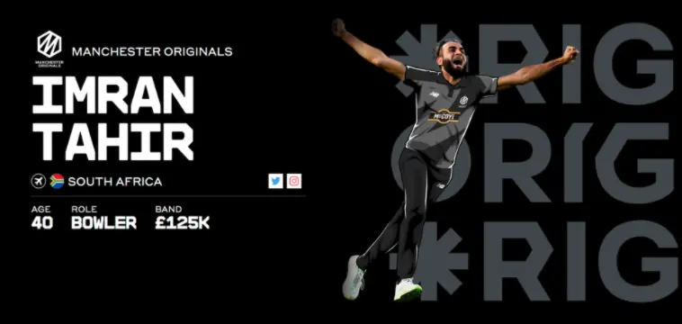
Manchester Originals.
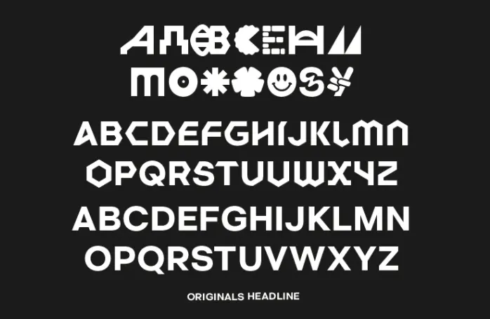
Each team in the competition has its own brand identity and we were lucky enough to work with FutureBrand on the design of a bespoke font for Manchester Originals. They coveted a typeface that would celebrate Manchester as “a global city of firsts”, a typographic identity that was bold and reflective of Manchester’s cultural heritage, as a city of innovators and creative power.

We created a typeface that literally embodied Manchester’s iconic culture as an alphabet. These cultural icons were designed by FutureBrand and crafted to fit the typeface by our design team, they sit within a core skeleton of cap letters, with each cap having two forms — a standard grotesque and hexagonal disruptor alternates. The hexagonal shapes were developed to create a feeling of spontaneity and empower the brand to craft and create variety in messaging. They evoke the team and city’s spirit of innovation and creativity.
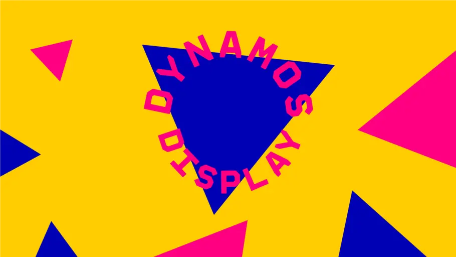
Dynamos Display.
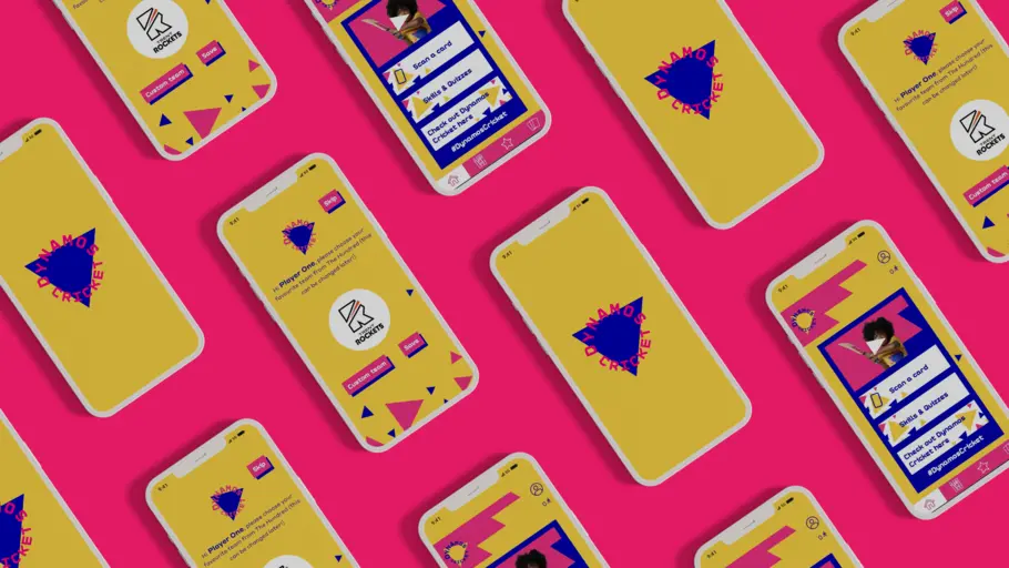
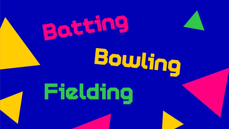
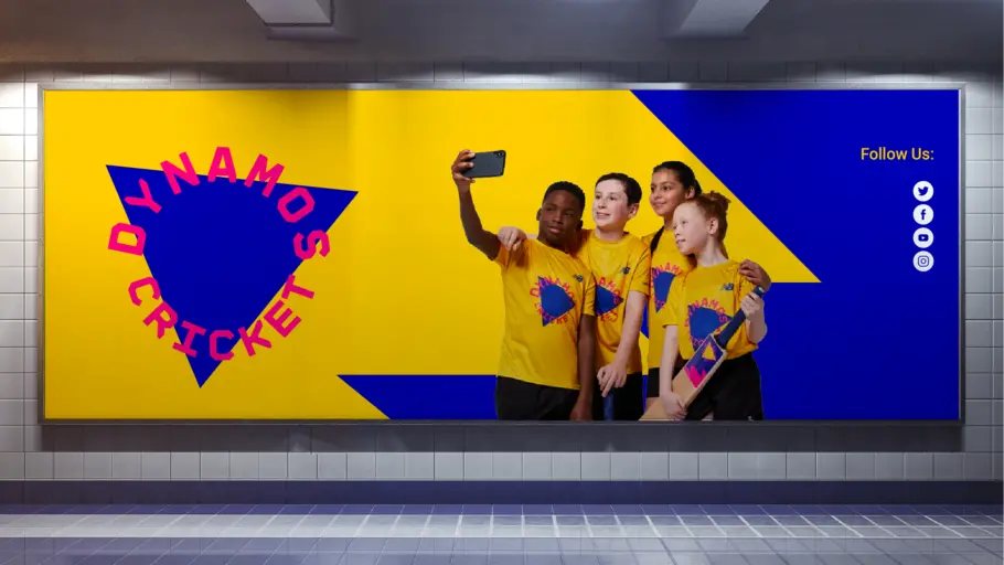
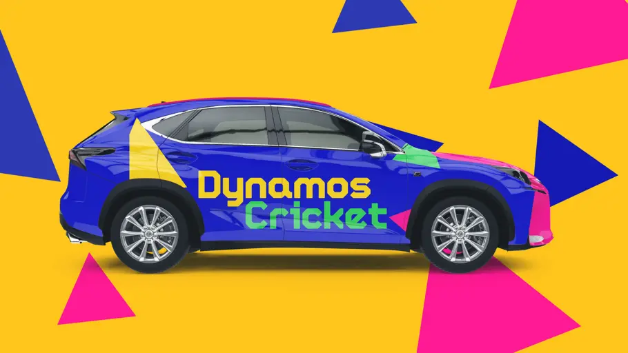
Dynamos Cricket is a junior participation programme for 8-11 year-olds who are either graduating from the All Stars Cricket programme or are entering the sporting world of cricket for the first time. The brand is built from the idea of energising the game of cricket for a new generation of players, and seeks to bring a confident urban attitude. We created a new typeface for the Dynamos brand, entitled ‘Dynamos Display’. This specific cut of the ECB Hundred font was created with a full lowercase to aid readability and comprehension for younger readers, whilst still maintaining a link back to the core brand. This font is used in short, sharp bursts to add drama to punchy headlines.