Cotford takes you places: A soulful, contemporary serif typeface for the digital age.
Tom Foley, Creative Type Director.
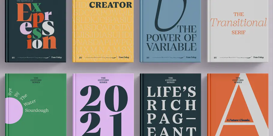
New from the Monotype Studio, Cotford is a contemporary serif from Creative Type Director Tom Foley, featuring a variable font and 16 static weights, including Display and Text styles. Cotford is available to all Montoype Fonts customers and can also be purchased at MyFonts.
Cotford is a ramble through city and field, marsh and mountain. It contains multitudes: The sea breeze, the echo of a cobblestone street, the whisper of grass in the breeze.
Dynamic, adaptable, and surprising—Cotford is a languid serif that ranges from delicate thins, bending and reaching like flower stems, to bold heavy weights that command the page and screen with confidence and vintage charm. And as a variable font, Cotford allows designers to explore and refine the design almost endlessly, unearthing its many visual tones and hidden secrets.
It’s unexpected. An escape. And not just for the designers and brands using it, but for its creator as well.
“I designed most of Cotford during lockdown,” says Creative Type Director Tom Foley. “It became a form of escapism for me, something I could immerse myself in and transform the anxiety of what was happening around me into something productive. In this way it’s a deeply personal project.”


Cotford reflects an experience many people had during the peak of last year’s lockdowns: A yearning for familiar comforts and a bit of warmth amidst the uncertainty. In response, brands and designers increasingly turned toward expressive, often nostalgic type as a way to connect through the distance, pivoting away from their reliance on humanist and geometric sans typefaces.
Those styles provided a good balance of aesthetic appeal, versatility, and legibility, and their use has dominated branding for well-on twenty years. But as digital branding has matured and evolved with changes in technology, companies are eager to diverge from that model and design brand identities that are unique, human, and personal—and just as versatile. Cotford is a typeface for this moment.
Tom Foley, Creative Type Director.
When Foley finally began the transition from sketch to screen, he set out to design a soulful, contemporary serif typeface that delivers all the versatility and robustness today’s designers expect. Foley paid great attention to the quality of every curve, across all optical sizes, giving all styles a clean and elegant feel. Designers and brands can trust that the integrity of the design holds up in both micro sizes and on huge billboards.

The Variable font is the fullest realization of Foley’s ambition, offering the wide typographic range and performance efficiency the digital age demands. This expanded spectrum of visual expression allows designers to explore, tweak, and adjust the typeface until they find the perfect weight, contrast, and optical size for their project. At the same time, Cotford’s static weights follow a traditional model of 3 text and 5 display weights, making it a strong choice for brands looking for simple implementation.
Cotford is the sum of all of these parts. It is a celebration of shape, form and attention to detail—contemporary and yet familiar. A pop serif for the digital age, Cotford takes you places.


