10 Ways to use the 2023 Type Trends in your designs.
If you’re like us, the fast pace of today’s digital design world can be both inspiring and a bit overwhelming at times. Like we said in our 2023 Type Trends report, “as designers, we know that the best way to hone our craft is by considering, questioning, challenging, appreciating, and doing design work.” How do you juggle all those project and client requests while broadening your techniques?
Fortunately, there are endless trends reports and thought pieces out there highlighting excellent work, as well as tools to help you filter and organize new forms of inspiration. If you’ve sat down to start a new project, and are looking to for ways to incorporate new styles into your work, let our 2023 Type Trends be your guide.
Trend #1: Match Maker.
Match Maker is a trend about pairing different typefaces based on principles of diversity and inclusion, resulting in dynamic visual communication. This trend has three branches: Mix-Up, Loopy, and Subtle. Try it out: Mix-Up is textured and chromatic, making it the perfect choice to invigorate identities for art, music, or technology events, fusing multiple ideas into one playful yet cohesive look. A tip to keep your Mix-Up styles looking uniform: use similar alignments, color palettes, and weights to calm the chaos.


The Subtle and Loopy takes are milder than Mix-Up. Pairing loopy forms with static type or simply pairing two typefaces can result in elegant and organic forms, often implying a human-like touch. Try it out: These trends would work well for any project that requires the feeling of luxury: think fashion, hotels, or even automotive brands. Not sure where to start when pairing fonts? Try our AI font pairing tool to jump-start your designs.
Trend #2: Smart Grid.
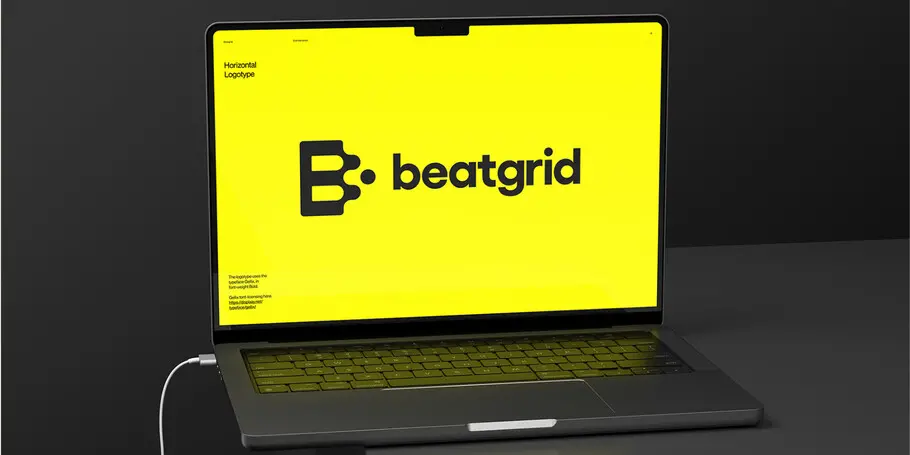
The Smart Grid trend blends art and science, utilizing grid structures with quarter or half circles to disrupt the pattern. It follows the NASA “worm” logo tradition. Try it out: Smart Grid forms are a sensible choice to serve as the face of any art, science, or technology brand.


Trend #3: Superhero.
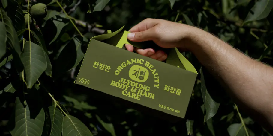
Superhero features outlined or shadowed forms that are often tilted, skewed, or curved into perspective. It has a playful comic book vibe and is explosive in form and color. Think big, bold, and fun, with lots of exclamation points. This trend’s dramatic aesthetic will call attention to any projects it’s applied to. Try it out: Superhero is the perfect choice to brighten up food and drink packaging or restaurant identities, but it also can work to shout out the mission for political or social impact organizations.


Trend #4: Super Sober.
Super Sober is the opposite of Superhero, showing up with graphic austerity, simplicity, and centeredness, often featuring muted color palettes and generous white space. It provides a quiet and precise look, standing out in a noisy marketplace and creating a moment of peace. Try it out: This trend’s soothing, Zen-like effect makes it a wise choice for products or verticals related to self-care.


Trend #5: Making The Cut.
Making The Cut involves cutting and removing pieces from letterforms to create sharp and edgy effects, often adding motion and visual interest. There is also a sub-trend highlighting use of decorative Ink Traps and a new trend called Hypertension, with sharp, flat, and diagonal forms that create visual tension. Making the Cut is becoming a fast favorite with technology and media brands. Try it out: Logotypes with these treatments can create cutting-edge effects for any company aiming to align itself with innovation and precision.


Trend #6: Pixel Play.
This trend uses pixel forms to add interest and show authenticity or homage to early digital experiences. Marks can include vintage video game motifs and beautiful glitches. A heightened global focus on sustainability has made all things vintage and antique cool again, thanks in part to their visual appeal and environmental benefits. Try it out: Pixel Play can work for almost anything: a fast-food restaurant logo, a luxury fashion app, or even car insurance branding. This trend is accessible and approachable, have fun with it.


Trend #7: Flux.
Flux is a trend that injects movement into design, whether via animation or variable fonts. Screens allow and encourage movement, and today even static images can look like they’re in motion. This trend includes Extended typefaces that convey a sense of sturdiness and confidence. Try it out: While we’ve spotted Flux used in everything from drone typography to conference branding, the Extended branch could play well with banking or finance verticals, offering a stable and legible appearance.


Trend #8: Volume Up.
Volume Up is a trend that blurs the boundaries between graphic design, motion, and 3D modeling. Like Flux, it emphasizes motion and suggests movement using exuberant expressions of dynamic design, lavish textures, and lighting. Try it out: Another utility player, Volume Up can find a home with arts institutions, media companies, or you guessed it: food packaging.


Trend #9: Liquify.
Liquify is all about organic and rounded forms, often showing up via custom lettering that looks like it’s melting or liquified. Legibility and readability are not a priority in this trend, and there is a move towards hand-finished designs using traditional art-making tools like paint and markers for authenticity and novelty. Try it out: Another foodie favorite: the artisanal approach and effects of Liquify lend themselves well to food and drink.


Trend #10: AI Painting.
AI design tools are rapidly evolving and will certainly change the art and design world, but we’re still only in the early days here. We call this trend, “AI Painting” because the letterforms often have a collaged look, with a soft focus or smudge in places where the machine stitched the image together. Sometimes AI painted type has a bizarre appearance, the untrustworthy uncanny valley. As for ways to incorporate AI fonts in your work? Head over to PicsArt to see what they’re doing to generate fonts with artificial intelligence. Finally, check out the book Artificial Typography which showcases an experiment Andrea A. Trabucco-Campos and Martín Azambuja ran in Midjourney to create fonts with prompts.


Future-proof your projects with awareness and agility.
Now that you’ve gathered a bundle of inspiration to take into your upcoming projects, make sure your font toolkit is sharpened, organized, and ready to go. Read on for ways to collect, organize, and catalog your type so that you can deliver high-quality, on-trend designs on time.


