Uncover 8 surefire sources of design inspiration.
As a modern creative, it’s easy to get swept away by trends and the latest and greatest. It’s also important to examine the constraints that come with the brief you’re working on before going too deep in the ideation process. First things first, though – let’s talk about how to get into that coveted creative flow state to set the tone for your project.
Below are some great sources of design inspiration (because you’re probably already browsing Behance and Pinterest):
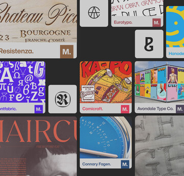
- The Brand Identity and It’s Nice That – Both of these sites are design resources with global reach and aim to champion creativity (just look at It’s Nice That’s mission) with high-quality content and beautiful showcases of graphic design and creative work.
- Pangram Paper – The type studio Pangram Pangram based in Montreal, Canada, produces an “experimental” editorial platform covering a mix of design news, typeface releases and designer interviews.
- Fresh Fonts newsletter - A paid indie newsletter rounding up everything happening in the type world. The best part? Subscribers receive a free font family every month, so you can feel good about supporting indie type designers and get hand-picked fonts delivered to your inbox.
- Adobe Live - Presented via Behance, Adobe holds live weekly sessions online with creatives. Hosted in France, Germany, the UK, and the US, it’s a fantastic resource; taking a deep dive into creatives’ profiles and their tips on different aspects of the creative practices.
- Weekly Typographic podcast – This weekly podcast by the League of Moveable Type is in its third season of in-depth conversations about the type and design community, including exhibitions, new releases, and interviews with designers.
- Instagram – The so-called “LinkedIn for creatives,” you’re likely already using Instagram to share and find creative work, but it’s more about fine-tuning your feed to work to your advantage. Curate your feeds to provide inspiration, so as not to get lost in endless scrolling, and be wise about how you save content you care about.
- Books – Building up a versatile home library may take years, but it’s well worth it when you need to take a step back and sit with something tangible. There’s no replacement for the vibrancy of printed pages and historical context that can get lost in the endless stream of content online.
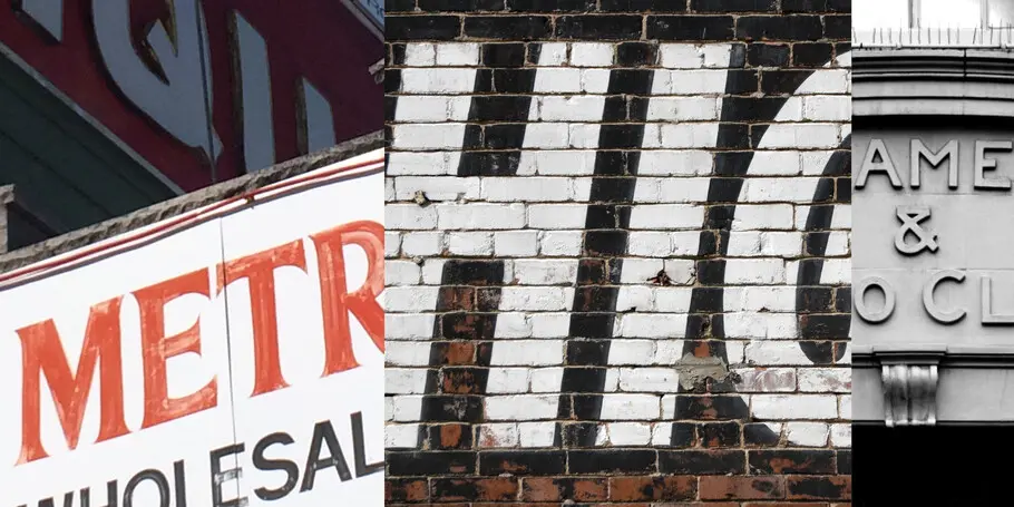
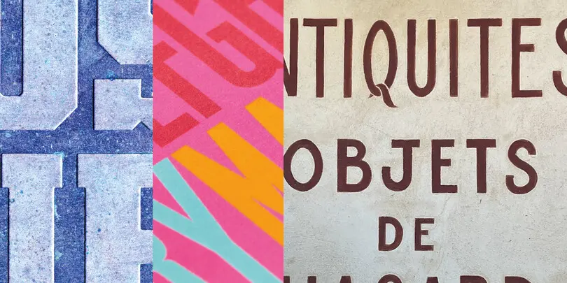
- The “real world” – When doing creative work, it can be easy to get lost in your screens, but don’t forget about the physical world around you. Set out on a scavenger hunt for hand-lettered signs, vibrant florals in nature or the curves found on cars. Once you’ve trained your brain to filter based on what you find inspiring it will become a natural process that happens by default.
If you’re seeking additional inspiration, look to some recent campaigns that were built on excellent use of type and technology.
San Francisco Orchestra rebrand by COLLINS – The work that COLLINS agency and Swiss type foundry Dinamo Typefaces teamed up on for the San Francisco Symphony demonstrate how powerful variable font technology can be when used to elevate both brand voice and brand content. The type forms are striking yet contemporary, responsive and variable — each character morphs in reaction to the sound of music. They show how variable technology can push a design concept forward in a way that makes sense.
M&M’S rebrand by JKR - This year, thanks to agency JKR and Monotype, the iconic candy brand got a modern makeover, with a revamped purpose of creating a world where everyone feels they belong. The rebrand included a fresh new look and updated personalities for the famous M&M’S characters; a more inclusive and welcoming tone of voice; and a custom, attention-grabbing variable typeface called All Together — a large, warm, playful, and conversational family.
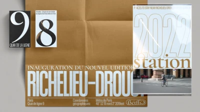
Paris 2024 Olympics custom type by Elliott Amblard, Joulie Soudanne, Art Direction by Sylvain Boyer, Royalties/Ecobranding, and Tina Payet– This custom typeface designed for the 2024 games is a reference to the last Paris games, held in 1924, nearly one hundred years ago. Its curved and slanted forms are emblematic of peak Art Deco styling, synonymous with French elegance. Finally, the custom type is a beautiful blend of contemporary and variable, designed specifically to adapt to all environments.
Evri rebrand by SuperUnion - Hermes, the UK’s largest dedicated parcel delivery company, recently rebranded as Evri. SuperUnion, along with the help of the Monotype Studio, designed a living logotype using variable font technology. Senior Creative Type Director Phil Garnham, worked closely with Superunion to create the logo which has over 190,000 versions, to help the brand realize its mission of positive and reliable delivery experiences for everyone, everywhere.
Be type-aware. Know what the boundaries are.
So you’ve got some creative angles for your project and you’ve sat down to start working… When does type selection come in? Depending on the sort of project you have or the kind of designer you are, type may come earlier or later in your work. If you’re a type nerd (like us!), your design process may be very type-centric. Whether you’re working on a custom type branding project or a type-heavy layout for an ad, it’s important to confirm that the typographic forms you choose will support the functions you want to achieve.
What’s the project brief asking of you? How can typographic form serve function?
Getting crystal clear about the requirements of the project is a critical step. Below are some starter questions to think through when starting any new project. These are just the tip of the iceberg though, rely on your brief for the full
- What is the role of type in the project?
- What language support do you need?
- Will diacritics be important?
- What kind of x-height do you need?
- What are the accessibility considerations?
- Which demographic(s) are you designing for?
Prototype with type early on.
Once you have a solid understanding of the requirements of your project, it’s a fine time to test your type options against them. Setting those constraints out establishes your problem-solving challenges.
- Can this font do what I want it to do?
- Can it support the project in a way that does it justice?
- Does the type have every feature that I want?
At this stage, things like unlimited font prototyping, font consultation services and subscriptions can help you visualize your own designs and determine if they’ll be sufficient for your project. Here are some good places to start browsing type, but note that Monotype Fonts is the only platform that allows you to prototype with fonts.
- Adobe TypeKit
- Monotype Fonts
- MyFonts
Find the font library for you.
Not sure where to start with choosing a font library or subscription? As you can probably imagine, not all font libraries are created equal. Depending on things like your project requirements, team size or licensing requirements, you may need a robust option meant for enterprise or something simpler. Read our guide to choosing a font provider here.


