Do you really need a custom font?
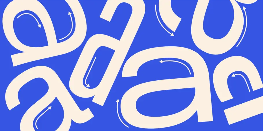
Choosing a font to represent your brand is no easy task. Your brand typeface is a first impression, the visual voice of your brand alongside your logo, colors, and imagery. Fonts carry emotional weight and can carry associations with other brands, content, or products.
Choosing a font to represent your brand is no easy task. Your brand typeface is a first impression, the visual voice of your brand alongside your logo, colors, and imagery. Fonts carry emotional weight and can carry associations with other brands, content, or products. When thinking through your options, there are three main solutions for type:
- Library - Select an existing typeface from a type library
- Modified - Take an existing typeface and modify it for your brand’s purposes and identity
- Custom - Commission the design of a custom typeface
How do you know which solution is best for your brand? Play along below to discover which option is right for you.
Are you going through a rebrand or brand refresh?
- Yes! And we need a new font as part of it.
- No. It’s just time for a new font.
- No – we don’t have budget for that right now.
Do you have time?
- Need it done yesterday.
- We have some time.
- Willing to go slow to get it right.
What’s your budget like?
- We’re prepared to spend money on this to get a quality font.
- We’d like to keep this as a moderate spend.
- We don’t have much budget for fonts.
Do you need to own the font outright so that no competitors can use it?
- Yes.
- Doesn’t matter.
- No.
Have you already looked for a brand font?
- Yes, and I couldn’t find what I was looking for.
- A little, and I found a few that might work.
- No. Where should I look?
Is anyone at your organization excited about choosing a brand font?
- Yes, loads. We would love to design our own brand typeface.
- Some people are, but there may be too many cooks in the kitchen.
- Not really - I’m alone in this mission.
What languages does your brand speak in?
- All of them! We want a typeface to use all over the globe, including support for Chinese, Japanese, and Korean.
- Not sure, the usual…
- English?
How often will you be choosing a new brand font?
- Not often – we’re hoping this new font has staying power.
- Not sure.
- We’ve been known to switch up our branding every few years.
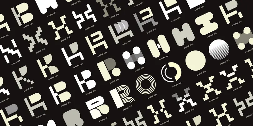
Will you need custom glyphs (logos or icons) with your brand font?
- Yes
- Not sure
- No
Font factors.
As you can see, the two major factors to consider first are timeframe and budget. Time and money are always important—in all business—everywhere—always. Custom-made fonts have a long lead time. Modified library fonts have a shorter time frame. Library typefaces are ready to go today.
Next up is the length of time between rebranding cycles. How long do you expect to keep this identity? The longer you intend to keep it, the greater the possibility of repaying the cost and time associated with a custom font. A new typeface isn’t the end of the effort. Type lives and speaks everywhere in an organization. New brands have a leg up on established brands here because there are bound to be fewer established uses. Change takes time, money, and effort.
Another important piece to consider is ownership or exclusivity. Does your brand need to be free to use the type everywhere in your organization? On every computer, with every brand partner, at every customer touchpoint? Does it matter if your competition is able to use the same font or would you prefer to own it outright?
Finally, your brand voice. Have you looked at whether there are existing fonts that encapsulate your brand vision or ethos? Are you going through a rebrand? If so, is it for positive reasons? Or did something happen at your company, requiring you to signify that things have changed, and you have established a new voice?
Brand type assessment.
Still not sure which to choose? Ask yourself (and any other internal stakeholders) these questions to help you decide on an approach.
- What do you hope to achieve through a custom-made typeface? Are you simply trying to avoid licensing? That’s a bad motive. ☹ Do you wish to find a unique typographic expression for your unique brand? Great motive. ☺
- Who are you as a brand? How do you see yourselves? Does everyone in the organization share that vision of who you are? Do you live that vision as a brand? Do your customers see you that way? Would you like them to see you that way? Is your idea of who you are an aspirational one? A realistic one?
- How are you different from your competition? Are you different? Sure you are, but how?
- What are your specific technical needs?
- What are your language or script needs?
- What do you think your future needs will be?
Proof points.
Finally, imagine yourself in each of the scenarios below. Are you facing similar challenges or working towards similar goals as any of the brands below?
A Playful New Custom Typeface That Reflects the Joy of M&M’S. This year, the iconic candy brand M&M’S came to Monotype looking for a new type family that would echo and amplify their brand ideal of creating a world where everyone feels they belong. The Monotype Studio gave the M&M’S type a makeover, bending the arc of an 80-year-old brand towards modern ideals. Other changes included a fresh look and updated personalities for the famous M&M’S characters and a more inclusive and welcoming tone of voice. The new, attention-grabbing typeface called All Together is a large, warm, playful, and conversational family.
Brainlab is Brought to Life with Modified Type. A global leader in medical technology, Brainlab had evolved into a powerhouse, transforming healthcare at scale across oncology, surgery, and total operating room digitalization. After 30 years, Brainlab was ready for a full rebrand and came to Monotype for a customized version of Helvetica Now to serve as their brand typeface. Taking inspiration from the iconic Brainlab logo created in 1989, the Monotype Studio incorporated shapes inherent in the logo design into the typography, resulting in Brainlab Now, a typeface evocative of what its brand stands for: open ecosystem and architecture, delivering a thoughtfully refreshed brand for “everyone, everywhere.”
Choosing from the Library for PRIDE NYC. Monotype and Lippincott partnered up to create a bold, inclusive new identity for NYC Pride, the marquee event held every year by Heritage of Pride, one of the most iconic, enduring LGBTQIA+ organizations in the country. The goal of the rebrand was to create a feeling of inclusivity and capture the spirit and importance of the organization’s home city of NYC. Fittingly, the organization chose two typefaces with strong NYC roots to represent the brand: Gotham® and Knockout®, both from NYC-based Hoefler&Co®. and now part of the Monotype Library.
Decision-making time: put your best font forward.
Now that you have assessed key decision-making factors, your organization’s needs, and font hopes and dreams, it’s time to explore the path forward for your new brand font. Here are several ways Monotype can help:
- Ready to go all in on custom type? Learn more about the process for commissioning a typeface for your brand here.
- Not sure about custom type but still want something more personalized? A modified option may be best for you.
Ready to find your own font? Unlock a world of typographic possibility (and access to over 250,000 fonts) with a Monotype Fonts subscription.


