An inclusive new identity for NYC Pride.
Sara Soskolne, Creative Type Director.
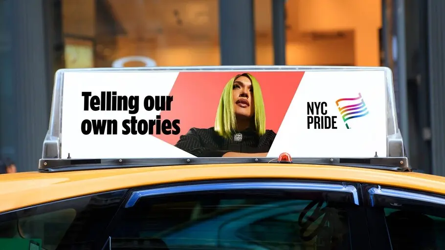
Monotype and Lippincott partnered up to create a bold, inclusive new identity for NYC Pride, the marquee event held every year by Heritage of Pride, one of the most iconic, enduring LGBTQIA+ organizations in the country.
40-plus years after the Stonewall Uprising in Greenwich Village, Heritage of Pride had arrived at a crossroads of sorts. Formed in the aftermath of Stonewall, the group’s legacy is woven into the full sweep of the modern LGBTQIA+ movement. As the organizer of the iconic NYC Pride march, The Rally, and other marquee events, Heritage of Pride has seen it all—from the early days of proudly defiant public demonstration through all the challenges, victories, and progress since.
Over the years, however, the organization never settled on a single, consistent brand identity for its centerpiece event, NYC Pride, choosing instead to change the visuals in keeping with each year’s theme.
The Heritage of Pride leadership team recognized it needed an enduring, resonant brand identity to help it drive equity and raise awareness around the organization’s incredible impact. Lippincott eagerly came on board to help Heritage of Pride develop a new brand identity for NYC Pride that would reflect the organization’s immense contributions to the LGBTQIA+ movement and the crucial role it continues to play. Monotype was honored to be a part of this project.
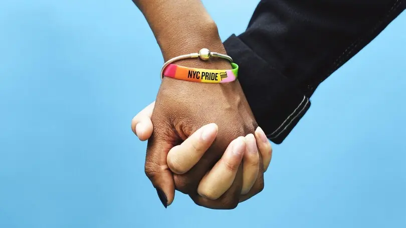
The goal of the rebrand was to create a feeling of inclusivity and capture the spirit and importance of the organization’s home city. This is New York after all, and the significance of the city and its people to the LGBTQIA+ movement cannot be understated. Fittingly, the organization chose two typefaces with strong NYC roots to represent the brand: Gotham® and Knockout®, both from NYC-based Hoefler&Co®. and now part of the Monotype Library. More on them in a moment.
The project began with a new positioning that would act as a foundation for the brand and experience. The new brand purpose, to inspire and empower every LGBTQIA+ person to proudly love and live their truth, speaks to NYC Pride’s roots in protest, and the annual celebration’s power in unifying and advocating for its community.
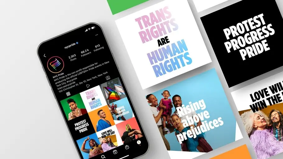
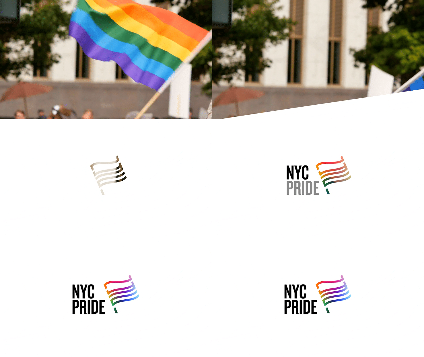
The new visual identity is built around an inclusive, community-centric and truly identifiable flag emblem—one that draws from history and captures the full range of today’s movement. The iconic Pride flag, which has evolved into a universal symbol of safety, community, and allyship, is at the center of it all, capturing the organization’s spirit of celebration and activism. The flag subtly features the letters ‘NYC’, and features an adaptive gradient, providing storytelling flexibility and inclusivity for different subgroups within the LGBTQIA+ community.
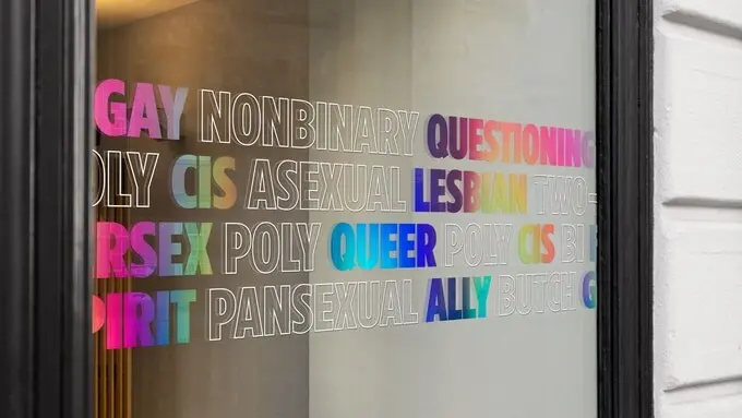
Gotham and Knockout bring more than NYC street cred to the story. With its roots in the eclectic typography of 19th century broadsides, Knockout brings an enduring fighting spirit that honors the determination of Heritage of Pride’s decades-long push for equality and representation.
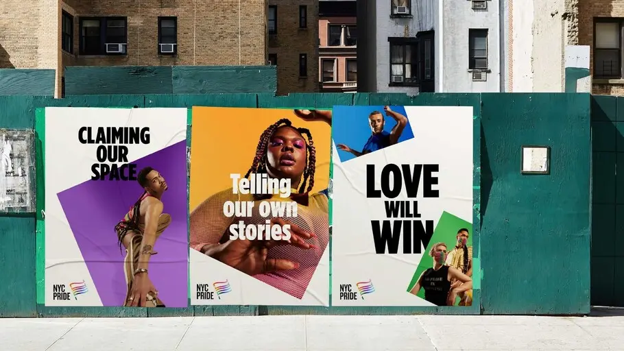
The unapologetically bold stature of Knockout perfectly counterbalances the friendly openness of Gotham, a contemporary take on a style of sign lettering found all over the streets of New York. Gotham’s elemental forms were made to express as broad a range of voices as possible. The prominent use of Gotham Condensed Extra Black allows the organization to speak in a voice that is both bold and welcoming, assertive and inclusive. Heritage of Pride joins a long list of prominent uses for Gotham, famously including the Obama campaign.
“I love seeing our typefaces put to use for such a meaningful cause and organization,” said Sara Soskolne, Creative Type Director at Monotype. “Knockout and Gotham are ideal choices to help tell the story of NYC Pride’s history and mission of inclusivity while conveying that it’s more than just an annual celebration—it’s a year-round commitment to equality.”
Jenifer Lehker, Partner, Design at Lippincott, added, “NYC Pride is recognized globally as a beacon of safety, community and allyship, but also as a symbol of protest and activism. Monotype understood this and beautifully contributed to our cause with the Gotham and Knockout font families, both of which truly convey the brand’s spirit and legacy.
“Pride began as a protest, and we wanted to capture a typographic voice reminiscent of bold, eye-catching posters used by protestors. Designed in NYC, Knockout and Gotham pay homage to the brand’s roots, while providing the visual boldness necessary to amplify the community’s voices.”
The fight for equality is never-ending, a fact that Heritage of Pride knows well. We hope this new identity for NYC Pride catapults the organization forward into a new era of advocacy and activism, and we are proud to play even a small role in that effort.


