Letters of likeness. A custom typeface for the National Portrait Gallery.
Karen Hughes, Co-founder and Creative Director, EDIT.
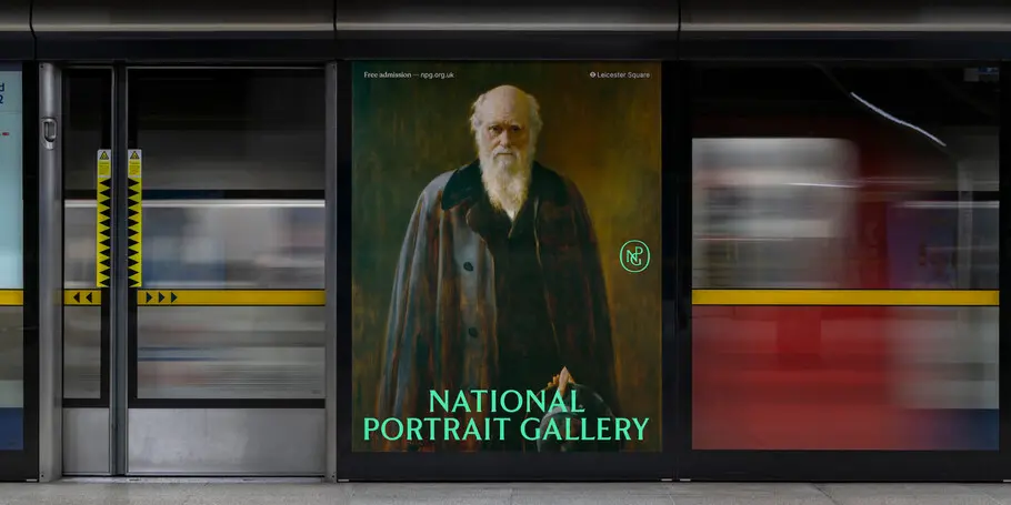
In early autumn of 2022, EDIT invited Monotype to partner on one of London’s most anticipated rebrands, the refurbished National Portrait Gallery which is home to some of the world’s most iconic and progressive portraits. Renovations began in 2020, when our friends at EDIT were tasked to reimagine the brand and develop a transformative strategy alongside partners Boardroom Consulting.
Typefaces, typography, and lettering are the foundations that underpin successful branding projects. Working closely with illustrator and lettering artist Peter Horridge, EDIT developed a new monogram and stackable logotype system that frames the vast, magnificent, and diverse collection of the National Portrait Gallery front and centre.
The early phases of the logo design process became a sounding board for typographic research and experimentation. Pairing typefaces to a logo, to a brand’s emotive quality and meeting the brand’s functional expectations can be challenging—it’s a process of discovery that aims to distill brand voice and persona into the form of letters. As the brand strategy and identity took shape, Monotype was asked to support the font discovery process and propose creative solutions to meet the brand’s needs.
Into the archives.
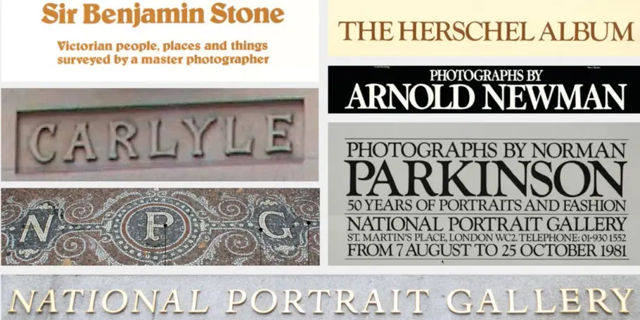
As you can imagine, the archives of such a prestigious creative institution provided a fertile backdrop to our project. EDIT and the National Portrait Gallery conducted audience research and sifted through the museum’s archives, providing our team with a huge array of material to work with, including all of the museum’s previous identities.
Monotype Executive Creative Director, Tom Foley, pored over countless ephemera to pull inspiration, from posters to brochures and even a stone mosaic that was recovered during the museum’s architectural renovation. “Having access to such varied and rich references from the NPG’s branding archive was a gift, and a curse,” said Foley.
Tom Foley, Executive Creative Director at Monotype.
A modern classic.
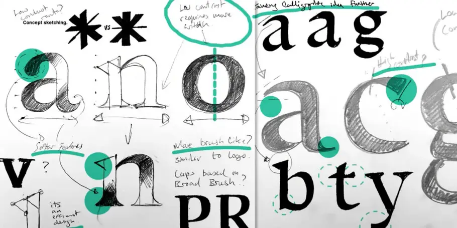
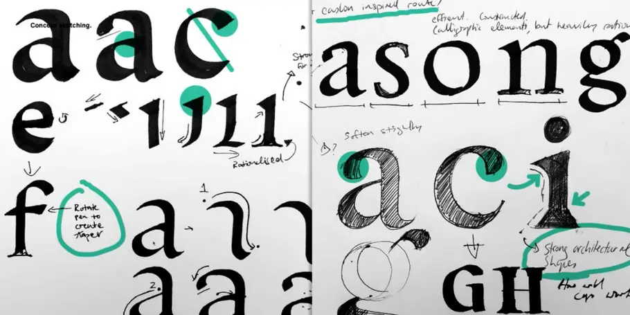
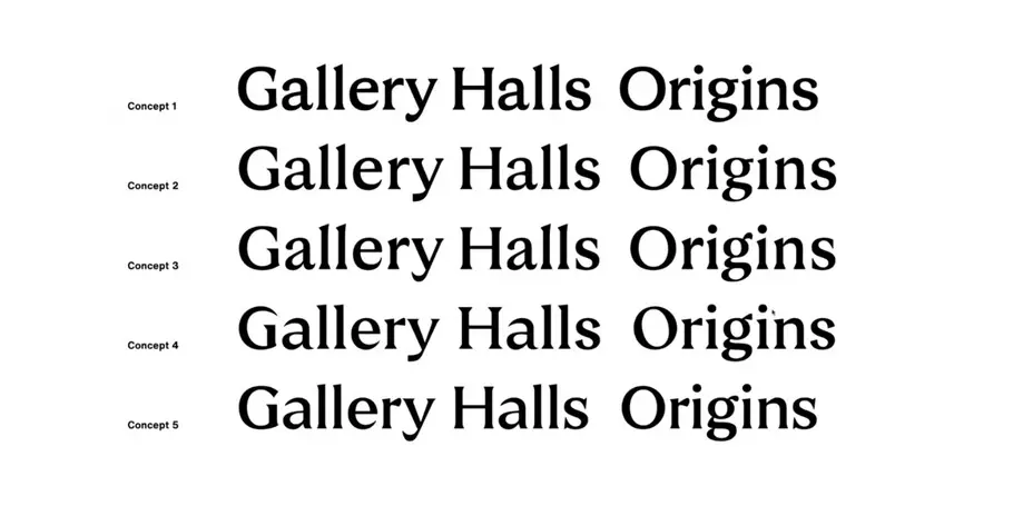
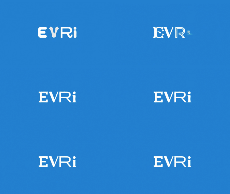
It became clear in the early phase of the project that this brand demanded a typeface with a sense of history, something that hinted towards an Art Nouveau-inspiration, much like the characters in the mosaic. So, with the project brief in hand, Foley selected pieces from the archive as reference points and quickly began sketching. From these hand-drawn ideas, five design directions were explored, each taking inspiration from different aspects of the brand’s heritage research.
Environment dictates design.
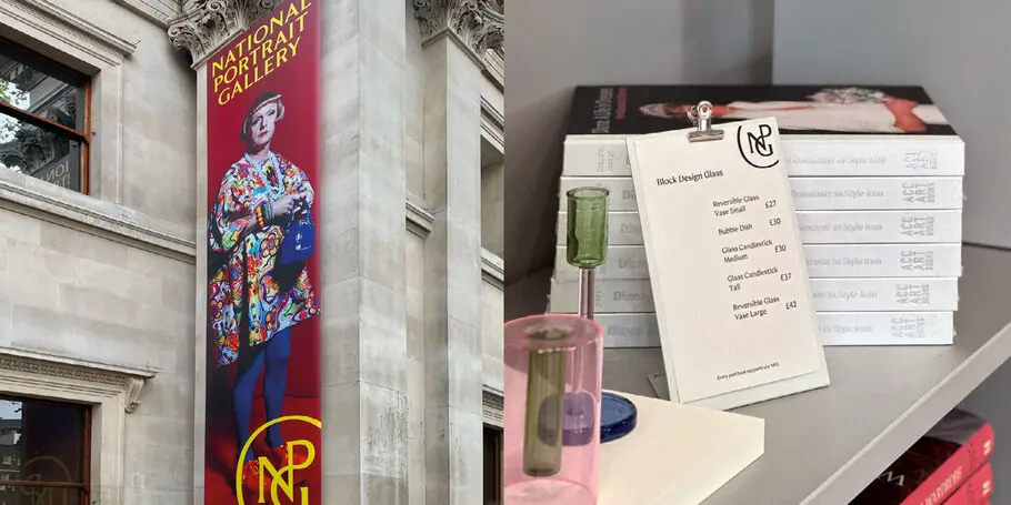
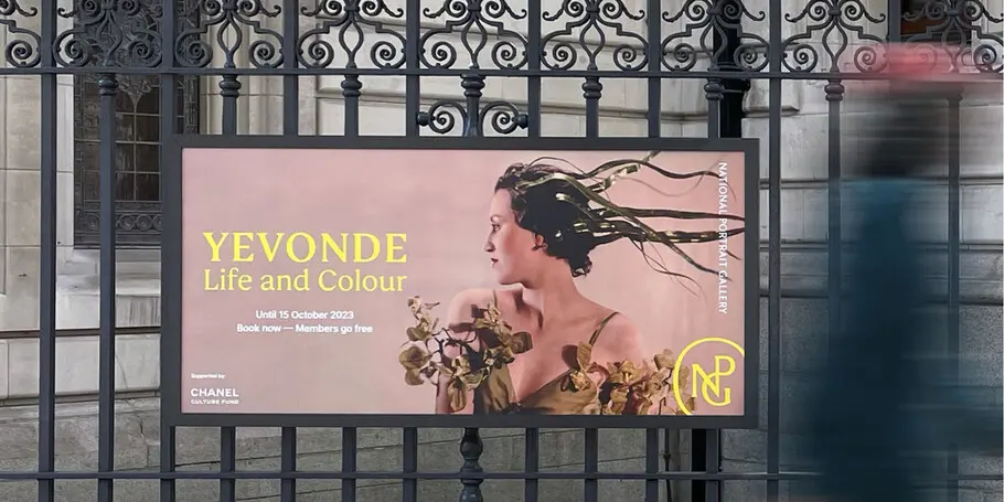
Typefaces do not live in isolation, it’s their ability to operate and synthesize new ideas within visual systems that continues to give them and brands distinctive superpowers. In a graphic system, the combination of elements revitalizes a typeface and reforms perception and interpretation. Monotype and EDIT collaborated closely, placing our type ideas into the new brand system as soon and as much as possible as updates were made, to get a sense of how it worked alongside imagery, lockups, and logotype. A pivotal moment presented itself, as it became clear that this typeface had to stand out against images of all sorts of contrasts and colors – this became a key observation that dictated many of the brand fonts design decisions.
Test, test, test… and test.
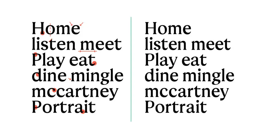
Selecting and arriving at a concept is easy. Type design is an art or craft. Defining an idea or direction is a small part of what becomes a significant working process of refinement and then much further refinement. We pride ourselves on our ability to craft letter shapes to exacting standards.
“We were trying to retain the aesthetic, but also make sure it works,” said Foley, “The original design was display-focused, but in later refinement, it becomes important to test it for different settings and use cases.”
EDIT had also been testing the typeface in the brand system, and a design agency working on the gallery signage also tested the type at big scales to see what worked best. All this testing provided invaluable feedback, all of which informed the refinement process.
Focused and conservative, by design.
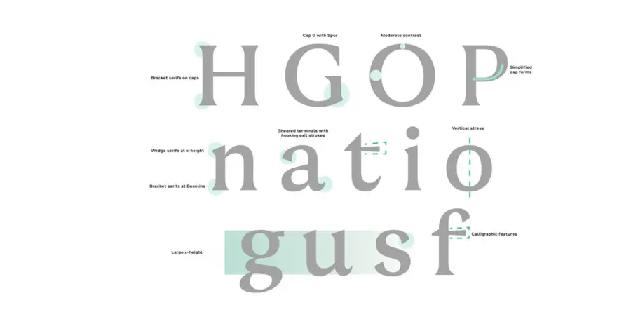
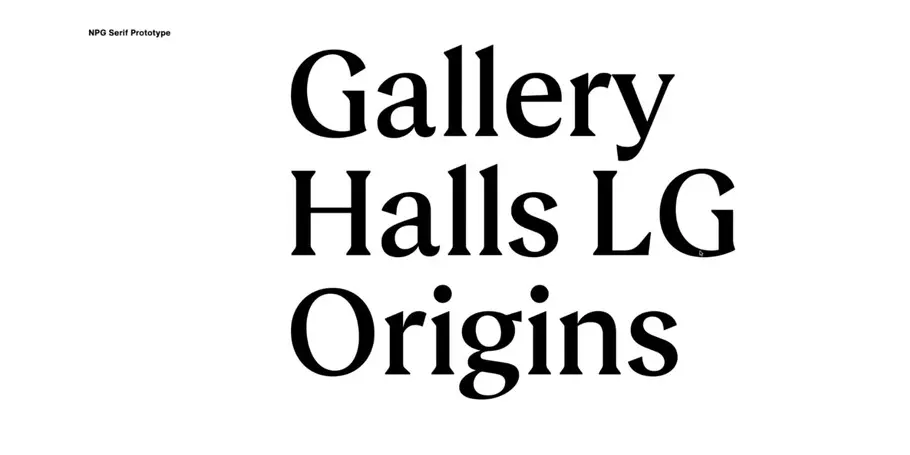
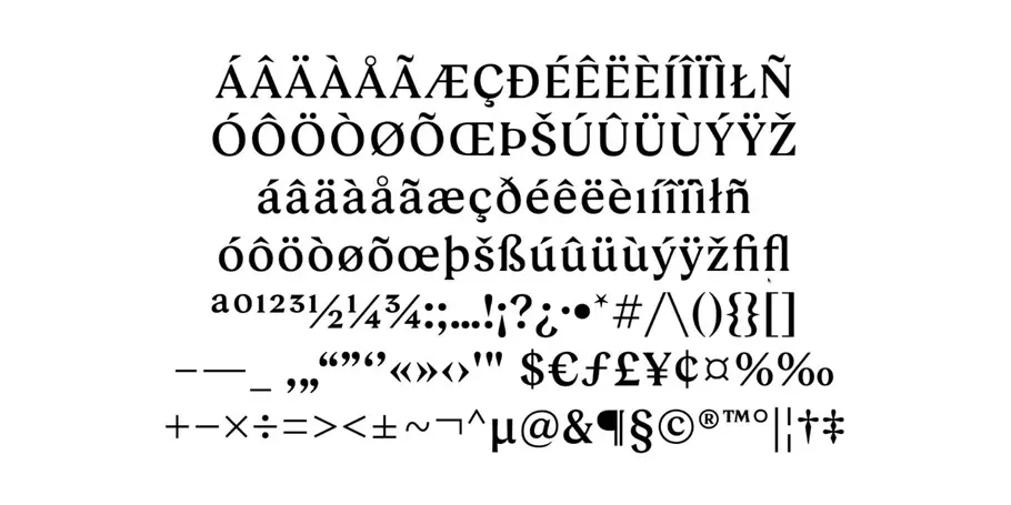
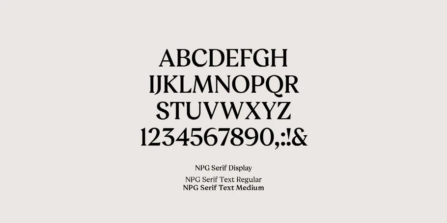
Comprised of a small family of three weights: one display, and two text, NPG Serif is a simple but robust design optimized to work across the gallery’s physical and digital platforms.
On June 22, 2023, the National Portrait Gallery had a successful grand reopening, debuting the renovated gallery, fresh identity and custom typeface to visitors.
“The focus was to create a visual identity that embodies beauty, longevity, and flexibility, celebrating the National Portrait Gallery’s cherished historical pieces and its contemporary collection and exhibition program,” said EDIT’s creative director Karen Hughes, “To achieve this, we also needed a bespoke typeface that preserved the brand’s heritage but can function in our modern world. Monotype delivered NPG Serif, an impeccable balance of classic and contemporary styles that feels fresh yet is rooted in visual details from the National Portrait Gallery’s rich history.”
Credits
Freddie Mercury (detail) by Neal Preston, 1986, Photo by Neal Preston © Queen Productions Ltd
Mo Farah, 2012 by Kate Peters
Maisie Williams (detail) by Miles Aldridge, 2017 © Miles Aldridge
Gluck (detail) by Gluck, 1942
L.S Lowry by L.S Lowry, 1938 © Rothschild Trust Company Inc; on loan to the National Portrait Gallery, London
Samuel Johnson by Sir Joshua Reynolds, circa 1756
Elton John (‘On the throne’) by Suzi Malin (1978) © Suzi Malin
Ira Aldridge after James Northcote (circa 1826) Private Collection; on loan to the National Portrait Gallery, London
All other images © National Portrait Gallery, London unless otherwise stated.


