Bringing the Pride Amsterdam identity to life with a unique type family.
Lucien Spee de Castillo Ruiz, Executive Director, Pride Amsterdam.
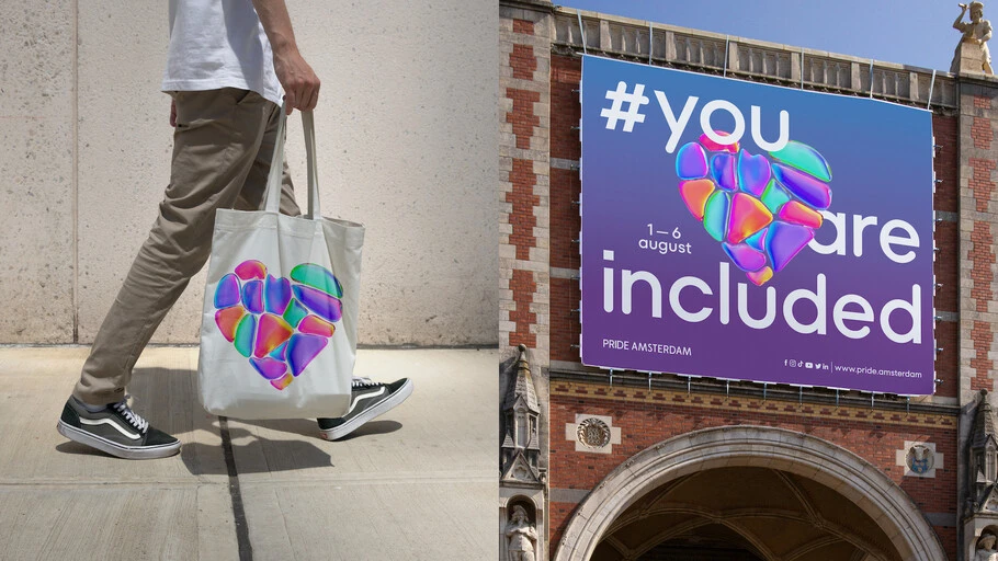
In 2022, Monotype partnered with D8 to craft a fluid new identity for Pride Amsterdam, one of the biggest Pride celebrations in the world, attracting thousands of visitors.
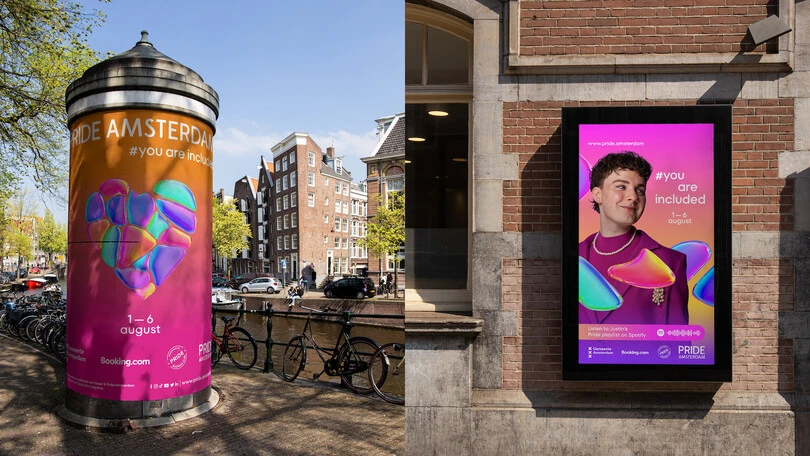
In 2023, we were honored to modify the typeface TT Fors to offer Pride Amsterdam a lasting brand asset to complement a fresh new brand theme.
Each year, Pride Amsterdam takes over the city for a week in late summer with dance parties, film screenings, sporting events, debates, exhibitions, education, and its famous Canal Parade. The event attracts hundreds of thousands of visitors, making it one of the biggest Pride celebrations in the world.
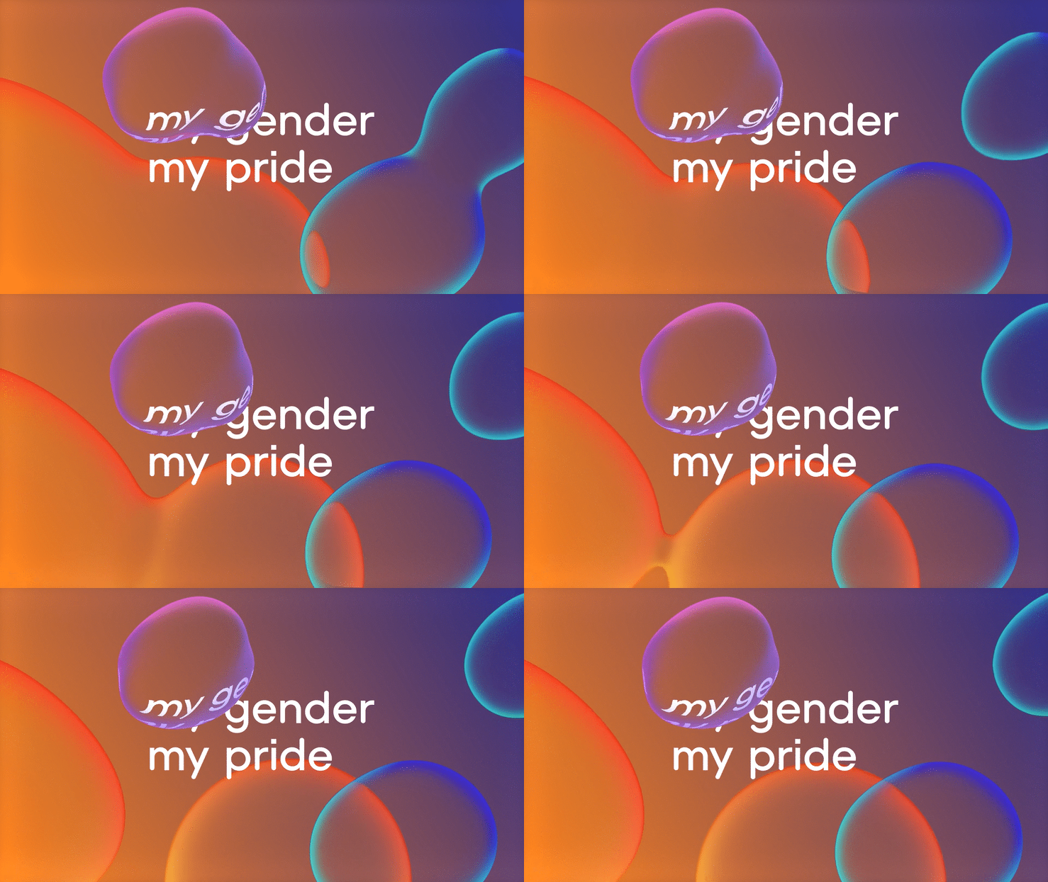
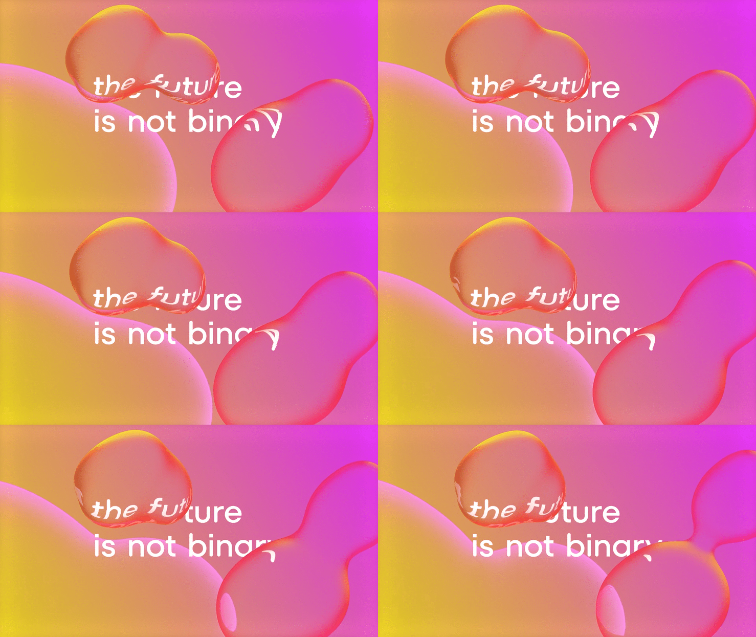
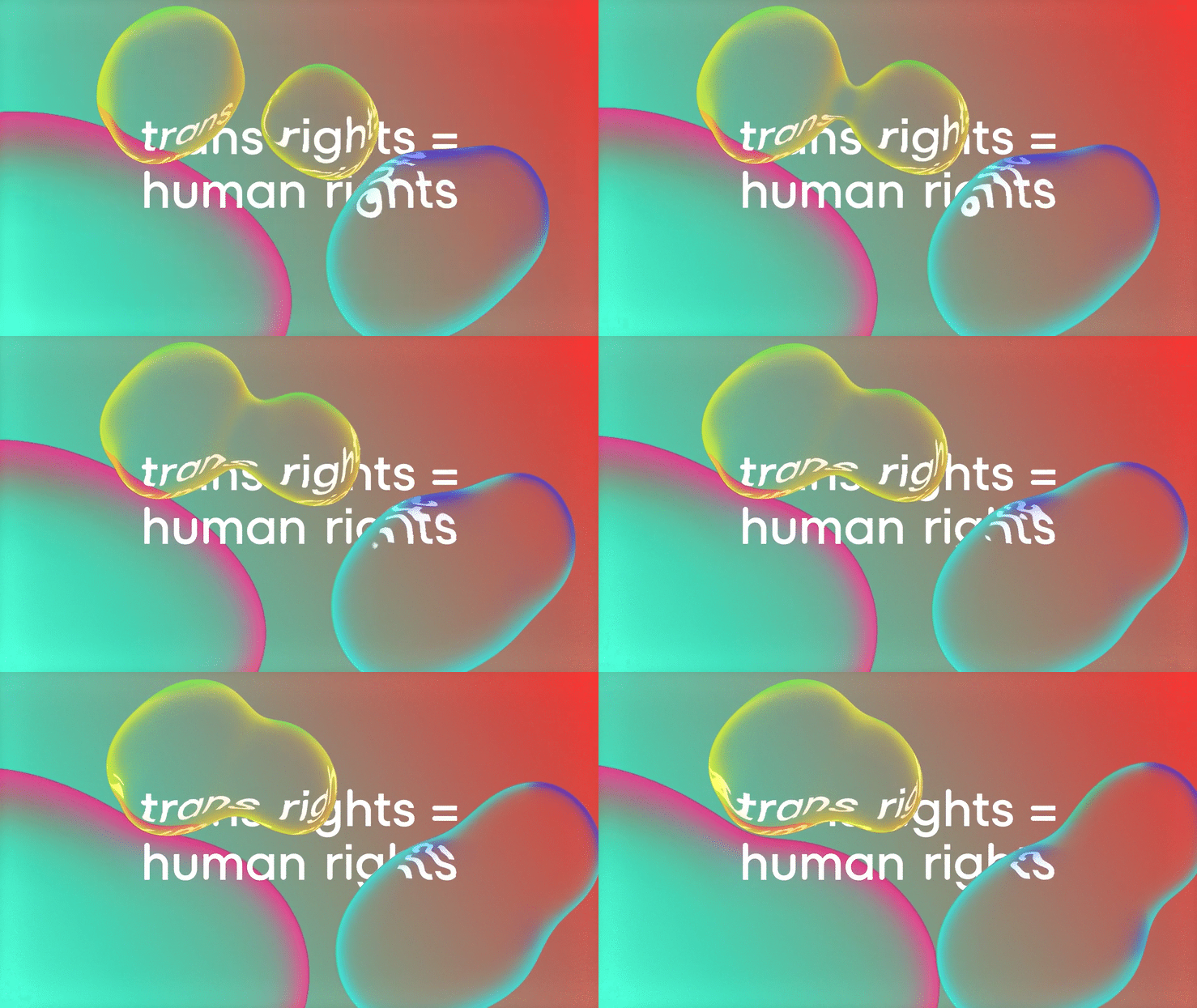
Our partners D8 led a rebrand for Pride Amsterdam in 2022, reflecting the theme of, “My Gender, My Pride.” Ultimately, the idea of “fluidity” and flags representing the diverse Pride community inspired the shapes, colors, and iridescent gradients for Pride Amsterdam. D8 needed a simple, clean typeface to balance the highly colorful visual language. Monotype supported the brand with TypeType’s geometric sans TT Fors for the identity, which D8 customized with square and round shapes to lend an air of quirkiness.
2023: You are Included.
D8 created a new thematic style for this year’s Pride, which focuses on inclusivity. The typeface TT Fors worked so well in the initial rebrand, that D8 returned to Monotype to make actual modifications to the typeface so that it’s fully functional and can be used for any text; not just headlines. Pride’s visual identity changes thematically each year, with the only constant being the Pride logo. The typeface has become a useful instrument, an anchor for the brand’s identity to morph around each year.
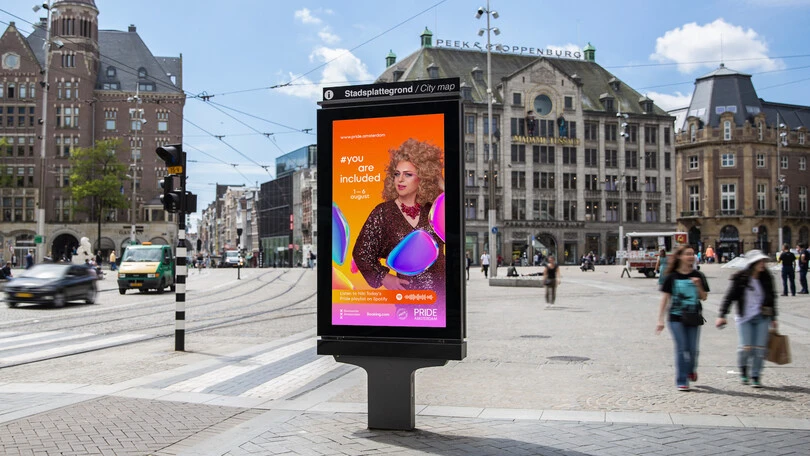
The City Council of Amsterdam gave two organizations the right to host a week each of Pride. Queer Amsterdam is hosting the first week, and Pride Amsterdam is hosting the second week, and now thanks to a clear identity – they’ll stand out as their own organization even if both celebrate and support common goals.
Evoking the spirit of Pride Amsterdam through type.
In a practical sense, the typeface brings simplicity and balance to a fun, colorful identity with many ingredients. The simplicity of TT Fors is useful in grounding the identity amongst bright colors, gradients, and imagery. The modified TT Fors for Pride retains the clarity of the original typeface, while introducing an unexpected and cheerful mixture of shapes and rounded stroke endings, evoking the feeling of diversity, quickness and originality.
Emilios Theofanous, Creative Type Director, Monotype.
Having also supplied Gotham for the type for NYC Pride, we’re elated to now have the important story of Pride written in our type in two major cities. While the vibrant identity would be nothing without its varied color system, fluid shapes, and, most importantly, a rich community of ambassadors, we’re proud that our type is a piece of such a meaningful mission.
Looking to the future: World Pride 2026.
Amsterdam is looking forward to hosting World Pride in 2026, the ultimate Pride event, for the first time ever since hosting citywide celebrations since 1996.
Lucien Spee de Castillo Ruiz, Executive Director, Pride Amsterdam.
