Utility, authority, and a hint of steel for Bekaert.
Phil Garnham, Executive Creative Director at Monotype
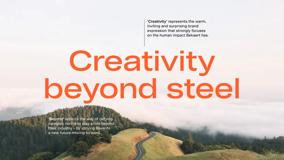
Monotype designed a pair of custom typefaces for global market leader in steel wire transformation and coating technologies, Bekaert, creating a bold, modernist design that speaks to the company’s extensive history and industrial heritage. The typefaces are an integral part of a company-wide rebrand, led by Interbrand and designed to support Bekaert’s ambition to be the leading partner in shaping the way we live and move: safe, smart, sustainable.
The challenge:
Bekaert has over 140 years of pioneering heritage, founded in Zwevegem, Belgium, where Leo Leander Bekaert started a small, barbed wire business to help farmers who needed to fence in stubborn, straying cattle. Since then the business has expanded around the world and also applies its expertise beyond steel to create new solutions with innovative materials and services for markets including new mobility, low-carbon construction, and green energy. Bekaert’s solutions can now be found in everything from cable-stayed bridges and car tires to champagne cork cages and electrolyzers for hydrogen production.
However, while the business is flourishing, the brand called for some attention. Historically, Bekaert had focused on B2B, technology and product-focused marketing, but realized it needed a clear, strategic brand foundation, and a new visual identity. This had to support the brand with its plans for the future, as well as attract new talent into the business.
“Bekaert wanted to be more visible, stand for something and own a topic,” says Interbrand’s Executive Director Creation Jens Grefen. “They wanted to be more present as a brand with an attitude and mindset.”
Interbrand and Bekaert knew that the company had to combat a “sea of sameness” when it came to a rebrand. In the world of steel that means plenty of grey and bluish tones, and not a whole lot of personality - typefaces included. Although Bekaert itself has a rich, historical narrative, any new piece of branding or typography had to move the business onwards without neglecting this heritage. And finally, Bekaert had to emphasize its hard-earned authority in the field, while expressing the future-oriented innovation happening within the company.
“We thought about a custom font because that would really push the visual story further in terms of what you want to achieve as a purpose-led brand, reflecting how interactions should feel with you, as a company,” says Grefen.
The solution:
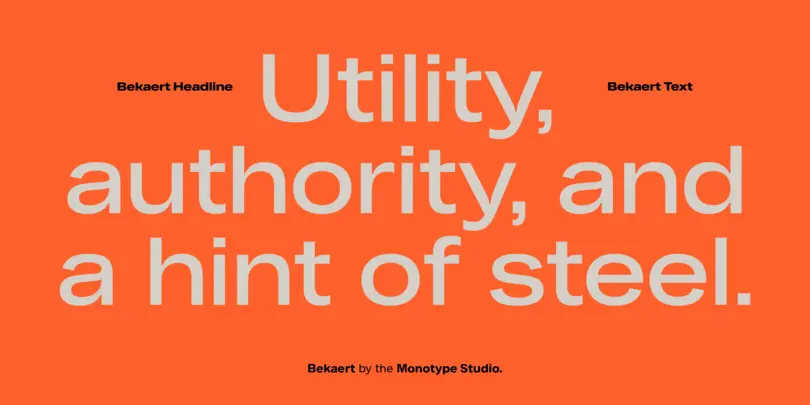
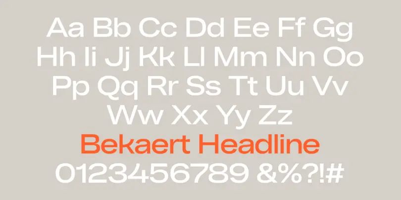
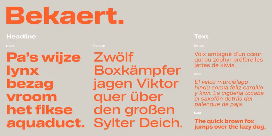
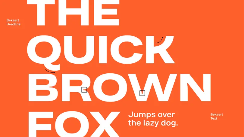
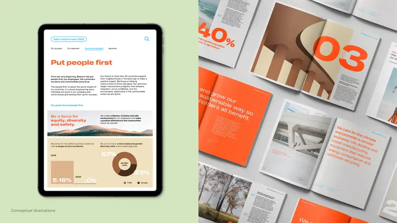
Enter Bekaert Sans and Bekaert Headline, a pair of custom typefaces that speak to Bekaert’s industrial heritage without sacrificing personality. Bekaert Sans offers six weights, designed for use in text, while Bekaert Headline has a single weight, intended for bold statements around the company’s ambition, portfolio offering and employer proposition.
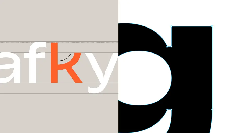
The arm of the K in both typefaces extends gracefully upwards, in a reference to Bekaert’s logo, and an echo of the ductile qualities of steel wire. “We have these really nice, elevating curves, which work well in dialling down the abruptness, or maybe the ruggedness you often see in grotesque fonts,” says Phil Garnham, Executive Creative Director at Monotype.
Phil Garnham, Executive Creative Director at Monotype.
These details particularly shine through at larger sizes, which reveal the design’s snippy, incised ink traps. These elements speak to the physicality of Bekaert’s products, as well as the history of type, and the way it was once manually constructed – another nod to the brand’s own, long heritage.
“The typography, for me, was like the cherry on the cake,” says Grefen. “This is what really makes it theirs. It gives you a fresh feeling, but also feels like it’s been around for a while, so has this gravitas and history to it. You go, ‘Oh, this is very modern’, and you see this in modern design as well.
The custom typefaces were an instant hit with Bekaert’s rebranding team - who described the K as ‘quirky’. The set of letters strikes a careful balance; sturdy and robust enough to express the company’s authority, while adding a certain character that reflects the creativity that leads to unique solutions.
Bekaert’s design team were also fans. “When we showed one iteration of the piece, one of the designers from Bekaert said, ‘I love that, I’d put it on my teeshirt and wear it everyday’,” says Eva Olk, Senior Designer, Interbrand Cologne. “It was nice to see designers feeling proud of having this unique type set.”
The outcome:
Bekaert Sans and Bekaert Headline have created huge practical, as well as creative, benefits. Although Bekaert had initially discussed licensing fonts, the brand decided to commission something totally unique and ownable only to the business. “This peace of mind element was quite important,” says Olk. “They are a global company, they have a lot of company locations all over the world, they use different languages, so that was one positive aspect. They can have one typeface they can distribute all over the world to the different offices, use in various languages, and it’s unique and distinctive.”
“It’s this ease of use,” adds Grefen. “They can share it, they can spread it within the organization, and it will help create internally, this identity of belonging together and creating this visual realm of ‘this is us’. As an organization with teams around the world, type is a key element.”
More than this, the typefaces reinforce the broader vision for the business. “Bekaert was looking for a visual identity that sends a clear signal that the whole company is building on its strengths and moving in new directions. Something that energizes people, and rallies them under one flag that says “this is our next chapter”. says Grefen. “This is what we need to do in the future to stay successful.”
The custom typefaces give Bekaert a newfound freedom of expression. They defy category norms, helping the brand to cement its position as a leader, while reminding partners and consumers of the human side of the business. Bekaert has a new sense of confidence when it comes to communications, and now has the necessary tools to experiment further with its branding and typography. According to Interbrand, the updated identity is inspiring the company to look anew at its marketing and comms strategy, as well as other aspects of business such as events.
“The type has the potential, alongside the iconic symbol that they’re using right now, to become one of the signature assets for them, that really makes them distinct in the future,” says Grefen.
“Attentive typography is vital in today’s unsettled world. Brand ‘is’ reading and so speaking with a clear, ownable typeface that evokes the company’s values is undoubtedly one of the most effective assets brands can use within a highly competitive market. Bekaert’s typeface is a great example of type effectiveness in action,” says Garnham.


