Q&A from the 2023 Type Trends Webinar.
We recently presented our 2023 Type Trends report during a lively, interactive webinar. Our Creative Type Directors and report curators, Emilios Theofanous and Terrance Weinzierl, walked through the projects featured in the report to a global audience of over 1,300 live attendees. There were too many thoughtful questions to answer during the Q&A, so we’ve taken the time to answer them below. Enjoy!
Artificial Intelligence.
How is AI influencing type? As we said in the Type Trends report, and in the podcast, “AI will change the art and design world; we just don’t know exactly how it will pan out yet. While artists dabble and dissect the opportunities with new tools like AI, everything is under scrutiny. AI promises to accelerate the prototyping and ideation stages, leaving us more time for strategy.
AI-painted letterforms often have a collaged look, with a soft focus or smudge in places where the machine stitched the image together. Sometimes AI painted type has a bizarre appearance, an uncanny valley vibe we don’t immediately trust.” We’re still holding out for truly AI-generated type that’s as good as the “real thing.” That said, we recently launched a free font pairing tool that uses AI to suggest good font pairs. Gain inspiration for your next project today here.
What was the AI typography book you recommended? Artificial Typography by Andrea A. Trabucco-Campos and Martín Azambuja. Read an interview with the curators here.
Legibility and accessibility.
Are there trends related to meeting ADA requirements and selecting and pairing typefaces? As far as we know, there are no ADA requirements for actual typeface features, just the typography, or how type is used. Legibility is a common FAQ here at Monotype. There are several features that can make a typeface more legible, but again, legibility/character differentiation and readability comfort are a combination of the typeface and typography. Read our recent piece, How to find a legible font, for more information.
What are accessible fonts for medical electronic dashboards? While we don’t have a list of fonts for medical dashboards, we do have two collections for related use cases that can help. Our collection, Sci-Fi Superstars, features fonts that have a contemporary appearance and are well-suited for any electronic screen. Automobile environments also have many similar requirements as medical devices (legibility, resource optimization, environmental considerations, high/low contrast settings), so our Fonts for Cars collection may provide suitable options.
If we are designing for retail environments (convenience stores specifically), do you feel legibility/readability is important? This is a use case where legibility is certainly important. During the webinar, we showed off the branding for Gogo, a convenience store in Beijing, by Meat Studio. The identity falls into our Pixel Play trend, and features familiar-looking pixelated nostalgic iconography for playful everyday items. It’s fun and friendly while being readable.


I am very concerned about the literal illegibility of many current type trends. Typography awards are going to headlines that cannot be read, which goes against everything I know about “communication arts”. Would love to hear comments about this. It depends on the intended audience and message. Like we mentioned in the presentation, type as art might be very hard to read. Type meant for a driver of a vehicle needs to be very clear, while eccentric food packaging lands somewhere in the middle. We will likely see more maximalism trending in 2024, so more illegible stuff coming soon. To each their own.
It is also about expression; we are all different, so why not choose a typeface that expresses a mood or a feeling as well? This might not always be the ideal scenario when legibility is important, but in many instances, expressive typography can make your brand stand out and offer a unique perspective.
Trends and culture.
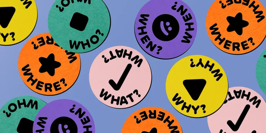
In our increasingly polarized world, are you seeing any type trends that are split along ideological lines? Or any trends that uniquely bridge those divides? The Match Maker trend doesn’t bridge ideological divides, but points to bridging and embracing of differences. As we said in the type trends report, “This variety and diversity of typefaces continues to reflect this generation’s attitudes, values, goals, and missions. Diversity, equality, and inclusion in visual form, Mix-up describes the human experience and life on Earth: wildly complex, diverse, and rich. It often adds visual depth and interest, being active and inclusive. It’s human. It’s biodiversity. It’s alive.”
Are those trends a good example that the more we get into technology, the more we want to experiment with our paper and pencil ability? We haven’t seen this kind of experimentation since the 90s, kinda like we are trying to get back to our organic roots through technology. Great call-out! As any creative likely already knows, basic drawing skills can help every design discipline. Many of the trends featured in this year’s report had a human touch, whether the designer actually sketched on top of digital work, or hand-drawn elements were simply implied. Our friends at UnderConsideration took a labor-intensive, handmade approach to the physical badges for their 2022 Brand New conference, using molds to create the rubber letterforms (watch a timelapse of their process below). So whether it’s an initial sketching phase or a piece for the final output, it certainly seems as if there’s a collective return to analog experimentation; after all, it’s fun and refreshing to work with your hands and take a break from screens.
Typography (and graphic design) seems to have been obsessed with minimalism for a long time now, but recently there seems to be a shift towards ‘more is more,’ maximalism, illegibility, etc. Why do you think that is? A reflection of our hectic lifestyles? Maybe. Trends ebb and flow, especially long-standing trends of minimalism and maximalism. Our instinct tells us it’s often just being different to stand out, to go against a trend in spite. Maybe it depends on the person; if your life is boring, you will seek adventure and excitement; if your life is hectic, you might seek peace and calm. There is a mood to sell to everyone.
Not that long ago, we had the digital-first trend, simple, no-frills design, because the digital world dictated that recognition comes from other things; this presentation seems to imply that that idea has now gone; thoughts? The simple, no-frills design aesthetic is still here (see our Super Sober trend below). While there’s room for experimentation and maximalism to the extreme, digital experiences and screens will continue to require clean UX to leave room for the experience.


Trends and time cycles.
What happens when it isn’t a trend anymore? Should we try to stick to timeless rather than trend? As mentioned, trends ebb and flow and eventually fade out or become something else altogether. Take Smart Grid, for example. This trend first appeared in 2021 as “Blockheads,” in 2022, we saw it evolve to “Organic Modular,” and now we see it as “Smart Grid, a blend of art and science built on grid structures disrupted - judiciously - by quarter or half circles.” Stick to your project guidelines and needs, trust the brief, and if helpful, use trends as inspiration, not as a rule.
Do you have any concerns with the longevity of trends? Take Pepsi’s new “classic” rebrand for an example. How do companies have longevity as a brand? While trendy work is innovative and fun to admire, there is still value in classic takes. In 2021 we called out a trend about nostalgic typography. Monotype’s own Executive Creative Director, Phil Garnham, said in the 2021 trends report, “There is comfort in the warm, soft-edged physicality of these letter shapes, a nod to a vintage era of playful swashes, fat serifs, quirky letters, and vibrant color schemes.” Classic rebrands like Fisher Price by Emily Oberman/Pentagram, Chobani, and Dunkin Donuts by JKR, are all solid examples of how to maintain longevity as a brand while imparting some classic elements. In short, there’s no right or wrong when it comes to choosing trendiness over heritage. When digging through the history of a brand, you often find some gold. Read this piece for more of Phil’s take on how nostalgia can be a part of timeless branding.
Within these modern trends/designs, do you see preferences in fundamental, more timeless typography rules that are finding new uses? Not to keep plugging Smart Grid, but this trend takes the fundamental grid and flips it on its head, resulting in organized precision that has been selectively softened and made more organic.
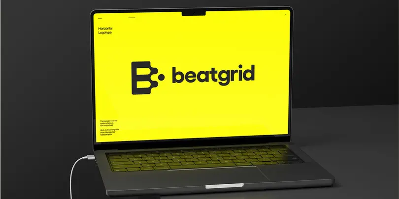
Beatgrid by Erik Herrström. Typeface: Gellix by Displaay.
Tools and resources.
FontExplorer is/was an indispensable tool for font management. Where should long-time Font Explorer users turn for a replacement? Our Monotype Fonts platform has font management capabilities and is the spiritual successor to Font Explorer.
Best tools for animating type? Variable fonts can be quickly and easily animated with CSS; there are many accessible tutorials and videos online. You don’t need to be a coding expert to do so! You can also create animations in AfterEffects with the use of some plugins. And for Python aficionados, DrawBot is an amazing tool that can also be used to animate variable fonts; it also has many exporting capabilities, including videos!
Is there a Monotype service for the freelancer similar to Adobe Fonts? Our individual plans on the Monotype Fonts platform provide access to over 40k fonts.
What software is being used now to create fonts? We use Glyphs app at Monotype and have our own special and private tools. Others use RoboFont or FontLab editors. Many type designers and engineers publish their python scripts on GitHub. There is a healthy font tool community out there, and many online classes and workshops available! Check out Type Electives, an online design school shaping the future of type, co-founded by Lynne Yun and our very own Juan Villanueva.
What are your favourite sources (website, accounts, newsletters…) to stay up to date with what happens in the design world? You’re in luck! We have an article here about some of our favorite sources of inspiration.
Trends in practice.
How might a small nonprofit stay up to date with trends, when design resources are limited, and we’d never use 30 typefaces – we need to keep it simple! Keep it simple with classic typefaces that never really fall out of style like Helvetica or Avenir. If changing creative resources like fonts and images is out of the budget, consider the tone of voice and copywriting. These trends are not just about form; they are about tone too.
How is sustainability taken into account in type design? You can improve your digital design by using sustainable fonts including compressed fonts, variable fonts, and micro type. Compressed fonts have faster font load times, boosting website load speeds as well. Read on for 4 tips for being more sustainable when you design. If podcasts are more your thing, listen to our podcast episode with Nathan Lance, creative director at Leap, a B Corp certified design agency in Truro, England, where he shares his expertise on eco-friendly design, sustainability, and brand transparency.
Where does Emilios get his sweaters? Emilios: Let me keep some secrets :) Terrance: If I do this next year, I’m going ALL OUT on my costume!
Trends never end.
Can’t get enough of type trends? Download the 2023 report here if you haven’t, or watch the recording of this year’s type trends webinar for more inspiration.


