How to find legible fonts.
Legibility is a crucial consideration when trying to choose a font for your project. Here’s how to find a legible font that will be easy on the eyes for your readers and customers.
We get a lot of questions here at Monotype, but one of the most frequent is probably some variation of this: How do I find legible fonts? People may ask it differently — they’ll ask which fonts are the most legible, for example, how they can tell if a font is highly legible — but everyone is asking the same basic thing: What makes a font legible, and how do I find one?
Like many design questions, the recipe for this answer is a blend of art and science and is governed less by rules than by best practices. The key is to understand the key components of a font that affect legibility, and then find the font with those characteristics that best matches the visual language you’re working within.
Legibility is a broad topic with far more nuance than we can cover in a single article, but understanding a few key points will help you confidently choose a legible font for your next project. Let’s dig in.

Legibility is in the mind of the reader.
When we read, our eyes take in the forms written on a page, translate those forms into letters, combine the letters into words, and then connect those words to their meanings. All this happens so quickly we barely notice it.
But if one of those steps in the process slows down or hits an obstacle, our reading slows down with it. This may not matter in some cases — a deliberately obfuscated headline in a magazine, perhaps — but it matters a lot in digital or quick glance use cases, or in extended reading environments where you want the reader immersed in the story.
Highly legible fonts essentially get out of the reader’s way. They are easy for the eye to scan and for the brain to comprehend, so the reader is able to flow through the pages of a book or instantly ascertain the text on a car screen. They can feel as natural and effortless as breathing.
What makes a font legible?
Ok, so the obvious question here is: What makes a font “easy” on the eyes and brain? Aren’t all fonts just … letters? Why are some letters easier to read than others?
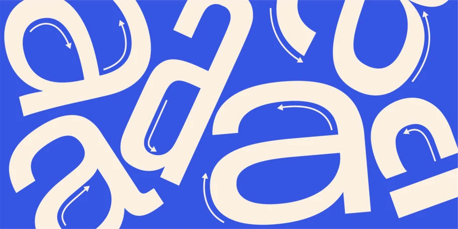
When looking for legible fonts, it’s helpful to think about the shapes of letters and words (fun fact: the term for word shape is “bouma”). Your eyes and brain don’t actually trace every curve and angle of a lower-case “a” before confirming that, yes, it’s a lower-case “a.” Maybe that’s how it worked when you were just learning to read. Still, most of us gain the ability to determine that an “a” is an “a” based on its general shape and its relationship to the letters around it.
That said, letters come in a variety of shapes depending on the style of a typeface. The “O” in a geometric sans serif, like ITC Avant Garde, is an almost perfect circle. A single-story “a” could be confused, at first, for that same “o.” Can you read a geometric sans like Avant Garde or Futura? Of course. But it could often be easier.
Enter humanist typefaces. Humanist typefaces are rooted in calligraphic tradition and therefore have echoes in human handwriting (hence the name) hardwired into their DNA. A popular example of humanist type is Proxima Nova by Mark Simonson. Look closely at the “o” and you’ll see it’s a subtle oval, not a circle. Examine the lowercase “a” and you’ll notice that the strokes on the bowl get thinner as they meet the vertical stem. All these details signal the letter’s identity to our brains. Other popular humanist typefaces (and humanist/geometric hybrids) include Frutiger, Morandi, Gotham, and Optima.


Serif fonts deliver similar legibility to the reader, so it’s no surprise they are the predominant choice for books, magazines, and other long-form reading situations. However, serif typefaces have historically posed a challenge in digital use cases because of their stroke contrast, the difference between thick and thin lines in a typeface (discussed below). High stroke contrast serif fonts with thin lines are intended for use in larger sizes, while serifs meant for use in smaller sizes are designed with less stroke contrast. This effect and fussiness is often exacerbated by screen quality, which makes serif typefaces harder to design with in digital uses cases where a range of sizes might be required. Because of this, humanist typefaces became the preferred choice for digital use cases and remain so today, even though modern mobile screens deliver almost flawless clarity on serif fonts.
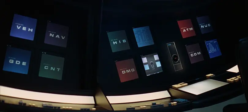
A good example of the opposite of these styles is the typeface Eurostile. There is nothing wrong with Eurostile as a typeface, and in fact it is incredibly popular in sci-fi films because of its futuristic (in the 70s) and now retro-futuristic vibe. When car companies began rolling out touchscreens and infotainment systems in their vehicles, many of them chose Eurostile for the UX of those systems. Unfortunately, Eurostile is largely based on square-shaped letterforms that can be difficult to distinguish from each other when you only have a split second to glance at them. Like when you’re driving a car, for example.
Characteristics of a legible font.
Finding a legible font is very much a Goldilocks affair, and, ultimately, the goal is to find a font that feels comfortable to read. For designers, the key is to understand some essential details that contribute to good legibility and then find typefaces that balance those factors with the visual language you’re looking for.
Contrast:
Contrast describes the difference between thick and thin strokes in a letter. Typefaces with some contrast are generally easier to read because that variation in stroke width helps the reader distinguish between letters that have common shapes.
That said, typefaces with too much contrast can end up being quite difficult to read outside display uses. A font like Bodoni, with its dramatic thick-thin dynamic, makes for a stunning headline. But those delicate thin strokes all but disappear at body text size, rendering the typeface all but impossible to read.

X-height:
X-height literally refers to the height of the lower-case x in a typeface, which essentially dictates the height of the lower-case letters in the typeface. Larger x-heights tend to deliver better legibility because the generous size makes the letters easier to read.
However, an x-height that’s too tall can blur the distinction between upper- and lower-case characters, and even between certain lower-case characters (an h and n, for example). Small x-heights can deliver good legibility as well, depending on the design and weight of the typeface.
Spacing, kerning, and crowding in general:
The space between letters is as essential to legibility as the letters themselves. An improperly kerned r and n, for example, can easily look like an m. Text that is too tight overall can slow a reader down, and text that is too loose can seemingly drift off the page.
Some typefaces are spaced and kerned thoughtfully and require minimal additional refinements, but many will require attentive adjustments when put into layout. Legible type should feel like it breathes and flows easily, guiding the reader through words and sentences without doing a double take.
During your discovery process, seek out typefaces where the letters are connected but not crowded and, if possible, investigate potentially problematic letter combinations for kerning issues. This will help you determine how much adjusting you’ll need to do yourself.


Optical sizing:
Optical sizing is the practice of designing different versions of a font with consideration for how and where it will be experienced. These optimizations can include much of what’s discussed above – adjusting the spacing, x-height, stroke contrast, or detailing. Larger sizes are designed with splashy uses in mind — headlines or even billboards — and typically show off the details and subtleties of a typeface while also spacing appropriately for those larger scales. By contrast, letterforms in fonts between 3 and 7 pt are simplified and exaggerated for maximum clarity at those small sizes, and so they’ll render cleanly on screens.
Not all typefaces are optically sized, but they’re worth seeking out if you’re looking to use the same font family in a range of applications and sizes.

The optical sizes in Helvetia Now enable it to unction flawlessly in a range of applications, from large, eye-catching display text to hyper-legible micro type.
When in doubt, test it out.
Once you’ve browsed options and selected a few potential winners, the single most important step you can take is to test. When you do, keep in mind that there is a nuanced difference between legibility and readability — if legibility is being able to determine the difference between characters, then readability is all about the comfort of reading. If you have a very legible typeface spaced poorly, it won’t be very readable. Your role as designer is to combine the type design (the typeface itself) and typography (how it’s used) into something pleasing for the reader.
So, set some text and see if it feels comfortable. Is there a healthy variation between tall and short? Do any words or letter combinations feel crunched? Do you find yourself doubling back to read phrases a second time? You can even ask a friend or co-worker to read it as well.
Again, legibility is a blend of art and science, and truthfully there is no perfect font for legibility. But with some basic best practices, plus your eye and instincts, you can find something that delivers excellent legibility for your readers and users. Good luck!


