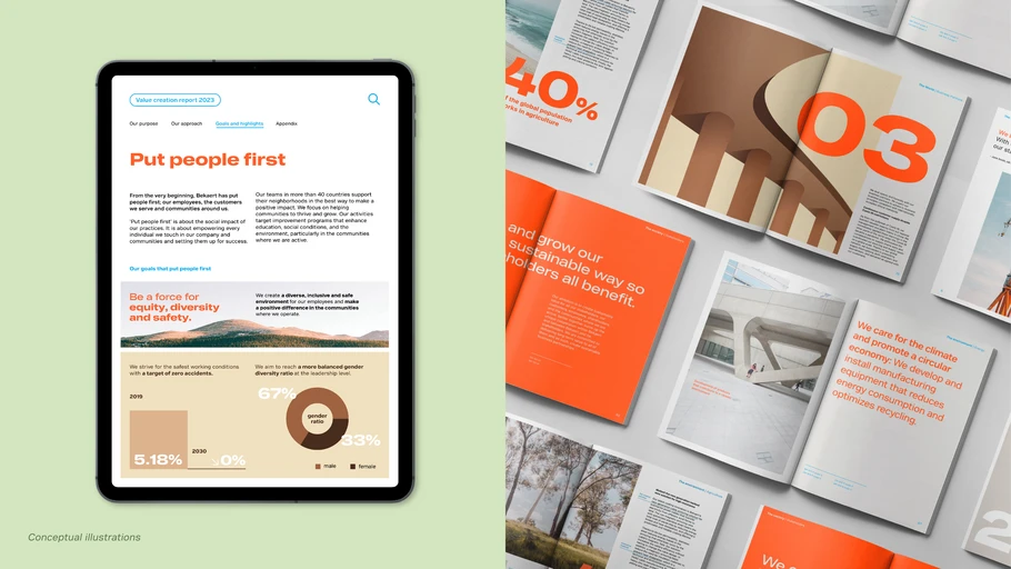
Your guide to consistent, powerful, and meaningful branding.
In the words of Monotype Creative Director, Charles Nix, “Branding is always happening. There are no static brands.” And because brands are constantly evolving, they need pillars in place to keep them united.
Type is one of those pillars. And even though it’s the designers who fret over x-heights and the shape of a “g” in a particular typeface, everyone at an organization has a responsibility to ensure brand consistency.
Consistency isn’t box seats: It’s the ballpark.
We know that brands are powerful. They create trust, establish identity, build a strong ethos, and keep customers coming back. Consistent use of typography keeps everyone on the same page—pointing in the same direction. Establishing and maintaining consistent typography says, “Our brand values are important. We believe them. We live them. The way we speak to each other verbally and visually is a key reflection of that.”
For your customer to know who you are—and to trust you, to do business with you, to give you money, to help you succeed—your brand needs to know itself and convey that identity at every turn. Good, consistent typography isn’t a luxury, like box seats at the ballpark. It is the ballpark. It’s table stakes. It’s a business necessity.
How to establish & maintain consistency.
It can be difficult to predict the journey a brand will take over the years. Think of brands that existed before the Internet and before apps, never mind that web-based fonts weren’t even a thing. Brands of the Web2 world will have to adapt as the world changes to Web3, the metaverse, and whatever lies beyond that. That said, what are the actionable steps an organization can take to ensure branding and typeface consistency? Let’s review.
Track text and display fonts.
Whether you’re designing swag, a letterhead, or an internal presentation, know the brand’s primary and secondary fonts from the get-go. While there’s no minimum number of typefaces a brand could choose, and only using one would take a pretty intense level of discipline, it’s important to at least have the text and possibly display fonts figured out. In addition, you might need to go into your designer’s cabinet and pull out some “spice,” a.k.a. a new display font for a special occasion. Having a universal way of knowing what goes where for which brands is the first step to success.
Keep it Simple, Serif or Sans (K.I.S.S.S).
Consider it a rule for anything in branding, in addition to the hierarchy of typography: If the system is so complex that even the creators aren’t able to keep it straight, then there’s no hope for the rest of the brand partners. With Monotype Connect as a management platform, admins can get a birds-eye-view into the organization’s fonts, and only allow access to the right fonts employees should be using.
Get everyone aligned.
A brand’s voice is expressed through typography. Everyone at the brand should understand that and be on board with it, whether they’re directly involved with brand design or not. It helps to have one platform or system that easily integrates brand fonts into a design program. With Monotype Connect, all it takes is the “sync” button. But from a higher level, knowing the “why” of the brand, down to the font choice, is an internal, if not psychological factor that keeps a brand strong.
Conduct ongoing brand audits.
Branding is always happening. Conducting ongoing brand audits or assessments internally, with the option to leverage help from external partners, is not a bad idea. An assessment should take a high-level and scrupulous view. Consistency, brand voice, and relevance to sizing, color contrast, legibility, and more must be considered. Monotype’s Brand Type Assessment service can offer these insights, keeping all canoes pointing in the same direction and ferrets out any problems in the system.
Above all, communicate.
Brand values, the name, the logo, the mission, and other brand elements uphold what a brand is, even though it’s changing; and typography is how it’s all expressed. If there’s a change, let everyone know. If there’s an access issue, get it fixed. If you’re using Monotype Fonts, for instance, everyone on the design and digital teams should have needed access.
Why Monotype Connect?
When you’re looking for a type family that satisfies all of your brand needs, it pays to have a world-class search tool, which Monotype Fonts has built right in. Find and filter fonts by style, mood, language, font features, font format, foundry and more.
In addition to over 250,000 font options, Monotype Connect makes syncing and sharing font files with others a breeze. Beyond this, it offers easy uploading of third-party fonts, one license agreement, simple syncing, organized libraries, and access control – a major mistake-saver.
For example, if you have a team within your organization (or outside) that needs to use a specific font or set of fonts, you can gate access to the typefaces and ensure that they use only fonts that match the brand guidelines. No more using the wrong “Helvetica” even though you thought it was the same. And with that, Monotype Fonts is nothing short of everything.


