Type resources for designers and brand owners


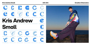
On this week’s episode, Kris Andrew Small talks about converting frustration into energetic creativity, coping with ADHD, and finding inspiration in 80s New York and his vibrant Sydney surroundings. Tune in now.
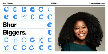
Ready to dive into the world of political design? Tune in to hear Shar Biggers’ wild ride designing for high-stakes presidential campaigns, from working on Hillary’s 2016 run to the rollercoaster of the Biden-Harris rebrand.
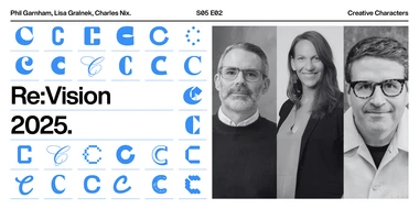
Type is a mirror on culture — the themes of “now” create the visual cultures of tomorrow. Tune in to explore the themes in Re:Vision, a transformative approach to our annual trends report, and discover how type shapes the world around us.
Join us for a delightful chat with Taekyeom Lee, the graphic designer and educator who takes typography off the page and into the third dimension. Tune in now.
This report is different – different from what we’ve done in the past and different from the top ten lists found everywhere across the design landscape. This year, we’re turning our gaze forward to examine the trends impacting our world and the ways type and design can leave a mark on our future.
Join us for our final episode of 2024, where host Bill Connolly catches up with Creative Director Simon Waterfall. The two discuss Simon’s storied career, and where luck has brought him to today.
In this episode, host Tom Foley chats with Cat about building an ethical branding agency, tackling big projects, and having fun at work. Tune in now.

There comes a time in every organization’s life when a makeover becomes essential.

HM International is a leading provider of content management services for corporate clients in the financial and capital markets. Headquartered in Hong Kong, the company offers a diverse range of services, including financial disclosure and compliance solutions, language services, and media placement, along with customised marketing and creative solutions, such as website design, social media, and digital marketing services.
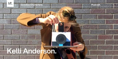
Doug Wilson catches up with Kelli Anderson about her forthcoming typography pop-up book, her passion for teaching design with tactile objects, and her love of all things paper. Tune in now.

We recently had the pleasure of hosting Brand Talks in Cologne. It was our first ever aufenthalt in the carnival-capital, and it was a great success! We enjoyed a captivating afternoon, hearing from some of the industry’s finest, talking about what they do best. Monotype’s Creative Type Director,Sina Otto set the stage with a powerful opening.
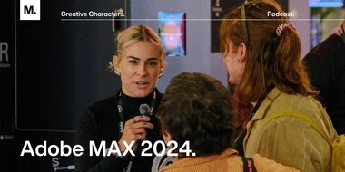
Listen in for a behind-the-scenes look at Adobe MAX 2024. Tune in now to hear from twenty or so voices at MAX, all of whom were kind enough to share their time and their stories with us on the mic.
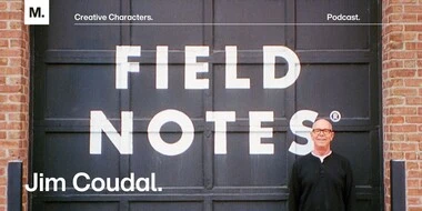
Here’s the story of Field Notes, in all of its 3½ × 5½-inch glory, from co-founder Jim Coudal. Tune in now. No need to take notes (unless you want to, of course).

There comes a time in every organization’s life when a makeover becomes essential.
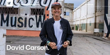
This week on Creative Characters, host Graham Sturt sits down with graphic design icon and the father of grunge typography, David Carson. Tune in now.
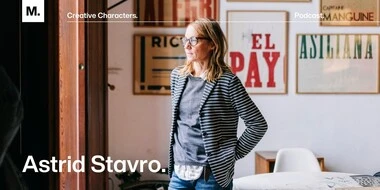
This week, Monotype’s Executive Creative Director, Tom Foley, sits down with renowned graphic designer Astrid Stavro to explore her captivating journey. Tune in now.
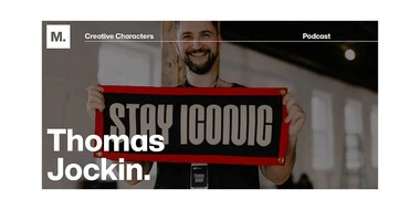
This week on Creative Characters, host Charles Nix sits down with Thomas Jockin, the founder of Type Thursday, a global type meetup. Tune in for an interesting look at the intersection of type design, education, and community-building.