How the pandemic made fonts friendlier.
Creative Type Director, Phil Garnham, spoke with the Economist in May about the impact the pandemic has had on type. With such an unprecedented year we’ve had, the Economist and Phil uncover how this period has evolved fonts to become friendlier to their audiences.
First published on The Economist, by Arthur House.
It’s too early to know exactly how the pandemic will influence art and design, but it has already changed brand typography. Seismic historical events can jolt creativity in new directions. The eruption of an Indonesian volcano in 1815 caused freakish weather throughout the world, inspiring a new genre of gothic fiction. Out of the devastation of the first world war came modernism, with great innovation in literature, art – and typography. Gill Sans, a fresh, forward-looking font created by Eric Gill in 1926, embodied the post-war world’s desire for novelty.
You might think you’re reading the words when you look at a sign or logo. But how they’re written may be as important as what they say. Typefaces are the visual equivalent of tone of voice. You wouldn’t write a party invitation in Times New Roman or a heartfelt apology in Comic Sans. For companies, typefaces play a more important part in articulating their identity than any other design element.
When the world changes, so does what we want to say. So the pandemic is already influencing brand typography. Plain, tidy and functional fonts are giving way to rounder, softer and more expressive ones. The trend started a few years ago, led by companies with self-consciously playful identities like Duolingo and Mailchimp, but it has gathered pace over the past year. In Britain, Currys PC World, an electrical-goods shop, and Zoopla, a property website, have abandoned soulless styles for more characterful characters. To sell a washing machine these days, you need flamboyant descenders on your “g”s.
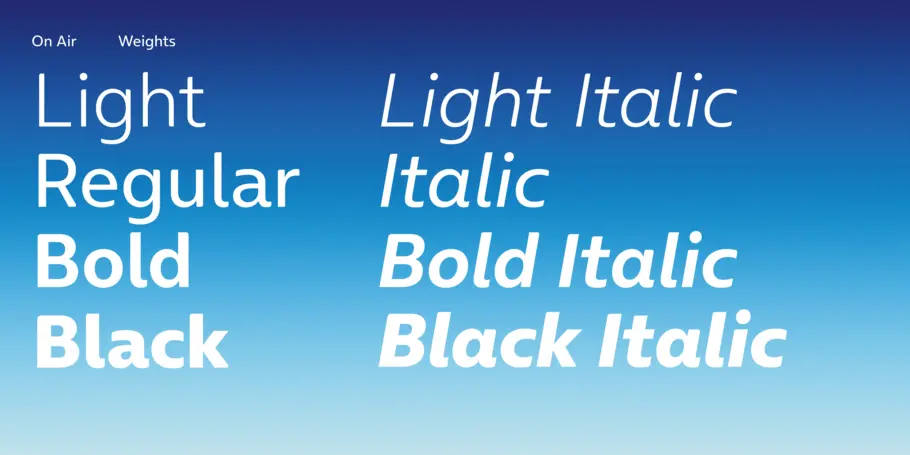
The latest big name to follow suit is O2, a telecoms company. The brand is dropping Frutiger, the banal Humanist Sans it has used since 2002, for On Air, a new typeface created by Monotype (which also designed The Economist’s Milo font). On Air’s rounded corners and “calligraphic elements” suggest a human touch, says Phil Garnham. The aim is to lend warmth and personality to O2’s marketing copy. The effect of fonts such as On Air is “subliminal”, says Garnham, a reminder of just how powerfully type can influence our understanding of words. Yet since the turn of the century, brands have been stuck in a typographic rut. As usual, it was the internet’s fault.
For two decades brands have chosen generic sans-serif fonts for their legibility across screens of varying sizes and resolutions. O2’s outgoing typeface, Frutiger, is often considered the most readable typeface ever invented, which is why it appears on airport signs all over the world. Though the technology now exists for designers to use any font on a website, brands have continued to gravitate towards cold, geometric staples like Avenir, Gotham and Proxima Nova.
On Air
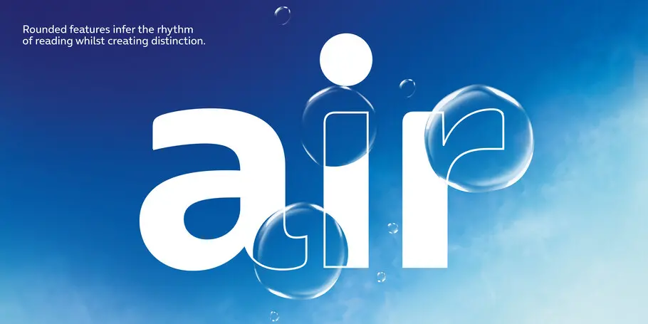
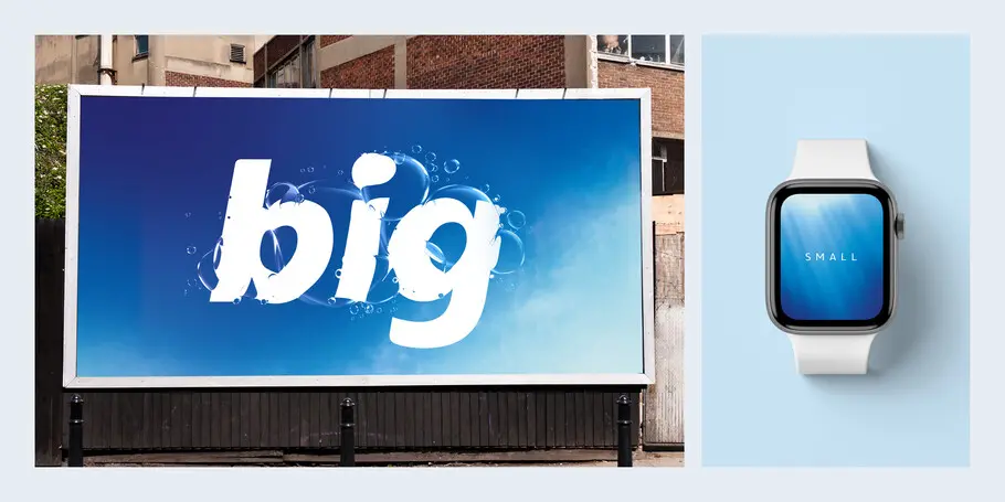
Typefaces are the visual equivalent of tone of voice.
But legible doesn’t necessarily mean memorable – in fact, the opposite may be true. In 2018 researchers at the Royal Melbourne Institute of Technology found that readers tended to gloss over words in overly familiar typefaces, and recalled them better when reading involved some “desirable difficulty”.
They designed a typeface called Sans Forgetica, which omitted parts of letter strokes and required the brain to fill in the blanks. Testing it on students, they discovered that facts written in this font were more likely to be remembered than those written in Arial (although other researchers subsequently found no evidence that Sans Forgetica boosted retention).
Whatever their effect on memory, functional fonts are on their way out. This is partly because screen resolutions have improved and font design systems are more advanced. It is also because the pandemic has changed the way brands interact with us. When shops are closed, written marketing material – be it online or dropping through the letterbox – becomes more important. Typefaces have to work harder than ever.
Legible doesn’t necessarily mean memorable – in fact, the opposite may be true.
Pandemic-era fonts share a common theme: curved lines and rounded shapes. Aoife McGuinness, a neuroscience consultant for HeyHuman, a marketing agency, says the brain may be hardwired to associate certain shapes with concepts or sentiments.
A study of food packaging from 2017 found that people associate rounded typefaces with sweeter tastes and angular ones with sour. Straight lines and sharp angles carry a solidity and authority, whereas curves and circles convey softness, mildness and even friendliness. Warm typefaces could be a way to get closer to consumers, especially those feeling lonely during lockdown. If you can’t hang out with your real-life mates, why not become friends with your broadband provider?

Nick Stickland, founder of odd, a creative agency that works with fashion companies on brand identity, has a different take. He thinks the enforced domesticity of the pandemic and resulting boom in interior design has changed tastes. The trend for cool Scandinavian minimalism has given way to a new-found appreciation for cosy maximalism. In this context, cuddly typefaces are the typographical equivalent of comfy tracksuit bottoms.
Pandemic-era fonts share a common theme: curved lines and rounded shapes
We’ve also had plenty of time to think. Consumers care more about sustainability and diversity than they did in 2019 and companies are having to listen. If coldly geometric characters bespeak a certain authority, even arrogance, then the shift to warmer, more rounded letterforms reflects a humbler, more deferential approach. For brands, tweaking their typeface is one way to stay ahead of the curve.