Resources

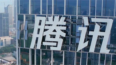
Tencent

If you’re using a messaging app in China, chances are it’s owned by Tencent. See the brand identity and typeface that is helping Tencent expand to new markets.
Learn more
Tencent expands global presence.

If you’re using a messaging app in China, chances are it’s owned by Tencent. See the brand identity and typeface that is helping Tencent expand to new markets.

Sagrantino

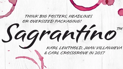
Sagrantino is a non-connecting script that traces its roots back to hand-drawn letterforms, and the connection between pen and paper. Named after the Italian wine, Sagrantino is bold and full of flavor, while embodying a sense of freedom and fluidity. Its quirky character shines at larger sizes – making it perfect for headlines, posters, or anywhere type is needed to really make a point. The family is available as OpenType Pro fonts, and has an extended character set that supports most Central European and many Eastern European languages.
Learn more
Introducing Sagrantino.

Sagrantino is a non-connecting script that traces its roots back to hand-drawn letterforms, and the connection between pen and paper. Named after the Italian wine, Sagrantino is bold and full of flavor, while embodying a sense of freedom and fluidity. Its quirky character shines at larger sizes – making it perfect for headlines, posters, or anywhere type is needed to really make a point. The family is available as OpenType Pro fonts, and has an extended character set that supports most Central European and many Eastern European languages.

Paula Scher

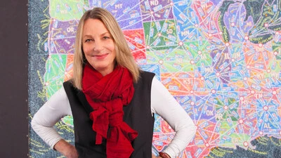
In the latest Type Mixtape from the new issue of The Recorder, Paula Scher walks through some of her favorite typography projects from her iconic career.
Learn more
Type Mixtape: Paula Scher.

In the latest Type Mixtape from the new issue of The Recorder, Paula Scher walks through some of her favorite typography projects from her iconic career.

Amariya

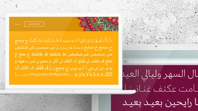
Created with screen reading in mind, Amariya’s sculpted, understated elegance is specifically designed for long-form copy in Arabic, Urdu or Persian. Its open shapes and streamlined forms are tailored not just to the digital world, but the flow and rhythm required by someone immersing themselves in words.
Learn more
Introducing Amariya.

Created with screen reading in mind, Amariya’s sculpted, understated elegance is specifically designed for long-form copy in Arabic, Urdu or Persian. Its open shapes and streamlined forms are tailored not just to the digital world, but the flow and rhythm required by someone immersing themselves in words.

Caecilia

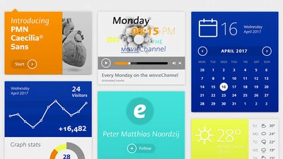
The making of the serif typeface PMN Caecilia from first sketches to usable fonts took more than seven years. Designed by Peter Matthias Noordzij, it is the child of a time when font technology changed rapidly, not knowing which development the next day would bring. Eventually it was released in 1991 and quickly turned into a quiet tip for designers; not overused, and yet selected for prominent applications. Today, more than 25 years later, Noordzij adds a sans serif companion to his first type family and equips it for today’s needs.
Learn more
The story of PMN Caecilia Sans.

The making of the serif typeface PMN Caecilia from first sketches to usable fonts took more than seven years. Designed by Peter Matthias Noordzij, it is the child of a time when font technology changed rapidly, not knowing which development the next day would bring. Eventually it was released in 1991 and quickly turned into a quiet tip for designers; not overused, and yet selected for prominent applications. Today, more than 25 years later, Noordzij adds a sans serif companion to his first type family and equips it for today’s needs.

SST

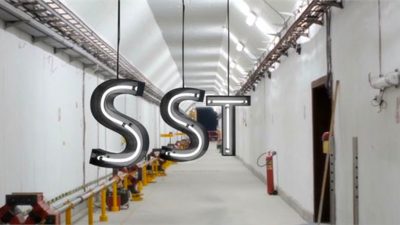
The SST font tackles a central challenge of branding – universality. The SST superfamily supports more than 90 languages including Japanese, Thai and Arabic.
Learn more
SST : a font for everywhere.

The SST font tackles a central challenge of branding – universality. The SST superfamily supports more than 90 languages including Japanese, Thai and Arabic.

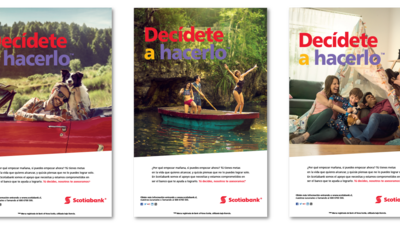
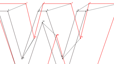
Scotiabank has long used Frutiger as its brand font. But as they expanded to new digital channels and regions, font licensing became too complex. Until now.
Learn more
Simplified font licensing for Scotiabank.

Scotiabank has long used Frutiger as its brand font. But as they expanded to new digital channels and regions, font licensing became too complex. Until now.

Variable Fonts

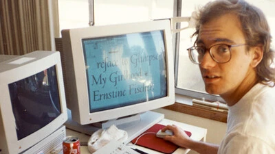
Bob Taylor, Monotype’s Font Technologies Director, offers his views on the promise of Variable Fonts and shares how Monotype and the tech industry are bringing this promise to reality.  He shares a few Variable Font tests gone wrong, what we are learning, and introduces the newest Variable Font from Monotype.
Learn more
Variable Fonts: making the promise a reality.

Bob Taylor, Monotype’s Font Technologies Director, offers his views on the promise of Variable Fonts and shares how Monotype and the tech industry are bringing this promise to reality.  He shares a few Variable Font tests gone wrong, what we are learning, and introduces the newest Variable Font from Monotype.

California

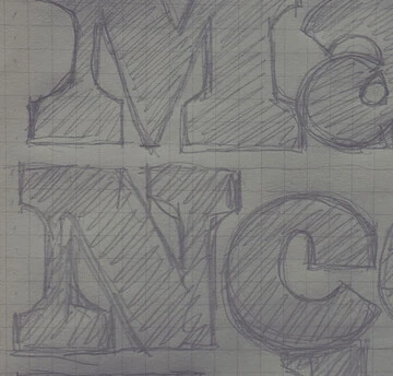
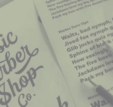
Tom Rickner, veteran type designer, shares his personal role in the beginnings of type’s most exciting development in decades.
Learn more
Part 1: from TrueType GX to Variable Fonts.

Tom Rickner, veteran type designer, shares his personal role in the beginnings of type’s most exciting development in decades.