SST : a font for everywhere.
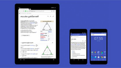
SST is a typeface that tackles one of the central challenges of branding – universality. With support for 93 languages, spread across six weights plus italics, SST is a typeface super-family on a global scale that meets the needs of companies who communicate across multiple platforms and places.
“It has the notable feature of having no notable features,” says type director Akira Kobayashi. “In other words, it has an understated look that fits products and brands with a solid or clean image.”
Kobayashi first designed SST as an exclusive typeface for Sony – in partnership with Hiroshige Fukuhara, chief art director at Sony Creative Center. Because the company operates in a number of countries, it needed a design that would work across a demanding range of touch points. Above and beyond practical considerations, it needed to be timeless – forgoing trends in favor of solid design principles that would remain relevant, despite an ever-changing digital world.
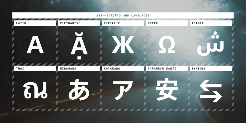
The SST superfamily of fonts supports 8 scripts and over 90 languages.
“I think any type has its own position in the map of typography, if there is such a thing,” says Kobayashi. “An attractive typeface with trendy styling might look outdated in just a couple of years, or a type with embellished characters could instantly attract attention.”
“Being understated does not mean being less expressive,” he adds. “SST was created to be flexible enough to let the products or brands speak for themselves. An ideal type for long-term branding is a type like SST, which does not try to attract attention to itself.”
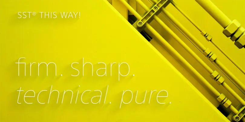
Kobayashi aimed to create a typeface with universal and timeless appeal – which is no small order. Starting with a sketch of the alphabet created by Sony’s art direction team – who set out to achieve the readability of a humanist sans design and the solidity of a neo-grotesque – the designer first developed the Latin type, before moving onto the multilingual glyphs.
Kobayashi used Monotype’s network of local designers to harness language expertise, and gain insight into cultural sensitivities – making sure the typeface was tailored to each country. This was also a chance to ensure individual details such as curvature and line width were consistent across multiple languages.
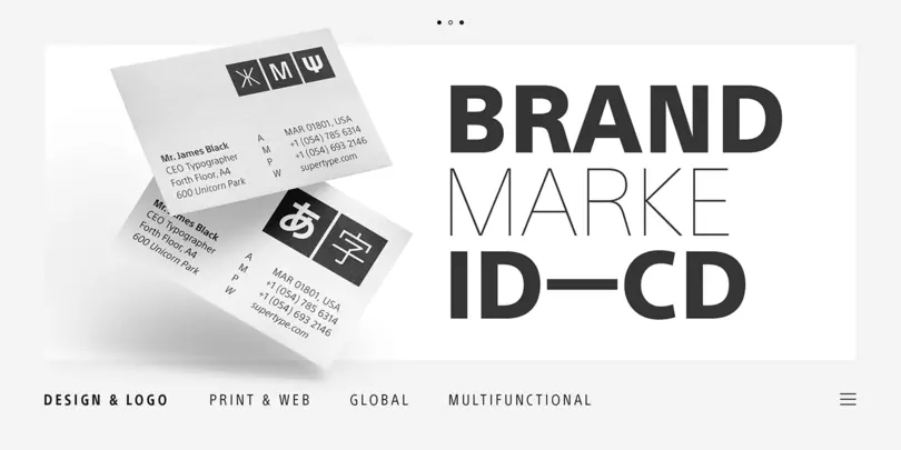
“Imagine that you need to describe what your product or brand does, and the text has to have a solid and clean tone,” he elaborates. “You would choose an appropriate type such as Helvetica or Avenir, but what about Japanese, Arabic, and Thai languages? Well, that’s where the SST type family can provide a good solution.”
The use of some clever optical illusion allowed line width to appear consistent across characters, and legibility was maximized by using ample space for apertures and counters at smaller sizes – perfect for small screen displays.
And despite the need for SST to be restrained in appearance, Kobayashi still managed to sneak in some defining characteristics – giving the y a straight instead of curled leg, to avoid the typeface feeling too ‘soft’. This letter, with its “clean and simple” look became the key glyph that defined SST’s characteristics.
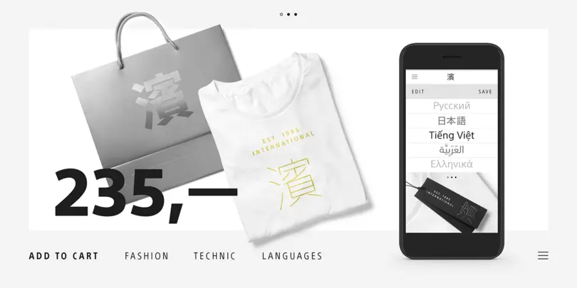
To accompany the typeface’s release – and show off its multilingual credentials – London creative agency La Familia adopted a slightly different approach to the usual static specimen. The team placed letterforms from SST’s various languages into the real world – appearing on flickering neon signs, as floating bubbles or raindrops trickling down a train window.
Working out how SST would function in three dimensions was a process of trial and error, but also a chance to explore how it would function in surprising settings – and places that reflected its linguistic capabilities.
“We wanted to show letters in different environments, places and contexts,” explains La Famila director Pablo Rivera. “We tried to find where on the planet you can find something similar to neon, and that was where the idea of the northern lights came from. It was about finding the right places and the right footage for the fonts.”
Get the SST fonts
Visit the SST web specimen to experiment with this superfamily. Each SST script is available from MyFonts. For information on Enterprise or OEM licensing, contact us.
The Studio team.
Akira Kobayashi.
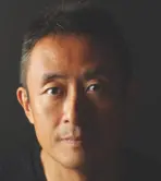
Creative Type Director Akira Kobayashi has nearly four decades of experience and an extensive background in Japanese typeface design and is a 2022 TDC Medal and Keinosuke Sato Award winner. After studying at Musashino Art University in Tokyo for four years, Akira Kobayashi accepted his first job at phototypesetting manufacturer Sha-Ken Co., where he was involved in the lengthy and intricate process of designing Japanese fonts.


