Resources

One of the best rebrands of 2016, the new Premier League identity features a typeface that performs confidently from screens and jerseys to TV and league tables.
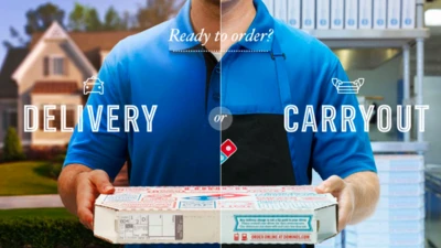
Monotype designer Terrance Weinzierl delivered a taste of modern Americana to Domino’s, with his modular, multi-weight Pizza Press typeface.
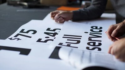
Monotype and Lippincott worked closely with Southwest Airlines to craft an authentic typographic voice that formed the center of a fresh new identity.
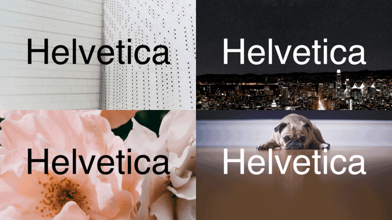
In many ways the idea that Helvetica is a 'neutral' typeface has become a self-fulfilling prophecy. That's not to say it isn't, but the neutrality narrative is only half the story.
Juan Erquicia, Group Brand Manager at Santander, discusses the hurdles his brand faced heading into its rebrand, and how a custom font from Monotype helped solve those challenges.
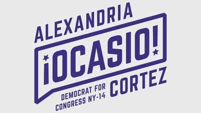
There’s more to a political campaign than ideology. Fonts and design play a crucial role in conveying a candidate's personality (or lack thereof), perspective, and potential.
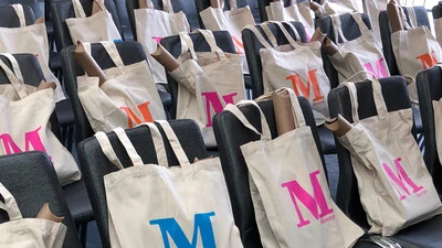
The 2019 edition of Brand Talks San Francisco brought together leaders in design and branding to hear from brands that have tackled the issue of visual consistency head-on.
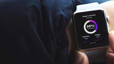
When screens get smaller, spacing gets tight, details get lost, and forms blend together. The resulting legibility issues can make for a frustrating reading experience. Here’s how to find the fonts that can fix it.

This custom-designed font family, Alibaba Sans, will help partners and customers power on-brand designs.
