Resources
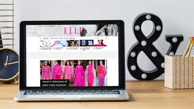
Fonts play an indispensable role in shaping your experience of published media, working in a deliberate way to communicate the information clearly and legibly.
Helvetica® is perhaps the best-known typeface of all time, inspiring designers across multiple generations and around the world. Recently, Monotype’s Studio team released Helvetica® Now, a reimagination available in three optical sizes - Micro, Text, and Display. Every character has been redrawn and refit; with a variety of useful alternatives added.
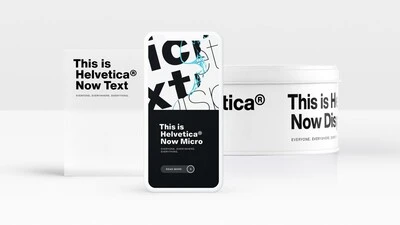
Designers and studios might be deeply familiar with Neue Helvetica, but it’s the product of a pre-digital era. Here are four reasons why it’s time to switch.
Optical sizing has long been part of the type designer’s toolbox, but for many people the term may not be familiar. Here's why that should change.
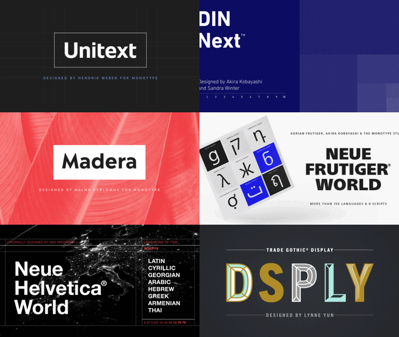
You know what they say, “classics never go out of style.” Maybe this is true, maybe it isn’t. But one thing is certain: When sans serifs took over typography in the early 1900s, they weren’t just a fad. They came to stay.
A good typographic system is like a family—and just like people, it comes in all shapes and sizes, allowing it to address a range of design requirements.
If fonts could speak, what would they say? The second installment of our Good Type series looks at how the fonts you choose impact the voice of your brand.
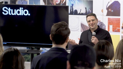
In this new video, learn more about how we bring brands to life, utilizing our full product suite to empower modern brand expression.
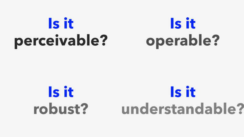
In this three-part series, we’ll show you how fonts can help your website follow the standards established by the Americans with Disabilities Act.
